Table of Contents >> Show >> Hide
- Why This Color Choice Feels Surprisingly Smart
- What Universal Khaki Actually Looks Like
- Why Universal Khaki Works With So Many Styles
- How It Fits Into 2026 Paint and Decor Trends
- Best Ways to Use Universal Khaki at Home
- Colors That Pair Beautifully With Universal Khaki
- Who Should Consider This Color
- Why This Color Matters Beyond One Year
- Real-World Experiences With a Surprisingly Universal Color
- Conclusion
Every year, the paint world rolls out a Color of the Year with the kind of drama usually reserved for award shows, snack launches, and celebrity breakups. Sometimes the choice is bold. Sometimes it is moody. Sometimes it looks stunning in a designer loft and slightly alarming in a split-level ranch with fluorescent kitchen lighting. But the 2026 Sherwin-Williams Color of the Year lands differently. Instead of giving homeowners a trendy shade that demands a complete personality transplant, Sherwin-Williams chose Universal Khaki SW 6150, a warm, earthy neutral that feels unexpectedly easy to live with.
That is exactly why this pick stands out. Universal Khaki is not trying to become the loudest paint chip in the room. It is not here to perform. It is here to work. And in 2026, that practicality feels fresh. The shade sits in a sweet spot between beige, tan, taupe, and soft earth tone, which makes it flexible enough to move across decorating styles without looking bland, dated, or aggressively “safe.” In other words, this is not your aunt’s dusty builder beige. This is beige after it got a better tailor, a skincare routine, and a solid understanding of texture.
Why This Color Choice Feels Surprisingly Smart
What makes Universal Khaki such a compelling 2026 choice is the bigger design mood surrounding it. Homeowners are still interested in personality, but many are getting tired of interiors that feel like they were decorated for social media first and actual living second. After years of cool grays, all-white minimalism, and then a wave of louder color experimentation, there is a visible swing toward warmer, steadier, more grounding tones.
Sherwin-Williams clearly saw that shift coming. Universal Khaki was selected as a color with staying power, not just novelty. It reflects a growing appetite for rooms that feel comforting, livable, and intentionally designed. The appeal is simple: people want spaces that calm them down instead of asking them to emotionally process a chartreuse accent wall before coffee.
There is another reason this pick matters. For 2026, Sherwin-Williams and HGTV Home by Sherwin-Williams made the same Color of the Year selection for the first time. That shared choice says a lot. It suggests broad confidence that this hue can connect with designers, everyday homeowners, remodelers, renters looking for inspiration, and anyone else trying to make a room feel more finished without making it feel too precious.
What Universal Khaki Actually Looks Like
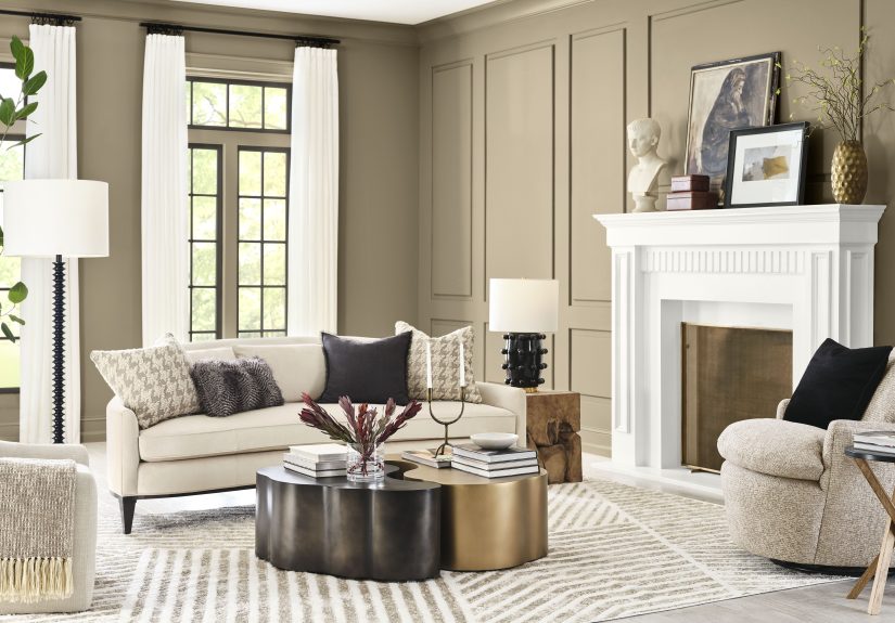
The name “khaki” can make some people nervous. It can sound flat, utilitarian, or suspiciously close to the pants section at a department store. But Universal Khaki has more nuance than the name implies. It is a mid-tone warm neutral with earthy depth, soft golden warmth, and just enough complexity to avoid reading one-note.
In bright natural light, it can feel sandy, relaxed, and quietly elegant. In lower light, it becomes richer and cozier, leaning into that warm, grounded feeling that so many 2026 palettes are chasing. It works because it does not skew too yellow, too gray, or too peach. Instead, it lands in that rare middle ground where it can look tailored in one room and soft in another.
This balance is what gives the color its “universal” reputation. It can look classic on walls, sophisticated on cabinetry, polished on exterior siding, and unexpectedly chic on furniture or built-ins. It has enough body to hold its own, but not so much intensity that it dominates everything around it.
Why Universal Khaki Works With So Many Styles
1. It behaves like a neutral, not a trend stunt
One of the biggest strengths of Universal Khaki is that it functions like a real design tool. It can anchor a room the way a good pair of jeans anchors a closet. You can dress it up, tone it down, make it more rustic, more modern, more traditional, or more organic. It adapts instead of fighting back.
2. It flatters natural materials
Wood, stone, linen, leather, plaster, clay, matte metal, aged brass, woven textures, walnut finishes, and handmade ceramics all look better when paired with a warm, earthy backdrop. Universal Khaki brings out the richness in those materials without making a room feel heavy. That makes it ideal for interiors leaning into layered textures rather than flashy color contrast.
3. It bridges old and new
This is where the color gets especially useful. In a traditional home, Universal Khaki can feel timeless. In a newer home, it softens sharp architecture and makes modern spaces feel more welcoming. In a transitional room, it acts like a diplomatic translator between antique wood furniture and contemporary lighting. Frankly, every home could use a little diplomacy.
4. It works in both maximalist and minimalist rooms
Minimalists like it because it feels calm and clean without becoming sterile. Maximalists like it because it gives patterned textiles, bold artwork, and collected objects something stable to sit against. Universal Khaki does not steal the spotlight, but it makes everyone else on stage look more expensive.
How It Fits Into 2026 Paint and Decor Trends
Universal Khaki lands at the intersection of several major design directions for 2026. First, warm neutrals are replacing the icy gray palette that dominated for years. Second, there is a strong pull toward earthy tones that feel tied to landscape, climate, and natural materials. Third, homeowners are increasingly focused on longevity. They want colors that still make sense after the algorithm gets bored and moves on.
That is what makes this pick feel timely without feeling risky. Sherwin-Williams did not choose a novelty color that will be impossible to style two years from now. Instead, it chose a hue that acknowledges the renewed love of beiges, browns, clay shades, muted greens, and softened yellows. Universal Khaki fits into that wider movement while still feeling distinct enough to lead it.
It also aligns with the idea of “quiet luxury,” though thankfully in a way that feels less buzzwordy and more usable. Rather than shouting wealth, it suggests care: good materials, thoughtful layering, restrained color, and a room that feels finished because the choices make sense, not because somebody panic-bought six marble objects.
Best Ways to Use Universal Khaki at Home
Living Rooms
Universal Khaki is a natural fit for living rooms because it creates warmth without visual noise. It can soften large open-plan spaces and make smaller rooms feel more composed. Pair it with ivory upholstery, walnut tables, black metal accents, and natural fiber rugs for a look that feels clean but not cold.
Kitchens
In kitchens, this shade works especially well on cabinetry, islands, or walls. It gives a room more personality than plain white but still keeps the space approachable. Try it with creamy backsplashes, brushed brass hardware, wood shelves, and stone countertops for a kitchen that feels timeless rather than aggressively trendy.
Bedrooms
Bedrooms benefit from Universal Khaki’s cocooning quality. It has enough warmth to make the room restful without becoming muddy. Add soft white bedding, olive accents, caramel leather, or muted blue textiles and the space instantly feels calmer. It is the visual equivalent of a deep exhale.
Exteriors
This is one reason the color feels especially universal. On exteriors, Universal Khaki can read as refined and natural rather than stark. It plays well with brick, stone, dark trim, black windows, and wood doors. If you want curb appeal that does not feel like it is trying out for a reality show, this is a strong contender.
Built-Ins and Accent Zones
If painting an entire room feels like too much commitment, Universal Khaki still shines on built-ins, bookcases, mudrooms, powder rooms, and entryways. It brings warmth to transitional spaces and adds polish without screaming for attention.
Colors That Pair Beautifully With Universal Khaki
One reason this shade has such broad appeal is that it pairs well with a wide range of supporting colors. Sherwin-Williams itself positions the color within a larger story of warm neutrals, rich earthy shades, softened greens, and watery blues. That gives homeowners a lot of room to personalize it.
- Soft whites and creamy off-whites: Great for trim, ceilings, cabinetry, and contrast that feels gentle rather than harsh.
- Deep auburns and burgundies: These add drama and historic richness without clashing.
- Terracotta and clay tones: Perfect for a sunbaked, desert-inspired look with warmth and character.
- Muted greens: Olive, moss, and garden-inspired greens emphasize the color’s earthy side.
- Teal and watery blues: These create a fresh, sophisticated contrast that keeps the palette from becoming too monochromatic.
- Walnut and other medium-to-dark wood tones: A nearly foolproof pairing that adds depth and realism.
If you want a room that feels layered but not busy, Universal Khaki can act as the anchor while deeper accent colors do the storytelling. If you want something quieter, pairing it with cream, soft beige, and natural wood creates a soothing, high-end look that still feels approachable.
Who Should Consider This Color
Universal Khaki is a smart choice for homeowners who want a paint color that looks current but will not age out quickly. It works well for people who like warm neutrals, earthy palettes, understated elegance, and spaces that feel lived in rather than staged. It is also excellent for anyone trying to bridge different styles in one home.
That said, this may not be the best choice if you only love cool-toned interiors or if your home relies heavily on icy whites, blue grays, and crisp chrome finishes. Universal Khaki thrives in spaces with warmth, texture, and material variation. It wants friends. Specifically, friends made of linen, wood, stone, and maybe a moody red door.
Why This Color Matters Beyond One Year
The best Color of the Year picks do more than create a moment. They reveal where taste is heading. Universal Khaki suggests that people are craving homes that feel resilient, comfortable, and flexible. The message is not “play it safe.” The message is “choose something that lasts.”
That is a meaningful shift. In a design culture that often rewards constant reinvention, a color like Universal Khaki makes a case for permanence. It reminds us that timeless does not have to mean boring, and neutrality does not have to mean lifeless. A well-chosen neutral can be expressive in its own quieter language.
And that may be the real reason the 2026 Sherwin-Williams Color of the Year feels so right. It is not trying to win by being the most dramatic option in the lineup. It wins by being the shade people can actually imagine living with, decorating around, and loving long after the annual trend cycle packs up its ring light and leaves.
Real-World Experiences With a Surprisingly Universal Color
One of the most interesting things about a color like Universal Khaki is how often people describe the same experience after using it: the room suddenly feels more finished, even when almost nothing else changed. A living room with mismatched furniture starts to look intentional. A hallway that used to feel forgettable becomes connected to the rest of the house. A kitchen with too many visual materials starts making sense. That is the quiet magic of a truly versatile neutral. It organizes without showing off.
Homeowners who usually avoid khaki-like tones often end up surprised by how flexible it feels once it is on the wall. Many expect it to read dull, flat, or overly traditional. Instead, they find that it changes with the light and seems to pull the best qualities from everything around it. In the morning, it can look soft and airy. In the evening, it becomes warmer and more intimate. That subtle movement keeps it from feeling static, which is often the problem with weaker neutrals.
It also tends to solve one of the most common decorating headaches: the “why does this room still feel unfinished?” problem. People can buy the right sofa, the right rug, the right lamps, and still feel like the room lacks cohesion. A grounding wall color often turns out to be the missing piece. Universal Khaki has the kind of middle-note quality that helps wood tones, upholstery, art, and metal finishes stop competing and start cooperating.
Another common experience is that it makes sentimental pieces easier to keep. Family furniture, vintage finds, inherited wood pieces, older flooring, and handmade decor can all feel more current when paired with a balanced neutral. Instead of forcing a room to look brand-new, Universal Khaki lets it look evolved. That matters to people who want a home with character rather than a space that feels copied from a showroom.
Designers also tend to appreciate colors like this because they offer freedom. A client can begin with a calm, warm backdrop and then change accents seasonally, swap pillows, rotate art, or update a light fixture without repainting the entire house. That makes the color practical for real life, not just professionally styled photography. And real life, inconveniently, keeps happening between paint projects.
Even renters and cautious DIYers can learn something from this kind of shade. The experience of living with a flexible neutral often changes how people think about color in general. They realize a room does not need a loud statement to feel designed. Sometimes it just needs a thoughtful base that allows texture, shape, and daily life to come forward. In that sense, Universal Khaki is more than a trend pick. It is a reminder that design works best when it supports the way people actually live.
Conclusion
The 2026 Sherwin-Williams Color of the Year earns its “surprisingly universal” reputation because it does what many trend-driven shades cannot: it fits into real homes with real furniture, real lighting, and real life. Universal Khaki is warm without being sleepy, classic without being stale, and versatile without fading into the background. Whether you lean modern, traditional, earthy, eclectic, or somewhere gloriously in between, this color offers a foundation that feels current now and believable later. For a paint world that sometimes confuses “new” with “loud,” that is a refreshingly grown-up choice.