Table of Contents >> Show >> Hide
- Why a Gallery Wall Works So Well in a Home Office
- Start With the Wall, Not the Frames
- Choose a Layout That Matches the Mood
- Pick Frames That Belong to the Same Conversation
- What to Put Inside the Frames
- Plan the Layout Before You Hang Anything
- How High Should You Hang a Gallery Wall?
- Use the Right Hardware and Save Yourself Regret
- Style Tips That Make the Whole Wall Look Better
- Common Mistakes to Avoid
- Specific Gallery Wall Ideas for Different Home Office Styles
- The Real Secret: Make It Personal, Then Edit
- Experiences and Real-Life Lessons From Hanging a Gallery Wall in the Home Office
- SEO Tags
A home office can be many things. It can be a productivity bunker, a Zoom stage, a quiet little cave for deep work, or the room where you sit down to “answer three emails” and somehow emerge two hours later researching desk lamps and espresso machines. Whatever version you’re working with, the walls matter. A lot.
One of the smartest ways to make a home office feel polished, personal, and actually enjoyable is by hanging a gallery wall of frames. It fills blank space, gives the room character, and helps the office feel less like a spare room with a laptop and more like a space with intention. Better yet, a thoughtfully arranged gallery wall can make your work zone look more organized, even on the days when your desktop definitely is not.
The trick is that a gallery wall should feel collected, not chaotic. In a home office, that balance matters even more. You want something inspiring enough to keep the room from feeling sterile, but not so busy that your eyes start filing a noise complaint. The sweet spot is a frame wall that looks curated, fits the scale of the room, and supports how you actually use the space every day.
Why a Gallery Wall Works So Well in a Home Office
Unlike a living room, where wall art often plays a background role, a home office puts your wall decor in direct conversation with your daily routine. You see it during focused work sessions, meetings, breaks, and the occasional dramatic stare into the middle distance. That means your gallery wall should do more than just “look nice.” It should help the room function better.
A gallery wall of frames adds visual structure to the office. It can define the desk zone, soften the hard lines of screens and shelving, and create a focal point behind or beside the workspace. In smaller offices, it also helps use vertical space efficiently, which is a big win when floor space is limited.
There is also the emotional side of it. A good home office gallery wall can hold art, photography, certificates, quotes, sketches, travel memories, magazine covers, black-and-white prints, or even framed fabric swatches. In other words, it can remind you that your job may involve spreadsheets, but your walls are still allowed to have a personality.
Start With the Wall, Not the Frames
Before buying a single frame, step back and evaluate the wall itself. This is where many people sprint straight into trouble. They collect the frames first, then wonder why the final arrangement looks like it was assembled by an enthusiastic raccoon. Start with the wall instead.
Measure the Available Space
Look at the dimensions of the wall and the furniture around it. Is the gallery wall going above a desk, next to a bookcase, around a corner, or on a full blank wall? If it hangs above furniture, the arrangement should feel tied to that piece instead of floating awkwardly in space. As a rule, the whole grouping should read as one visual unit.
If your gallery wall is above a desk, credenza, or storage cabinet, leave enough breathing room between the furniture and the lowest frame so things do not feel cramped. In most home offices, a gap of around 6 to 8 inches works well, depending on scale.
Think About Sightlines
In a home office, your gallery wall may appear in video calls, side views from your desk, or straight-on when you enter the room. That means placement matters. If the wall sits directly behind you, aim for a clean, balanced arrangement with a cohesive palette. If the wall is beside your desk, you can be a little more playful because it functions more like a private inspiration zone than a public backdrop.
Choose a Layout That Matches the Mood
Not every gallery wall should look the same, and that is good news. Some home offices benefit from crisp order, while others look better with a layered, collected feel. The best layout depends on your style, the architecture of the room, and how much visual energy you want.
The Grid Layout
A grid is the neat freak of gallery walls. It uses matching or similarly sized frames arranged in straight lines with consistent spacing. This works beautifully in modern, minimalist, or traditional home offices where you want calm and control. A grid also looks great on camera, which is helpful if your office doubles as a meeting background.
Best for: black-and-white photography, botanical prints, architectural sketches, certificates, or a series of related artwork.
The Organic Layout
An organic gallery wall mixes frame sizes and sometimes orientations while still maintaining overall balance. One larger piece often acts as an anchor, with smaller frames arranged around it. This style feels more lived-in and creative. It is ideal for writers, designers, artists, or anyone whose office should feel a little less corporate and a little more “ideas live here.”
Best for: mixed art, family photos, travel pieces, postcards, illustrations, and vintage finds.
The Linear or Ledge-Inspired Layout
If you are hanging frames above a desk in a narrow office, a horizontal arrangement can be especially effective. It visually widens the room and keeps the composition from climbing too high up the wall. Another smart option is using a picture ledge with layered frames, which gives flexibility if you like to rotate art or avoid committing to a hundred nail holes.
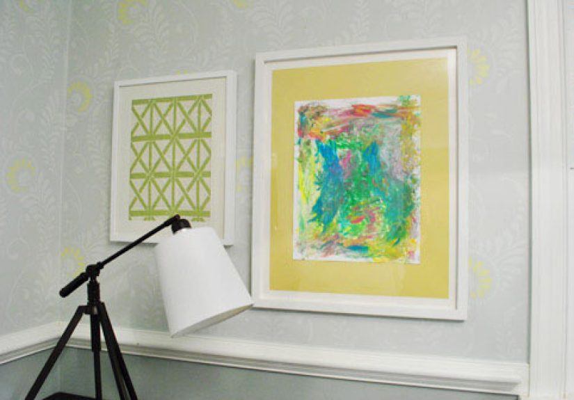
Pick Frames That Belong to the Same Conversation
Frames do not need to match exactly, but they should look like they know each other. A gallery wall becomes more successful when the frames share at least one common thread: color, material, thickness, finish, matting style, or overall design era.
For a polished home office, consider these frame strategies:
- All black frames: clean, modern, and easy to coordinate.
- Natural wood frames: warm, organic, and excellent in offices with plants or soft neutral palettes.
- Mixed metals and wood: more eclectic, but best when the art itself is restrained.
- Thin matching frames with white mats: classic, bright, and especially good for smaller offices.
If your desk, shelves, and lighting already have strong visual character, keep the frames simpler. If the office furniture is plain, the frames can do a little more of the heavy lifting.
What to Put Inside the Frames
This is where the home office becomes yours. A gallery wall is not just about frames; it is about what lives inside them. And no, it does not all have to be “serious office art.” Unless your personal brand is intimidating tax attorney in a prestige drama, you have room to loosen up.
Smart Content Ideas for a Home Office Gallery Wall
- Black-and-white photography for a clean, timeless look
- Abstract prints that echo your office color palette
- Maps, travel photos, or postcards that spark creativity
- Typography or quotes used sparingly, not like a wall is shouting at you
- Framed magazine covers, book pages, or sheet music for personality
- Certificates, awards, or credentials mixed with art so the wall feels sophisticated, not self-congratulatory
- Children’s artwork or family photos if your office leans personal and warm
A strong mix usually includes some variety in subject matter and scale, but not so much that the eye gets lost. One useful rule is to keep a color story running through the whole arrangement. That could mean repeating black, white, brass, oak, muted green, warm beige, navy, or whatever fits the room.
Plan the Layout Before You Hang Anything
This step is boring in the same way flossing is boring. Which is to say: not exciting, but wildly helpful. Professionals and seasoned decorators often arrange pieces on the floor first, photograph the layout, and then transfer that plan to the wall. Another popular method is using paper templates cut to the size of each frame and taping them to the wall until the arrangement feels right.
That planning stage helps you solve three major problems before they happen: uneven spacing, poor scale, and accidental nail-hole confetti.
Spacing Matters More Than People Think
The fastest way to make a gallery wall look messy is inconsistent spacing. In most home offices, 2 to 3 inches between frames looks balanced and intentional. Tighter spacing feels more unified and works especially well for smaller frames. Wider spacing can work too, but only when it is consistent and the wall is large enough to support it.
Think of the negative space as part of the design. The air between the frames is not empty; it is what helps the whole thing breathe.
How High Should You Hang a Gallery Wall?
The classic art-hanging advice is to place the center of a piece around eye level, often about 57 to 60 inches from the floor. For gallery walls, the same principle applies to the center of the overall arrangement, not each individual frame. That gives the composition a grounded, human-scale feel.
In a home office, adjust this rule based on context. If the gallery wall is above a desk, the furniture becomes your visual anchor. If the desk is tall, or if monitors sit in front of the wall, you may need to shift the arrangement slightly upward so it still feels visible and balanced. The goal is not blind obedience to a formula. The goal is that the wall looks right in the room.
Use the Right Hardware and Save Yourself Regret
A gallery wall is supposed to be inspiring, not an upper-body workout followed by drywall repair. Use hardware that matches the size and weight of each frame. Lightweight pieces may be fine with standard picture hangers. Heavier frames often need anchors or stronger wall hardware. On drywall, always check what your hanger or anchor is rated to hold, and do not assume every wall is eager to cooperate.
For stability, two hangers are often better than one for medium-size frames because they reduce shifting and crookedness. If you live in a rental or do not want to make holes, removable hanging strips can work for lighter frames, but be realistic about weight and wall texture. A giant glass frame secured with wishful thinking is not a design plan.
Basic Tools to Keep Nearby
- Tape measure
- Pencil
- Level
- Painter’s tape
- Hammer
- Appropriate hooks, anchors, or strips
Style Tips That Make the Whole Wall Look Better
Anchor the Arrangement
Every good gallery wall needs an anchor. That could be the largest frame, a striking central piece, or a pair of medium frames that establish the middle. Once that anchor is set, build outward. This keeps the arrangement from drifting into chaos.
Mix Sizes, Not Personalities
Different frame sizes create rhythm, but the overall mood should stay consistent. A moody black-and-white photography wall, for example, can include various sizes while still feeling cohesive. What usually does not work is combining ultra-minimal line drawings, neon typography, rustic farmhouse signs, and a gold baroque portrait frame and hoping they magically become friends.
Leave Some Quiet Space
Not every inch of wall needs filling. In a home office, especially, visual calm is valuable. Let the gallery wall stop before it overwhelms the desk, shelving, or door trim. A slightly smaller arrangement that feels intentional will always outperform a giant wall collage that looks one frame away from mutiny.
Common Mistakes to Avoid
- Hanging the whole arrangement too high
- Using random spacing between frames
- Choosing art that clashes with the room’s color palette
- Making the gallery wall wider than the furniture below without purpose
- Ignoring glare from windows or task lighting
- Using flimsy hardware for heavy frames
- Overdecorating a small office until it feels visually noisy
One overlooked issue in home offices is screen glare and reflection. If your gallery wall includes glass frames near a desk lamp or window, check how the wall looks at different times of day. Glare can make beautiful art practically invisible and surprisingly distracting.
Specific Gallery Wall Ideas for Different Home Office Styles
For a Modern Office
Use a clean grid of black or white frames with white mats and restrained artwork. Stick to photography, abstract prints, line drawings, or monochrome designs.
For a Cozy Traditional Office
Choose warm wood or brass-toned frames, mix landscapes and vintage prints, and include one or two personal pieces to keep the room from feeling too formal.
For a Creative Studio Office
Build an organic arrangement with varied frame sizes, mixed media, and one or two unexpected elements like a textile piece, small mirror, or framed handwritten note.
For a Small Office Nook
Keep the arrangement compact. A vertical stack, a slim ledge, or a small clustered grouping above the desk often works better than trying to force a giant gallery wall into a tiny footprint.
The Real Secret: Make It Personal, Then Edit
The best gallery wall in a home office is not the one that looks the most expensive or the most “designer.” It is the one that feels intentional, supports the room, and gives you a reason to like being there. Start with pieces that mean something, shape them into a layout that suits the space, and then edit. Take one frame away if it feels crowded. Swap one bold print for something calmer. Move the entire arrangement down half an inch if it is bugging you. Tiny adjustments are often what turn a decent wall into a great one.
At its best, a gallery wall of frames makes a home office feel finished. It tells a story, creates focus, and adds style without requiring a remodel, a new desk, or a dramatic identity change. It is one of those rare decorating projects that can be practical, personal, and fun at the same time. Which is honestly more than most office chairs can say.
Experiences and Real-Life Lessons From Hanging a Gallery Wall in the Home Office
One of the most interesting things about hanging a gallery wall in a home office is how quickly it changes the mood of the room. A blank office often feels temporary, even when the furniture is nice. The moment frames go up, the space starts to feel claimed. It no longer looks like a leftover corner with a desk shoved into it. It looks like a room that belongs to someone with a point of view.
People often expect the biggest challenge to be choosing art, but in real life, the hardest part is usually editing. Many homeowners gather too many meaningful pieces and want all of them on the wall at once. The better experience usually comes from choosing fewer pieces and giving each one room to matter. In a home office, that restraint is especially helpful. You are trying to create inspiration, not visual traffic.
Another common experience is discovering that the wall looks different once the workday begins. A layout that seemed perfect at night can feel too busy when you are sitting in front of it for eight hours. That is why many people end up preferring quieter palettes, consistent framing, and art that feels interesting without demanding attention every five minutes. A home office wall should support focus, not compete with it.
There is also a practical lesson that almost everyone learns once: measure more than you think you need to. Even a beautiful arrangement can look off if the whole grouping drifts too far left, sits too high above the desk, or crowds a shelf. The most satisfying gallery walls usually come from patient setup. Laying frames on the floor, using paper templates, and stepping back repeatedly may sound tedious, but it saves a huge amount of frustration later.
Many people also find that mixing personal items with decorative prints creates the most successful office wall. A framed photo from a trip, an old postcard, a favorite black-and-white print, a certificate, and a small abstract piece can live together surprisingly well when the frames are coordinated. That blend makes the office feel professional but not cold. It says, “Yes, work happens here,” while quietly adding, “and a human being lives here too.”
One more real-world truth: gallery walls often evolve. What starts as six frames may become eight over time. A piece gets swapped. A better print is found. A photo gets reframed. This is not a failure of planning. It is part of the charm. The most memorable gallery walls tend to look collected rather than purchased in one dramatic weekend. They feel lived with, adjusted, and refined.
In many homes, the gallery wall also ends up improving how often the office gets used. A room that once felt flat starts feeling welcoming. People sit down more willingly, keep the area tidier, and enjoy the atmosphere more. That is the sneaky power of good wall decor: it changes behavior a little. Not in a magical, life-coach way. More in a “this room now has dignity, so maybe I should stop piling unopened mail on the chair” kind of way.
At the end of the day, hanging a gallery wall of frames in the home office is not just a decorating project. It is a way of making the room feel thoughtful, grounded, and fully yours. The experience is part creativity, part problem-solving, and part learning that a level is not optional no matter how optimistic you are. But once it is done, the result is worth it: a workspace with personality, purpose, and a lot more visual charm than four plain walls ever had.