Table of Contents >> Show >> Hide
- What Is a Sector Quilt, Exactly?
- 2019 at a Glance: The Numbers Behind the Quilt
- Why Technology Dominated the 2019 Sector Quilt
- Communication Services: The New-Look Sector with Old-School Muscle
- Financials, Real Estate, and Utilities: The Plot Twist Trio
- The Middle of the Pack Was Still Pretty Strong
- Health Care and Energy: Positive Returns, Negative Vibes
- What the 2019 Sector Quilt Really Teaches Investors
- The Human Experience of the 2019 Quilt
- Conclusion: Why the 2019 S&P 500 Sector Quilt Still Matters
Note: Clean <body>-only HTML for publishing. Unnecessary citation artifacts have been removed.
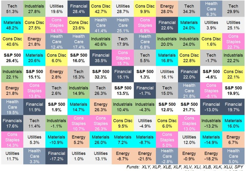
If you want to understand the stock market in 2019, skip the dramatic TV graphics for a minute and look at the quilt. Yes, the quilt. Not the cozy one your grandmother made, but the color-coded sector quilt that ranks the S&P 500’s sectors from best to worst each year. It is one of the simplest, smartest, and rudest charts in finance. Simple because it shows performance leadership at a glance. Smart because it reveals how quickly leadership rotates. Rude because it loves embarrassing anyone who thinks last year’s winner is automatically this year’s hero.
The 2019 S&P 500 sector quilt is especially fun to study because it captures a year that was strong, broad, and surprisingly uneven all at once. The S&P 500 roared back after the bruising sell-off of late 2018 and finished the year up about 31.5%, which sounds like a straightforward “stocks were great” story. But the quilt tells a more interesting tale. Information technology absolutely ran wild. Communication services and financials were no slouches either. Real estate and utilities quietly kept pace better than many people expected. Energy, meanwhile, was the kid at the party who technically showed up but never really found the dance floor.
In other words, 2019 was not just a bull market. It was a lesson in sector rotation, leadership changes, valuation sensitivity, and the danger of building a portfolio based on whatever made the loudest noise on financial Twitter. The quilt doesn’t merely show returns. It shows behavior. It shows where optimism clustered, where caution lingered, and where investors chased growth, hid in quality, or simply tried not to get steamrolled by the next macro headline.
What Is a Sector Quilt, Exactly?
A sector quilt is a visual ranking of annual returns. Each box represents a sector, and the boxes are stacked from highest return to lowest return for a given year. When you line up many years side by side, you get a patchwork of colors that bounces all over the place. That is the point. A quilt chart makes one big investing truth painfully obvious: sector leadership is rarely stable.
One year, utilities look clever. The next year, they look sleepy. One year, energy is the life of the market. The next year, it is a cautionary tale in oil stains and disappointment. Information technology can be the rocket ship, then cool off, then come back wearing sunglasses and acting like it never left. A good quilt chart strips away the illusion that market leadership moves in a neat, polite line. It does not. It zigzags, stumbles, surges, and occasionally faceplants.
That is why the 2019 S&P 500 sector quilt matters. It sits inside a longer history of ranking reversals. It reminds investors that sectors do not take turns in an orderly classroom circle. They leapfrog. They collide. They overheat. They recover. And they often surprise the people most convinced they have the script memorized.
2019 at a Glance: The Numbers Behind the Quilt
The headline number is easy enough: the S&P 500 gained roughly 31.5% in 2019. But the quilt becomes interesting when you rank the sectors themselves. Here is the broad order from strongest to weakest for the year:
| Rank | Sector | 2019 Return |
|---|---|---|
| 1 | Information Technology | 50.3% |
| 2 | Communication Services | 32.7% |
| 3 | Financials | 32.1% |
| 4 | Industrials | 29.4% |
| 5 | Real Estate | 29.0% |
| 6 | Consumer Discretionary | 27.9% |
| 7 | Consumer Staples | 27.6% |
| 8 | Utilities | 26.4% |
| 9 | Materials | 24.6% |
| 10 | Health Care | 20.8% |
| 11 | Energy | 11.8% |
The first thing that jumps out is how wide the spread was. The gap between information technology at 50.3% and energy at 11.8% was 38.5 percentage points. That is not a tiny style difference. That is a full-blown reminder that “the market went up” can hide wildly different investor experiences underneath the hood.
The second thing that stands out is that every sector finished positive. Even the laggard posted a gain. That makes 2019 look, on the surface, like a year of easy money. But the quilt still matters because relative performance shapes everything from fund rankings to investor psychology. A sector that gains 11.8% in a year when tech gains 50.3% can feel less like a winner and more like the person who brought a salad to a barbecue where everyone else showed up with ribs.
Why Technology Dominated the 2019 Sector Quilt
Technology did not merely lead in 2019. It lapped the field. That outperformance reflected a combination of factors: powerful earnings narratives, investor enthusiasm around software and platform businesses, lower interest rates, and the market’s willingness to pay a premium for companies with durable growth and fat margins.
When rates fall or even appear likely to fall, long-duration growth businesses often look more attractive because investors are more willing to pay up for future cash flows. That gave tech an extra tailwind. Add in the market’s appetite for mega-cap leaders and the sector looked like the cleanest shirt in the laundry basket. It was not just about gadgets or shiny devices. It was about scale, recurring revenue, cloud infrastructure, software dominance, and the sense that the biggest tech names had become less speculative and more structural.
Put differently, 2019 was one of those years when technology managed to look like both a growth play and a quality play. That is a dangerous combination for the rest of the leaderboard.
Communication Services: The New-Look Sector with Old-School Muscle
Communication services finished second, and that ranking deserves more attention than it usually gets. This sector had recently been reshaped by the 2018 GICS reclassification, which pulled in companies that used to live in information technology and consumer discretionary. That made the sector far more than old telecom names and phone-bill nostalgia. Suddenly, it had internet platforms, media giants, and digital advertising engines in the mix.
That matters when reading the 2019 quilt. On paper, communication services looked like a strong but distinct winner. In practice, some of its strength came from companies that fit the broader growth-and-platform story driving the market at the time. So the quilt is useful here not just because it ranks returns, but because it forces a better question: what, exactly, was inside the box?
The answer in 2019 was “more growth exposure than many casual observers realized.” That helps explain why the sector kept pace so well with the year’s dominant themes.
Financials, Real Estate, and Utilities: The Plot Twist Trio
Financials in third place at 32.1% makes the 2019 quilt more interesting. Many investors remember 2019 mainly as a big-tech year, and it was. But financials remind us that risk appetite improved far beyond one corner of the market. Banks, payment firms, insurers, and capital-markets businesses all benefited from the rebound in equities and a healthier tone across risk assets, even if yield-curve worries and rate sensitivity kept the sector from feeling like an obvious favorite all year long.
Then there is real estate at 29.0% and utilities at 26.4%, the kind of sectors that rarely receive fan mail from performance chasers. Their strong showings are a major clue to the character of 2019. Lower rates supported rate-sensitive and yield-oriented sectors, so the year was not simply a chest-thumping celebration of aggressive growth. It also rewarded areas investors often associate with income, stability, and duration sensitivity.
In plain English, 2019 was a year when the market said, “Sure, I like growth, but I would also appreciate some helpful interest-rate support, thank you very much.”
The Middle of the Pack Was Still Pretty Strong
Consumer discretionary, consumer staples, materials, and industrials all posted solid gains. That broad participation matters. It tells us the market’s rebound was not a one-sector miracle. Industrials at 29.4% suggest improving confidence around cyclical exposure. Consumer discretionary at 27.9% shows the U.S. consumer still had some punch. Consumer staples at 27.6% prove that boring sectors can have very exciting years when investors prize resilience. Materials at 24.6% remind us that even sectors often treated as macro mood rings can do well in a strong risk-on environment.
This is part of what makes the 2019 quilt visually satisfying. The boxes are not divided into “winners” and “disasters.” Instead, most of the quilt is green enough to make a gardener blush. The drama lies in relative performance, not in an obvious split between triumph and collapse.
Health Care and Energy: Positive Returns, Negative Vibes
Health care returned 20.8%, which would be a perfectly respectable year in many market environments. In 2019, though, it looked sluggish by comparison. Part of the problem was policy uncertainty. Election-season chatter about drug pricing, reform ideas, and headline risk created a ceiling on investor enthusiasm. Health care was not fundamentally broken. It was simply forced to run with a backpack while other sectors sprinted downhill.
Energy’s 11.8% return is even more revealing. Yes, it was positive. No, nobody was throwing confetti. In a year when the broad market soared, energy still finished dead last. That weak relative performance reflected the sector’s ongoing struggles with commodity-price swings, demand worries, oversupply concerns, and investor skepticism about whether old energy business models deserved the same premium as high-margin asset-light growth sectors.
The funny thing about energy in 2019 is that it teaches one of the most valuable quilt lessons: a positive return can still feel like underperformance if leadership elsewhere is dramatically stronger.
What the 2019 Sector Quilt Really Teaches Investors
1. Diversification looks boring until it saves your dignity.
Investors love diversification in theory and complain about it in practice. The quilt explains why. A diversified portfolio rarely owns only the top box. It also rarely gets trapped in the bottom one. In 2019, concentration in tech would have looked genius. In many other years, it would have looked like a great way to discover stress eating.
2. Sector rotation is real, but timing it is hard.
Finance people adore the phrase “sector rotation” because it sounds strategic and slightly cinematic. In reality, rotating at the right moment is brutally difficult. By the time a leadership trend looks obvious, a lot of the move may already be behind you. The quilt is a wonderful historical teacher and a terrible crystal ball.
3. Leadership can be broad, narrow, or weirdly mixed.
The 2019 quilt is not a pure cyclical story, a pure defensive story, or a pure growth story. It is a hybrid. Technology led. So did a newly reinforced communication services sector. Financials were strong. Real estate and utilities also held up well. That mix tells you 2019 rewarded more than one market narrative at once.
4. Definitions matter.
Because communication services had been reworked not long before 2019, quilt comparisons across years are helpful but not perfectly apples-to-apples. Sector charts look clean. Sector construction is not always clean. Investors who treat categories like eternal truths may miss how much the labels themselves can evolve.
The Human Experience of the 2019 Quilt
If you lived through the market in 2019 as an investor, advisor, financial writer, or just an ordinary person with a retirement account and a suspicious relationship with market headlines, the quilt feels familiar in a very human way. January started with a rebound that looked almost too eager, like the market had woken up after a terrible December and decided to overcompensate by jogging six miles and buying a green smoothie. Then came the endless parade of trade-war headlines, recession chatter, rate-cut debates, and those daily stretches where the market acted as if one word from the Federal Reserve could either launch civilization into a golden age or send it directly into the sea.
Technology was the sector that kept tempting people into emotional extremes. If you owned it, you felt brilliant. If you underweighted it, you felt late. If you avoided it on valuation grounds, you probably spent part of the year staring at performance tables like they had personally insulted your family. Communication services added its own layer of confusion because many investors still carried old assumptions about telecom, even while the sector had become home to businesses that behaved far more like growth platforms than utility poles with dividends.
Real estate and utilities created a different emotional experience. They were the quiet overachievers of the quilt. These were not usually the sectors drawing the loudest cocktail-party predictions, but they kept delivering. For investors who prized income, lower-volatility exposure, or rate sensitivity, 2019 felt like one of those rare years when being sensible did not mean being left behind. It was not flashy, but it was satisfying. Like bringing an umbrella on a day everyone mocked the weather forecast and then watching the sky prove you right.
Energy, on the other hand, was an exercise in frustration. It was the sector that made people say things like, “Maybe this is finally the turn,” right before it reminded them that timing commodity-linked businesses is about as relaxing as juggling kitchen knives in a moving car. Even positive returns could not erase the sense that energy was stuck in a market that preferred software margins to oil wells and recurring revenue to drilling budgets.
The deeper experience of the 2019 quilt, though, was psychological. It was a year that rewarded optimism, but not evenly. It invited performance envy. It encouraged hindsight. By December, many people felt the winners had been obvious all along, which is one of the stock market’s favorite lies. In real time, 2019 did not feel obvious. It felt noisy, headline-driven, and emotionally expensive. That is exactly why the quilt is so useful. It gives order to the chaos after the fact, while quietly reminding us that next time around, the leaders may wear entirely different colors.
Conclusion: Why the 2019 S&P 500 Sector Quilt Still Matters
The 2019 S&P 500 sector quilt remains a great teaching tool because it compresses a full year of market behavior into one visual hierarchy. It shows a roaring rebound year, but it also shows how unevenly that rebound was distributed. Technology was the star. Communication services and financials were strong supporting actors. Real estate and utilities proved that falling rates can make “boring” sectors look pretty clever. Health care and especially energy remind us that absolute gains do not guarantee relative glory.
More importantly, the quilt teaches humility. It warns against chasing last year’s winner as if markets owe us sequels. It argues for diversification without sounding preachy. And it reminds investors that sectors are not personalities. They are moving parts inside a constantly changing market machine.
So if you want one clean takeaway from the 2019 quilt, here it is: markets can rise together while still separating winners from laggards in dramatic fashion. That is why the quilt is more than a pretty chart. It is a memory aid for smarter investing and a gentle slap on the wrist for anyone who thinks the market will keep repeating itself just because it was nice enough to do so once.