
Table of Contents >> Show >> Hide
- What “Desktop Mode” Actually Does (and Why It Sometimes Disappoints)
- Way 1: Request Desktop Website in Safari (Fastest Option)
- Way 2: Make Safari Always Load Desktop Mode for a Specific Website
- Way 3: Set Desktop Mode as the Default for All Websites in Safari
- Way 4: Use Desktop Mode in Chrome, Firefox, or Edge on iPhone
- Troubleshooting: When Desktop Mode Doesn’t Change Anything
- Quick Cheat Sheet: The 10-Second Version
- Conclusion
- Real-World Experiences: What Desktop Mode Feels Like Day-to-Day (and Why You’ll Keep Using It)
Ever tapped a link on your iPhone and landed on the “mobile” version of a website that looks like it was designed for a hamster with tiny hands? You’re not stuck. iPhone browsers can load many sites in desktop mode (also called “Request Desktop Website” or “Desktop Site”), which often reveals missing menus, full settings panels, and the “real” layout you’d see on a computer.
In this guide, you’ll learn four practical ways to view desktop websites on an iPhonestarting with Safari (because Apple), then moving to settings that make desktop mode the default, and finishing with other browsers like Chrome, Firefox, and Edge. Along the way, we’ll also cover why desktop mode sometimes seems to do absolutely nothing (spoiler: it’s not always your fault).
What “Desktop Mode” Actually Does (and Why It Sometimes Disappoints)
Desktop mode on iPhone usually works by telling the website: “Hi, I’m a desktop browser,” via a setting that changes how the site identifies your device. Many websites respond by sending their desktop layout, which can unlock features that are hidden on mobilelike advanced filters, full dashboards, or upload tools.
But here’s the catch: modern sites are built with responsive design. That means the same “desktop” site can still rearrange itself to fit a small screen. So sometimes the page reloads, technically in desktop mode, but it still looks mobile-ish. Desktop mode is a powerful tooljust not a magic wand.
Way 1: Request Desktop Website in Safari (Fastest Option)
This is the quickest method when you only need desktop mode for one tab (like when a site hides a button you need).
Steps
- Open Safari and load the website.
- Tap the Page Menu button in the address bar (often shown as aA or a page/menu icon).
- Tap Request Desktop Website.
- Wait for the page to reload. You should now see the desktop layout (or at least a more “full” version of the site).
When this works best
- Web apps like Google Docs/Sheets, WordPress admin panels, or CMS dashboards.
- Sites that hide navigation behind mobile menus.
- Checkout pages where the mobile view removes options (shipping methods, promo code fields, etc.).
Quick tip
If the page is stubborn, try reloading once more after switching to desktop mode. Some sites take a second reload to fully commit to the desktop layoutkind of like your brain on a Monday morning.
Way 2: Make Safari Always Load Desktop Mode for a Specific Website
If there’s a site you constantly use in desktop modelike a work portal, an analytics dashboard, or a school systemSafari can remember that preference for that site. This is the “stop making me do this every time” option.
Steps (Per-Site Setting)
- Open Safari and go to the website you want to set.
- Tap the aA (or Page Menu) button in the address bar.
- Select Website Settings.
- Turn on Request Desktop Website.
- Tap Done.
Example you’ll actually care about
Let’s say you manage a website and need the full WordPress editor, plugin settings, or theme customization tools. The mobile view might hide key controls or constantly kick you into app prompts. Setting that site to always load desktop mode can save you time (and preserve your sanity).
Pro move
If a site works better in desktop mode but the text becomes microscopic, use Safari’s text-size controls (also in the aA/Page Menu) to increase readability without switching back to mobile.
Way 3: Set Desktop Mode as the Default for All Websites in Safari
If you frequently need the “real” versions of websitesmaybe for work, school, or managing online toolsyou can set Safari to request desktop mode by default for all sites. This is the “I’m basically a tiny laptop user” lifestyle choice.
Steps (System Setting)
- Open the Settings app on your iPhone.
- Go to Apps > Safari (wording may vary slightly depending on iOS version).
- Tap Request Desktop Website.
- Turn on All Websites (or set your default to Desktop).
Important trade-offs
- Some sites will feel cramped in desktop mode on a small screenlots of tiny text and sidebars.
- Some mobile-only features may disappear (simplified menus, mobile-friendly buttons, or app integrations).
- You can still switch a site back to mobile view when needed using the same aA/Page Menu.
Recommended approach
If “All Websites” feels like too much, use Way 2 instead: set desktop mode only for the sites you truly need (work portals, admin dashboards, ticketing platforms, finance tools).
Way 4: Use Desktop Mode in Chrome, Firefox, or Edge on iPhone
Sometimes you want desktop mode but you’re browsing in another appor a site behaves better in a different browser. The good news: Chrome, Firefox, and Microsoft Edge all support desktop mode on iPhone. The even better news: you don’t need a secret handshake to find it.
Google Chrome (Desktop by default or per page)
Option A: Turn on desktop mode for a single page
- Open the site in Chrome.
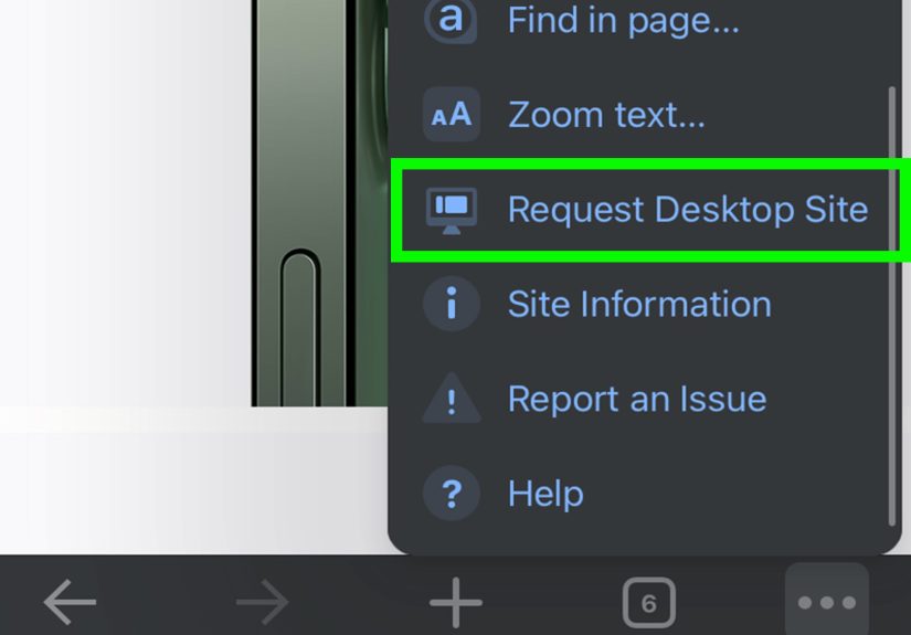
- Tap the More menu (three dots).
- Select Request Desktop Site.
Option B: Make desktop mode the default in Chrome
- Open Chrome > tap More (three dots).
- Tap Settings.
- Go to Content settings > Default site view.
- Select Desktop.
Firefox (Per-site memory built in)
- Open the page in Firefox.
- Tap the Page Actions menu.
- Tap Request Desktop Site.
Firefox can remember desktop mode for a site until you switch it backuseful if you have one stubborn website that always behaves like it’s trying to funnel you into an app.
Microsoft Edge (One-tap desktop view)
- Open the website in Edge.
- Tap the More menu (three dots).
- Select View desktop site.
Troubleshooting: When Desktop Mode Doesn’t Change Anything
You requested desktop mode. The page reloaded. And… it still looks the same. Before you throw your phone into a pillow (gently), try these fixes.
1) The site is responsive, not “mobile-only”
Many modern sites use the same code for mobile and desktop and simply rearrange the layout based on screen size. In that case, desktop mode may remove some mobile annoyances (banners, sticky bars) without dramatically changing the design. Try landscape orientation to trigger a wider layout.
2) The site is forcing mobile mode with cookies or account settings
Some websites remember your last view setting (or detect you’re on a phone and insist on mobile). Try:
- Open a Private tab and request desktop mode again.
- Clear the site’s data (or clear Safari history/website data if you’re comfortable doing so).
- Log out and back in, then re-request desktop mode.
3) You’re inside an in-app browser
Links opened inside apps (social media, messaging apps) may use a limited in-app browser that doesn’t fully support desktop mode. Tap Open in Safari (or your preferred browser) and try again.
4) Content blockers or extensions are interfering
Occasionally, content blockers can break scripts that control layout switching. If a site won’t load correctly in desktop mode, try temporarily disabling content blockers for that site (Safari’s Website Settings can help here), reload, and then re-enable them afterward.
5) Desktop mode works… but everything is tiny
Totally normal. Desktop layouts are designed for big screens. Try:
- Pinch-to-zoom (yes, classic).
- Use Safari’s text size controls via the aA/Page Menu.
- Rotate to landscape for more breathing room.
Quick Cheat Sheet: The 10-Second Version
- Safari (one-time): aA/Page Menu > Request Desktop Website
- Safari (per-site): aA/Page Menu > Website Settings > Request Desktop Website (On)
- Safari (all sites): Settings > Apps > Safari > Request Desktop Website > All Websites (On)
- Chrome/Firefox/Edge: Use each browser’s menu to request desktop (and set a default in Chrome if you want)
Conclusion
Desktop mode on iPhone is one of those “hidden in plain sight” features that can instantly make the web more usableespecially when you need full menus, advanced settings, or the complete version of a service. Start with Safari’s quick desktop request (Way 1), level up to per-site settings (Way 2), go all-in with default desktop browsing (Way 3), and keep other browsers in your back pocket (Way 4) for those weird sites that only behave when you switch apps.
And if desktop mode seems to do nothing, don’t assume you did it wrong. Sometimes the website is using responsive design, forcing mobile layouts, or remembering your settings through cookies. With a couple of tweaksprivate browsing, rotating the screen, or setting desktop mode per siteyou can usually get the view you want.
Real-World Experiences: What Desktop Mode Feels Like Day-to-Day (and Why You’ll Keep Using It)
The first time most people try desktop mode, it’s for a very practical reason: something is missing. In my case (and in the case of basically everyone who has ever tried to manage anything important from a phone), it was a dashboard button that simply did not exist on mobile. The website acted like it was doing me a favor“Here’s a simplified view!”but what it really meant was “Here’s a view that removes the one thing you came here to do.”
Desktop mode is especially clutch for “serious” tasks: editing a long document, changing account settings, managing orders, or digging through customer support pages that hide behind desktop-only navigation. For example, on some finance and billing portals, the mobile layout can feel like a hallway with all the doors lockedlots of summaries, very few controls. Switching to desktop mode often reveals full account menus, downloadable statements, and detailed transaction filters. It’s not glamorous, but it’s efficient.
That said, desktop mode has a personality. Sometimes it’s helpful and cooperative. Other times it’s like wearing reading glasses in the dark: everything is technically sharper, but you’re still squinting. On a small screen, desktop websites can get cramped, with tiny text, narrow click targets, and pop-ups that assume you have a mouse. The trick is learning a few comfort moves: rotate to landscape when you can, bump up text size using Safari’s controls, and don’t be afraid to pinch-to-zoom like it’s 2012.
Another real-world moment: buying tickets or reserving something time-sensitive. Mobile sites love to simplify the flow, which sounds nice until you need to pick a specific seat section, apply a promo code, compare refund options, or view the full terms. Desktop mode can expose those “advanced” options that mobile hides. It won’t guarantee a smoother checkoutbut it can stop you from missing a key option and only realizing it after you’ve paid.
The biggest lesson? Desktop mode is a tool, not a lifestyle requirement. For some sites (like news articles), mobile is totally finesometimes even better. But for portals, dashboards, forms, and anything that smells like “account management,” desktop mode can turn your iPhone into a surprisingly capable mini workstation. Once you set desktop mode for your most-used sites, you’ll wonder how you ever survived tapping hamburger menus that lead to… more hamburger menus.


 Close
Close