Table of Contents >> Show >> Hide
- Why Upload Your Own Fonts Instead of Using Only System Fonts?
- What You Need Before You Start
- How to Upload Your Own Fonts to HTML Using CSS
- Simple Working Example
- Best Practices for Better Font Loading
- Common Problems and How to Fix Them
- Accessibility and Readability Tips
- When Self-Hosting Fonts Makes the Most Sense
- Final Thoughts
- Real-World Experiences With Custom Fonts in HTML and CSS
- SEO Tags
If your website still looks like it got dressed in whatever was lying on the browser floor, custom fonts can fix that fast. A well-chosen typeface gives your brand a voice, improves visual hierarchy, and helps your pages feel more polished. The good news? Learning how to upload your own fonts to HTML using CSS is much easier than it sounds. No wizard hat required. Just a few font files, a little CSS, and the courage to not name your font folder “new-final-final-2.”
In this guide, you’ll learn how to add your own fonts to a website, write the correct @font-face rules, apply fallbacks, improve loading speed, and avoid the classic mistakes that make browsers act like they’ve never seen typography before. Whether you are building a portfolio, a business site, or a blog with strong opinions about serifs, this walkthrough will help you do it right.
Why Upload Your Own Fonts Instead of Using Only System Fonts?
System fonts are fast and reliable, but they are not always enough when you want a specific visual identity. Uploading your own font files gives you more control over branding, consistency, and design. It also lets you self-host files instead of depending entirely on third-party services.
That matters for a few reasons. First, custom fonts can make a brand instantly recognizable. Second, self-hosted fonts give you more direct control over performance and file selection. Third, you can choose exactly which weights and styles you need instead of dragging an entire type family onto the page like an overpacked suitcase.
What You Need Before You Start
1. A Font You’re Allowed to Use
Before you upload anything, make sure your font license allows web use. This is the least glamorous step and also the one most likely to save you from future trouble. Some desktop fonts do not automatically include webfont rights. If the font is commercial, read the license terms carefully.
2. The Right Font File Format
For modern websites, WOFF2 is the top choice because it is compressed, efficient, and widely supported. In many cases, it is the only format you need for a modern audience. If you support older environments, some developers still keep WOFF as a backup, but most current projects can stay lean with WOFF2.
3. Access to Your Project Files
You’ll need access to your site’s file structure so you can create a folder for your font files. A common setup looks like this:
That structure keeps things clean and helps you avoid digging through mysterious folders six months from now while asking, “Why is there a font file inside the image directory?”
How to Upload Your Own Fonts to HTML Using CSS
Step 1: Add the Font Files to Your Website
Upload your font files to a dedicated fonts folder inside your project. This can be done through your code editor, hosting file manager, Git workflow, or content management setup. The key is to keep the path predictable and neat.
Step 2: Create an @font-face Rule in CSS
The heart of custom font loading is the @font-face rule. This tells the browser the font’s name, where the file lives, and which weight or style it represents.
Here is what each line does:
- font-family: the name you will use later in your CSS.
- src: the file path to your font file.
- font-weight: identifies the weight, such as 400 for regular.
- font-style: usually normal or italic.
- font-display: controls how text behaves while the font loads.
font-display: swap; is a practical default because it shows fallback text first and swaps in the custom font once it is ready. That means visitors are less likely to stare at invisible text like they are waiting for a dramatic reveal that nobody asked for.
Step 3: Add More Weights and Styles
If your font family includes bold and italic versions, define each one separately. Browsers need distinct declarations for each combination.
This setup lets the browser load the correct file when text is bold or italic, instead of faking the style. Fake bold is like fake pockets: disappointing up close.
Step 4: Apply the Font to Your HTML Elements
Once the font is defined, use it in your normal CSS rules.
Always include fallback fonts. If the custom font fails to load for any reason, the browser will move down the stack. Ending with a generic family like sans-serif or serif is a smart move because it guarantees readable text.
Step 5: Link Your CSS File in HTML
Your HTML page must load the stylesheet where the font rules live.
That goes inside the document’s head section. Once your stylesheet is connected and the font files are in the correct folder, the browser can do the rest.
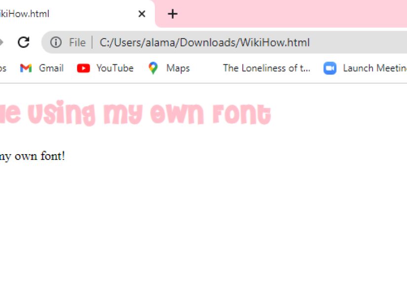
Simple Working Example
Here is a stripped-down example showing how custom fonts connect across HTML and CSS.
HTML
CSS
If the file path is correct and the font is valid, your page should now display the new typeface. If not, congratulations, you have entered the troubleshooting stage of web development, where the browser knows something you do not.
Best Practices for Better Font Loading
Use WOFF2 First
WOFF2 is the go-to format for modern web typography because it keeps file sizes smaller than older webfont formats. Smaller files usually mean faster loading and a better user experience. If you can avoid serving multiple older formats, your stylesheet becomes cleaner too.
Only Upload the Weights You Need
Do not upload every possible font file unless your design truly needs them. If your site uses regular and bold only, skip the rest. Every extra file adds weight to the page and can slow loading.
Use Sensible Fallback Fonts
A good font stack protects readability. If your custom font is unavailable, visitors should still see something close in tone and structure. For example:
This is especially useful across devices, operating systems, and language contexts.
Set font-display Intentionally
The browser needs instructions on what to do while the font is loading. Using swap often works well for content-heavy pages because it prioritizes visible text. Other values like fallback or optional can also make sense depending on your performance goals and branding needs.
Preload Only Critical Fonts
If a font is essential above the fold, you can preload it. But do this carefully. Preloading too many resources can backfire. For a critical font, the HTML can look like this:
The crossorigin attribute matters for font preloading. Without it, browsers may fetch the font twice. In other words, one missing attribute can turn your performance optimization into a performance prank.
Common Problems and How to Fix Them
The Font Is Not Showing Up
Start with the file path. Most custom font failures come from incorrect URLs. Double-check folder names, capitalization, and relative paths. Also make sure the CSS file is actually loading.
The Font Loads Locally but Not on the Live Site
This can happen because of server configuration, caching issues, or cross-origin restrictions. If the font is served from another domain or CDN, make sure the server is configured correctly for font delivery.
Bold or Italic Looks Wrong
If the browser is faking bold or italic, you probably forgot to define separate @font-face rules for those styles. Add the correct files and match the right weight and style values.
The Page Feels Slow
Audit how many font files are loading. Remove unused weights, choose WOFF2, and preload only the fonts that matter most. You can also explore variable fonts, which combine multiple variations into a single file and can simplify font management when used carefully.
Accessibility and Readability Tips
Custom fonts should help users, not challenge them to a duel. Decorative fonts may look exciting in headings, but body text needs to stay readable. Keep paragraphs comfortable to scan with reasonable font size, line height, and contrast.
Also remember that typography is not just visual style. It affects comprehension, hierarchy, and user trust. A beautiful font that hurts readability is basically a fancy chair made of thorns. Admired briefly. Avoided often.
Smart Accessibility Habits
- Use decorative or display fonts sparingly.
- Keep body text clean and legible.
- Test your typography on desktop and mobile.
- Use fallbacks that preserve readability.
- Check line spacing and paragraph width.
When Self-Hosting Fonts Makes the Most Sense
Self-hosting custom fonts is a great choice when you want stronger control over branding, privacy, caching, and performance tuning. It is especially useful for business websites, portfolios, online stores, and editorial sites where typography plays a major role in brand identity.
That said, not every site needs elaborate typography. If speed, simplicity, and maintenance are the top priorities, a system font stack may be enough. The best solution is the one that balances style with usability.
Final Thoughts
Uploading your own fonts to HTML using CSS is one of those web design skills that sounds more intimidating than it really is. Once you understand the basic pattern, the process becomes simple: upload the files, write @font-face, apply the font family, add fallbacks, and keep performance in mind.
The real win is not just making your site look better. It is making your design feel intentional. Fonts shape tone, guide attention, and help people trust what they are reading. So yes, typography matters. A lot. And now you know how to make it work without turning your stylesheet into a melodrama.
Real-World Experiences With Custom Fonts in HTML and CSS
After working with custom fonts on different kinds of websites, one lesson shows up again and again: the technical part is usually easy, but the decision-making part is where people get stuck. At first, many developers are excited to upload five font families, twelve weights, and enough italics to stage a Shakespeare festival. Then the site goes live, performance drops, and everyone suddenly remembers that users enjoy pages that actually load.
One common experience is discovering that the font you loved in a design mockup looks completely different on a live page full of real content. A font can look elegant in a giant homepage heading and then become a tiny gremlin in long-form body text. That is why testing matters. Good typography is not just about what looks stylish in isolation. It is about how the font behaves in navigation, buttons, forms, blog posts, and mobile screens.
Another very real experience is the file-path mistake. Almost everyone who learns how to upload their own fonts to HTML using CSS eventually spends an unreasonable amount of time debugging a problem caused by one missing dot, one wrong slash, or one folder named Fonts instead of fonts. It is practically a rite of passage. If the font is not loading, developers often assume the CSS syntax is broken, when the actual problem is simply that the browser is being sent to the wrong address.
There is also the performance awakening. Many site owners start with custom fonts because they want a premium look, then learn that every font file is another resource the browser has to fetch. That does not mean custom fonts are bad. It just means they should be handled with purpose. Once people trim unused weights, switch to WOFF2, and stop loading decorative fonts for tiny UI elements, the site suddenly feels much more professional.
A lot of teams also discover that fallback fonts are not a boring afterthought. They are part of good design. When the custom font is still loading, the fallback is the first impression. A thoughtful fallback stack keeps the page readable, stable, and visually close to the intended style. A random fallback stack, on the other hand, can make a sleek brand look like it borrowed its clothes from three unrelated operating systems.
One especially useful experience comes from working with bold and italic styles. New developers often think one font file is enough, then wonder why bold text looks awkward. The browser can simulate bold or italic, but the result is not always pretty. Once people start defining each weight and style properly, the difference is obvious. Headlines feel sharper, emphasis looks intentional, and the entire interface looks less improvised.
And finally, there is the satisfying moment when everything clicks: the font loads correctly, the headings look on-brand, body text stays readable, and the site feels like it has a personality instead of just existing on the internet out of obligation. That is why learning this skill is worth it. Custom fonts are not just decorative. They help tell the story of a brand, improve consistency, and make a website feel complete.
If you keep the process simple, respect performance, and test carefully, adding your own fonts becomes less of a technical headache and more of a design advantage. That is the sweet spot every developer wants.