Table of Contents >> Show >> Hide
- What Does “Hierarchy” Mean in Excel?
- Method 1: How to Create a Hierarchy in Excel with Pivot Tables
- Advanced Option: Power Pivot Hierarchies
- Method 2: How to Create a Hierarchy in Excel with SmartArt
- Pivot Tables vs. SmartArt: Which One Should You Use?
- Common Mistakes to Avoid
- Best Practices for a Strong Excel Hierarchy
- Final Thoughts
- Experiences from the Real World: What Creating Hierarchies in Excel Actually Feels Like
- SEO Tags
Excel is many things: a calculator, a data wrangler, a chart machine, and occasionally a source of deep emotional conflict. But when you need to show levels, categories, reporting lines, or parent-child relationships, Excel can actually do a pretty impressive job. The trick is knowing which kind of hierarchy you want to build.
If your goal is to analyze data by levels such as Region > State > City or Department > Team > Employee, PivotTables are your best friend. If your goal is to show a visual chain of command, process structure, or org chart that people can understand without squinting, SmartArt is the cleaner choice. In other words, PivotTables are for the brains, SmartArt is for the eyeballs, and together they make you look suspiciously organized.
In this guide, you will learn how to create a hierarchy in Excel using Pivot Tables and SmartArt, when to use each one, the exact steps to build them, common mistakes to avoid, and a few practical examples that make the whole thing feel a lot less like spreadsheet gymnastics.
What Does “Hierarchy” Mean in Excel?
A hierarchy in Excel simply means information arranged in levels. One item rolls up into another. Think of examples like these:
- Company > Department > Team > Employee
- Year > Quarter > Month
- Category > Subcategory > Product
- Country > State > City
Excel supports hierarchy in a few different ways, but the two most practical methods for everyday users are:
- PivotTable hierarchy: best for summarizing and analyzing multi-level data
- SmartArt hierarchy: best for visual diagrams such as organization charts and structured concepts
There is also an advanced option using Power Pivot hierarchies, which lets you create reusable field hierarchies inside a data model. That is fantastic for power users, analysts, and people who hear the words “data model” and smile instead of panic.
Method 1: How to Create a Hierarchy in Excel with Pivot Tables
A PivotTable hierarchy works by stacking fields in levels. The order of those fields controls how your data rolls up. For example, if you place Region above City in the Rows area, Excel will display Region first, then nest cities underneath it.
Step 1: Prepare Your Data the Right Way
Before you build anything, make sure your source data is clean. Excel behaves much better when your dataset follows a few simple rules:
- Each column has a unique header
- There is only one header row
- No completely blank rows or columns in the middle of the data
- Each row represents one record
- Spelling is consistent across categories
For example, a sales dataset might include columns like:
Date | Region | State | City | Product Category | Product | Sales
If one row says “Accessories” and another says “Accessory,” your PivotTable will treat them like different categories. Excel is helpful, but it is not a mind reader. Not yet.
Step 2: Insert the PivotTable
Select any cell in your dataset or highlight the entire range. Then go to Insert > PivotTable. Excel will ask where you want the report placed. A new worksheet is usually the cleanest option, especially if you enjoy keeping your raw data and your analysis from starting a custody battle.
After you click OK, Excel creates a blank PivotTable frame and opens the field list pane.
Step 3: Build the Hierarchy by Nesting Fields
This is where the magic happens. In the field list, drag your fields into the appropriate areas:
- Rows: the levels of your hierarchy
- Columns: optional secondary grouping
- Values: numbers you want to summarize
- Filters: top-level filters for the report
Example:
- Drag Region to Rows
- Drag State below Region in Rows
- Drag City below State in Rows
- Drag Sales to Values
Congratulations. You now have a hierarchy in Excel using a PivotTable. Excel will display Region as the top level, State beneath it, and City under that. It is basically a very disciplined family tree for your data.
Step 4: Rearrange Levels to Change the Hierarchy
The beauty of a PivotTable hierarchy is that it is flexible. Want City above State? Drag it higher in the Rows area. Want Product Category above Region? Move it. No formulas explode, no dramatic spreadsheet music plays, and your source data stays untouched.
This makes PivotTables ideal for quick analysis because you can test multiple hierarchy structures in seconds.
Step 5: Group Dates or Numbers into Higher Levels
Sometimes your hierarchy is not already sitting neatly in separate columns. That is where grouping helps. If you have a Date field, you can group it into levels like Year, Quarter, and Month. If you have numeric ranges, you can group values into bands.
To do it, right-click a date or number in the PivotTable and choose Group. For dates, Excel can group by years, quarters, months, or other time periods. For numbers, you can set starting points, ending points, and intervals.
That means one Date column can quickly become a structured hierarchy like:
Year > Quarter > Month
Which is much more useful than staring at a long list of individual dates and wondering what you did to deserve that.
Step 6: Make the Hierarchy Easier to Read
Once your PivotTable hierarchy is built, clean it up so humans can actually use it:
- Rename fields to make labels clearer
- Apply a PivotTable style
- Show or hide subtotals depending on the audience
- Use tabular or outline layout for better readability
- Add filters or slicers if you want interactive control
If your report will be shared with coworkers, clients, or leadership, formatting matters. A good hierarchy should tell a story, not look like Excel dumped a filing cabinet onto the page.
Practical Example: Sales Hierarchy
Let’s say you want to understand revenue performance across your territory. You can build this hierarchy:
- Rows: Region > Sales Rep
- Columns: Quarter
- Values: Sum of Sales
Now you can instantly see which sales reps contributed to each region, how performance changed by quarter, and where the money is coming from. That is a lot faster than manually sorting, filtering, and muttering at your screen.
Advanced Option: Power Pivot Hierarchies
If you use Excel’s Data Model and Power Pivot, you can create a formal hierarchy that appears as a single object in the field list. This is helpful when you repeatedly analyze the same roll-up path, such as:
Category > Subcategory > Product
Instead of dragging three separate fields every time, you create the hierarchy once and reuse it. This approach is more advanced, but it is excellent for large workbooks, repeat reporting, and multi-table analysis.
For many users, regular PivotTables are enough. But if you are building dashboards or models that multiple people will use, Power Pivot is worth knowing.
Method 2: How to Create a Hierarchy in Excel with SmartArt
If PivotTables organize your data, SmartArt organizes your message. SmartArt is ideal when you want a visual hierarchy in Excel, such as an organizational chart, reporting structure, decision tree, or concept map.
Step 1: Insert a SmartArt Hierarchy
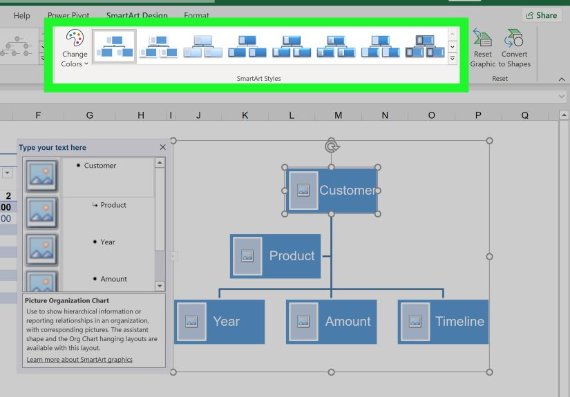
Go to Insert > SmartArt. In the SmartArt gallery, choose Hierarchy. Excel gives you several layouts, including:
- Organization Chart
- Picture Organization Chart
- Horizontal Hierarchy
- Circle Picture Hierarchy
Select the one that best matches your purpose and click OK.
Step 2: Enter Your Text
You can add text in two ways:
- Click directly inside each shape and type
- Use the Text Pane to enter items as a list
The Text Pane is often faster, especially when building a larger hierarchy. You can use indentation levels to show parent and child relationships. It feels a little like making an outline, except this one turns into a diagram instead of a wall of bullets.
Step 3: Add, Remove, or Reorder Shapes
Once the SmartArt graphic is selected, use the SmartArt Design tools to customize it. You can:
- Add a shape before, after, above, or below another shape
- Promote or demote items to change levels
- Move items up or down within the sequence
- Delete unused shapes
For org charts, Excel also supports special arrangements such as assistants and subordinates, which helps when the structure is not perfectly linear.
Step 4: Style the Hierarchy So It Looks Intentional
By default, SmartArt is decent. With a little styling, it can look genuinely polished. Use the SmartArt Design and Format tabs to:
- Change colors
- Apply SmartArt styles
- Resize boxes
- Adjust fonts
- Insert pictures in picture-based hierarchy layouts
Keep it simple. A hierarchy chart should clarify relationships, not audition for a reality show about graphic effects.
Practical Example: Department Org Chart
Imagine you need to show how the marketing department is structured:
- VP of Marketing
- Director of Content
- SEO Manager
- Content Strategist
- Email Marketing Manager
- Paid Media Specialist
SmartArt makes this easy. An Organization Chart layout instantly turns that list into a hierarchy your team can understand at a glance. It is fast, clean, and far more effective than emailing everyone a paragraph that begins with “Just so we are all aligned…”
Pivot Tables vs. SmartArt: Which One Should You Use?
Use PivotTables when:
- You need to analyze or summarize data
- Your hierarchy comes from columns and rows
- You want dynamic drill-down and regrouping
- You need totals, subtotals, filters, and flexible reporting
Use SmartArt when:
- You need a visual diagram
- You are showing structure, roles, or relationships
- Your audience needs an easy-to-read hierarchy chart
- You want presentation-friendly output inside Excel
In simple terms, PivotTables explain the data hierarchy, and SmartArt explains the visual hierarchy. One is analytical. The other is communicative. Both are useful, and neither should be forced to do the other’s job.
Common Mistakes to Avoid
- Messy source data: PivotTables depend on clean column headers and consistent values.
- Wrong field order: In a PivotTable, field sequence controls the hierarchy.
- Too many levels: A hierarchy with six or seven nested levels is technically possible and emotionally exhausting.
- Overdesigning SmartArt: Too many colors and styles can make the diagram harder to read.
- Using SmartArt for analysis: SmartArt looks nice, but it will not sum your sales or filter your quarters.
Best Practices for a Strong Excel Hierarchy
- Keep top-level categories broad and logical
- Use consistent naming conventions
- Put the most important level first
- Test different field orders in PivotTables
- Use formatting to guide the reader’s eye
- Choose SmartArt layouts based on clarity, not novelty
When in doubt, ask yourself one question: “Will the next person understand this in ten seconds?” If the answer is no, simplify.
Final Thoughts
Learning how to create a hierarchy in Excel is one of those skills that feels oddly advanced at first and then suddenly becomes part of your regular workflow. PivotTables help you build a hierarchy for analysis by stacking levels and summarizing results. SmartArt helps you build a hierarchy for presentation by turning structure into something visual and digestible. And if you need even more muscle, Power Pivot can take your Excel hierarchy to a reusable model-based level.
The key is choosing the right tool for the job. If you are comparing categories, drilling into data, or building reports, go with Pivot Tables. If you are mapping roles, departments, or concepts, go with SmartArt. Once you understand that difference, Excel gets a lot less intimidating and a lot more useful.
And that, honestly, is when the spreadsheet stops feeling like a punishment and starts feeling like power.
Experiences from the Real World: What Creating Hierarchies in Excel Actually Feels Like
The funny thing about Excel hierarchies is that most people do not go looking for them because they are feeling adventurous. They go looking because they have a mess. Maybe it is a sales report with fifty tabs, a staff list that has not been updated since the dinosaurs had dental coverage, or a product catalog that somehow lists the same item under three different categories and one mysterious label called “Misc Final New.” That is usually the moment someone realizes a hierarchy is not just nice to have. It is survival gear.
One common experience is the first time someone uses a PivotTable to turn raw data into a structure that makes sense. At first, the field list looks intimidating, like Excel handed you a control panel and quietly walked away. Then you drag one field into Rows, another into Values, and suddenly the fog lifts. Add a second field under the first, and there it is: a real hierarchy. Region rolls up into State, State rolls up into City, and the whole report stops looking like random spreadsheet confetti. That first successful PivotTable often creates the same emotional reaction as assembling furniture without leftover screws. Pride. Relief. Mild disbelief.
SmartArt brings a different kind of experience. It usually appears when someone needs to explain structure to other humans, not just analyze it privately with a coffee and a thousand-yard stare. Maybe HR needs an org chart. Maybe a project manager wants to map roles across teams. Maybe a department head wants something that says “we are strategically aligned” instead of “I made this in a panic five minutes before the meeting.” SmartArt is often the fastest route to that outcome. You insert a hierarchy layout, type in the roles, shuffle a few shapes around, and suddenly Excel looks less like a spreadsheet and more like a communication tool.
There is also a very real learning curve that almost everyone experiences. The first draft of a hierarchy is rarely the final one. People often build a PivotTable and realize they put the fields in the wrong order. Or they create a SmartArt chart that technically works but somehow resembles a family tree designed during a caffeine storm. That is normal. Hierarchies are about logic, and logic sometimes needs a revision pass. The good news is that Excel makes changes surprisingly painless. You can drag fields, regroup dates, add shapes, or demote levels without rebuilding from scratch.
Over time, users tend to develop their own preferences. Analysts often lean toward PivotTables because they love flexibility and live for a clean roll-up. Managers and team leads often prefer SmartArt because it helps them communicate without dragging everyone through the raw data swamp. The most effective Excel users usually end up using both. They analyze the structure with PivotTables, then present the structure with SmartArt. That combination is practical, fast, and a little bit elegant, which is not a word people use often enough about spreadsheets.
So yes, creating a hierarchy in Excel can start as a chore. But once you have done it a few times, it becomes one of those skills that saves hours, reduces confusion, and makes your work look sharper. That is not just an Excel trick. That is career-grade magic with gridlines.