Table of Contents >> Show >> Hide
- What “Blue Porcelain” Means in Bedding
- Why This Look Works (Even If the Rest of Your Room Is… Still Loading)
- Choosing the Right Fabric for a Blue Porcelain Duvet Cover
- Thread Count: Helpful Signal, Not a Magic Spell
- Print Quality: How to Tell If It’ll Look Expensive (Or Like a Pajama From 2007)
- Features That Make Life Easier
- Styling Ideas for a Blue Porcelain Duvet Cover
- Care Tips: Keep the White Bright and the Blue True
- Buying Guide: What to Look for Before You Click “Add to Cart”
- Mistakes to Avoid (A.K.A. How to Keep This From Becoming “Return Shipping: The Saga”)
- What It’s Like Living With a Blue Porcelain Duvet Cover (Experiences & Real-World Notes)
- Final Take
Some bedrooms whisper. A blue porcelain duvet cover politely clears its throat and says, “Allow me.”
With its crisp blue-on-white motifsoften inspired by Delftware, chinoiserie scenes, or classic toilethis look
instantly makes a bed feel styled (even when your “styling” was tossing two pillows and hoping for the best).
This guide breaks down what “blue porcelain” bedding really is, how to choose a duvet cover that feels as good as it looks,
and how to keep that bright white background from turning into “vaguely off-white, as seen in the wild.”
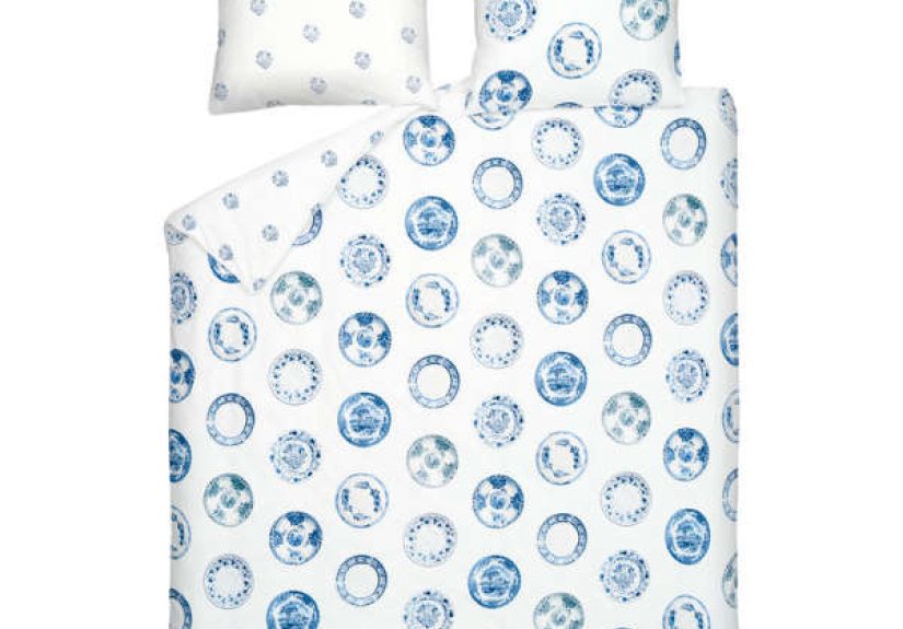
What “Blue Porcelain” Means in Bedding
“Blue porcelain” in textiles is less about literal pottery and more about a visual language: clean white space, rich cobalt or
indigo lines, and decorative motifs that feel collected over time. Think: delicate florals, winding vines, pagodas, birds,
pastoral scenes, or ornate borderspatterns that look like they could live happily on a teacup, a tile, or your bed.
Common pattern families you’ll see
- Delft-inspired: European blue-and-white traditionoften tidy, symmetrical, and charmingly “museum gift shop” (in the best way).
- Chinoiserie: Scenic, storybook motifsflorals, animals, pagodasdesigned to feel exotic and romantic without requiring a passport.
- Toile-style: Repeating narrative scenesclassic and slightly dramatic, like your bedding is about to gossip.
- Border-frame prints: A structured border around the edge that makes the bed look tailored and intentional.
The best part: blue porcelain patterns are “neutral-adjacent.” They bring interest without acting like an attention-hogging neon sign.
You can pair them with almost anything from crisp hotel whites to warm oatmeal linens, brass lamps, cane furniture, or a moody navy wall.
Why This Look Works (Even If the Rest of Your Room Is… Still Loading)
Blue-and-white is a design classic because it balances contrast and calm. The white keeps things bright and fresh; the blue adds structure and depth.
It reads clean, but not steriledecorative, but not chaotic.
In practical terms, a blue porcelain duvet cover does three jobs at once:
- Creates a focal point: Your bed looks “finished” without needing a dozen throw pillows auditioning for a runway show.
- Plays well with color: Blue pairs with warm woods, crisp whites, earthy terracotta, soft greens, and metallics.
- Bridges styles: Traditional, coastal, grandmillennial, modern classic, even minimalthis print can flex.
Choosing the Right Fabric for a Blue Porcelain Duvet Cover
The pattern gets the compliments. The fabric earns your loyalty at 2 a.m. when you’re either cozy or quietly mad at your bedding choices.
Here’s how the most common materials behave.
Cotton Percale: Crisp, Cool, and “Hotel Fresh”
Percale is a plain weave with a matte finish and a breathable, crisp hand-feel. If you run warm or love that cool-sheet sensation,
percale is often the safest bet. It also tends to show prints beautifullyclean lines, sharp contrast, and a tidy look.
Best for: hot sleepers, humid climates, people who like a crisp bed that snaps back into place.
Heads-up: it can wrinkle more than sateenif you want “effortless,” you may need to embrace “artistically rumpled.”
Cotton Sateen: Smooth, Drapey, and Slightly Luxe
Sateen has a smoother feel and a gentle sheen thanks to its weave structure. It drapes softly over the bed and can feel warmer than percale,
which is great if your room runs cool or you like a “buttery” finish. Blue porcelain prints on sateen often look richerdeeper blues, slightly
more glow.
Best for: people who prioritize softness, cooler bedrooms, anyone who wants a polished look with fewer wrinkles.
Heads-up: because it’s smoother, it can show snags more easily if your pet thinks your bed is a personal climbing wall.
Linen: Airy Texture and Relaxed “European Weekend” Energy
Linen duvet covers feel breathable and durable, with a casually wrinkled look that reads intentional. A blue porcelain print on linen tends to look
slightly softer and more organicless “fine china,” more “coastal villa.”
Best for: texture lovers, warm climates, people who want bedding that gets better with age.
Heads-up: linen can feel crisp at first and softens over time. If you want immediate cloud softness, consider a washed linen.
Lyocell (TENCEL™) and Bamboo-Derived Fabrics: Cool, Silky, and Great Drape
These fabrics are often praised for their smoothness and temperature comfort. They drape beautifully, which can make a porcelain print look extra elegant.
If you like a cooler touch with a fluid feel, this category is worth a look.
Best for: hot sleepers who hate crisp fabrics, people who want “smooth” without high shine.
Heads-up: follow care instructions closelygentle cycles and low heat help preserve both fabric and color.
Brushed Cotton or Flannel: Winter-Only, But Delightful
If you want your bed to feel like a warm hug in January, brushed cotton or flannel can be a cozy pick. Porcelain prints here often look softer and more
mutedless crisp contrast, more “storybook.”
Best for: cold climates, people who love warmth, “my thermostat is a suggestion” households.
Heads-up: if you sleep hot, flannel will not apologize.
Thread Count: Helpful Signal, Not a Magic Spell
Thread count is often marketed like it’s the only thing that matters. In reality, fiber quality, weave, finishing, and construction are just as important.
As a practical range, many bedding experts land around the mid-range (often roughly 300–500) as a sweet spot for balancing softness, breathability, and durability.
Translation: don’t buy a duvet cover just because the number is huge. A well-made percale with a sensible thread count can feel better (and last longer)
than a “sky-high” count that’s more marketing than material.
Print Quality: How to Tell If It’ll Look Expensive (Or Like a Pajama From 2007)
Blue porcelain designs live and die by crispness. You want lines that look intentional, not fuzzy. Here’s a quick quality checklist:
- Crisp linework: outlines should look sharp, not blurred.
- Even white background: “bright white” reads fresh; yellow-leaning whites can make blue look dull.
- Color consistency: blues should be evenno patchy areas that look like the printer gave up.
- Good opacity: you shouldn’t see your insert pattern or shadows through the cover.
- Pattern scale that fits your room: small motifs feel classic; large motifs feel bold and modern.
Bonus points if the duvet cover is reversible (pattern on one side, stripe or solid on the other). That’s basically two vibes for one purchase,
which is the kind of math we support.
Features That Make Life Easier
A duvet cover can be beautiful and still be annoying. The goal is pretty and functionallike a stylish jacket with real pockets.
Corner ties
Corner ties help keep your insert from migrating into one sad lump at the foot of the bed. If you’ve ever woken up under a duvet that’s somehow
only covering your knees, you already understand the value.
Closure type: buttons vs zipper
Hidden buttons feel classic and are easy to repair if one goes missing. Zippers are fast and tidy, especially if the opening is wide.
If you’re a frequent washer (or you’re waging war against pollen), a zipper can save time. If you’re concerned about long-term repairability,
buttons are the low-drama choice.
Wide opening + inside labels
Some duvet covers have extra-wide openings or labeled “top/bottom” tags. Small detail, big sanity. Your future self will appreciate it.
Styling Ideas for a Blue Porcelain Duvet Cover
Blue porcelain bedding is versatile. Here are a few looks that consistently workno design degree required.
1) Classic Coastal (Not Nautical Overload)
Pair your porcelain duvet with crisp white sheets, a natural fiber rug, light oak or rattan accents, and a simple stripe pillow. Add one sandy-beige throw
blanket for warmth. The vibe: “bright beach house,” not “I own eight anchors.”
2) Modern Classic (Clean + Tailored)
Keep the palette tight: white sheets, blue porcelain duvet, two euro shams in a solid navy or chambray, and minimal bedside styling.
A black metal bed frame or a clean upholstered headboard looks especially sharp here.
3) Grandmillennial / Traditional (Pattern With Manners)
Layer patterns thoughtfully: porcelain duvet + small gingham pillow + subtle floral throw. Keep everything in the same blue family so it reads curated,
not chaotic. Brass lamps and framed art make it feel collected.
4) Moody Luxe (Blue on Blue on “Wow”)
Paint or wallpaper a feature wall in deep navy. Let the porcelain duvet be the high-contrast star. Add velvet pillows, warm brass accents, and a creamy throw
blanket so it feels cozynot like a stylish iceberg.
5) Earthy Balance (Make Blue Feel Warm)
If blue feels “too cool” to you, anchor it with warm neutrals: oatmeal linen sheets, tan leather accents, terracotta decor, or walnut wood furniture.
Even adding greenery (plants, botanical art) makes the palette feel alive.
Care Tips: Keep the White Bright and the Blue True
Porcelain-style prints look best when the contrast stays crisp. That means protecting the white background from dinginess and helping the blue resist fading.
Washing routine that won’t sabotage your bedding
- Wash regularly: duvet covers often do best with consistent washing rather than “oops, it’s been two months.”
- Turn inside out: protects the printed surface from friction.
- Use cold or warm water: helps reduce fading and shrinkage risks.
- Choose a gentle detergent: especially if you have sensitive skin.
- Skip harsh extras: too much bleach or heavy softeners can reduce fabric life and affect color over time.
- Dry with care: low heat or line drying helps preserve both fiber and print.
Pro move: add a top sheet
If you use a top sheet, your duvet cover may not be in direct contact with skin every nightmeaning you can often keep it fresher longer between washes.
It’s a small habit that can save laundry time (and extend fabric life).
Buying Guide: What to Look for Before You Click “Add to Cart”
A gorgeous pattern won’t help if the fit is off or the construction is flimsy. Use this quick checklist:
- Match your insert size (and check if the brand runs large or snug).
- Look for corner ties if you hate shifting.
- Pick the right weave: percale for crisp/cool, sateen for smooth/soft, linen for airy texture.
- Check care instructions (machine washable is a lifestyle).
- Consider certification if you’re sensitive to chemicals (many shoppers look for well-known textile safety labels).
- Read the closure details so you’re not surprised by three buttons and a dream.
If you’re building a whole “blue porcelain” bed story, consider coordinating shams and a simple solid sheet set. Let the duvet do the talking; everything else can be the supportive friend.
Mistakes to Avoid (A.K.A. How to Keep This From Becoming “Return Shipping: The Saga”)
- Buying for looks, ignoring feel: if you hate crisp fabrics, don’t force percale just because it photographs well.
- Falling for extreme thread-count hype: mid-range quality often beats big-number marketing.
- Skipping corner ties: if you toss and turn, your insert will, too.
- Choosing a scale that fights your space: tiny prints can look busy in small rooms; jumbo prints can overwhelm minimal spaces.
- Washing too hot or drying too hard: heat is the villain in the “why does this look faded?” story.
What It’s Like Living With a Blue Porcelain Duvet Cover (Experiences & Real-World Notes)
A blue porcelain duvet cover isn’t just a “pretty print.” It becomes part of how your room feels day-to-dayespecially because your bed is usually the
biggest visual surface in the space. Here are the kinds of experiences people commonly notice after making the switch.
First morning effect: In daylight, the white background bounces light around the room, so even smaller bedrooms can feel brighter.
The blue lines add definition without darkening the space. It’s the rare pattern that looks polished at 8 a.m. when you’re holding coffee like it’s a life raft.
The “instant styling” benefit: Blue porcelain bedding tends to make a room look more intentional, even if the rest of the decor is still evolving.
A simple nightstand suddenly looks more curated. A plain headboard looks more expensive. The bed becomes the anchor, so you don’t feel like you have to
over-decorate everything else.
Seasonal flexibility: In spring and summer, the palette feels crisp and airyespecially with percale sheets and lighter layers.
In fall and winter, it still works because blue pairs beautifully with warm textures: chunky knit throws, velvet pillows, and warmer neutrals like camel,
cream, or cocoa. The duvet cover stays the same; the accessories do the seasonal costume change.
Pattern-mixing confidence: People often worry that a porcelain print will be “too much.” In practice, it’s surprisingly easy to mix.
The trick is scale and restraint: pair the duvet with one smaller pattern (like a tiny check, subtle stripe, or mini floral) and one solid texture
(like a waffle weave blanket). Because blue-and-white is so classic, the room reads layered, not messy.
Guest reactions: Blue porcelain patterns are familiar in a comforting waymany people associate them with heirloom dishes, classic interiors,
or coastal hotels. It often gets compliments because it feels timeless rather than trendy. It’s “You have taste” energy without feeling like you tried too hard.
Real-life durability moments: If you have pets or kids, the fabric choice matters more than the print. A tighter weave (like percale or a sturdy cotton)
can handle frequent washing and daily life better than something delicate. Sateen can look gorgeous but may show wear more quickly if it’s constantly tugged,
climbed, or attacked by enthusiastic claws. The lived experience is less about the pattern and more about whether the material matches your household.
Laundry reality: The biggest challenge is keeping the white background looking fresh. Most people find that consistent washing (instead of waiting forever),
gentle detergent, and avoiding excessive heat makes the biggest difference. Turning the cover inside out helps preserve the blue detail lines. If you’re using a top sheet,
the duvet cover can stay cleaner longer, which is a small quality-of-life winespecially if putting a duvet cover back on feels like competitive wrestling.
How it “ages” over time: A well-made blue porcelain duvet cover often softens beautifully, especially in cotton or linen.
Percale can go from crisp to pleasantly broken-in. Linen gets more relaxed. The best versions look even better as they become more comfortable
like your bed is both styled and genuinely lived-in, not staged for a catalog.
In the end, the “experience” of blue porcelain bedding is about balance: it’s decorative without being loud, classic without being stuffy, and flexible enough
to fit your room whether you’re a minimalist, a collector, or someone who just wants their bed to look good in the background of a video call.