Table of Contents >> Show >> Hide
- The German Table That Started the Conversation
- Why Color Blocking Works So Well on Furniture
- What Makes This Look Feel Modern Instead of Messy
- How to Style a Color-Blocked Dining Table at Home
- Who Should Buy a Color-Blocked Dining Table?
- Things to Consider Before Buying One
- The Experience of Living With a Color-Blocked Dining Table from Germany
- Final Thoughts
Most dining tables play it safe. They show up in walnut, oak, black, or white, quietly doing their job like polite guests who never touch the dessert tray first. A color-blocked dining table from Germany does the opposite. It walks into the room with crisp lines, contrasting tones, and enough personality to make your pendant light suddenly feel underdressed.
That is exactly why this style has become so appealing. It combines the restraint of modern European furniture with a playful use of color that feels fresh instead of fussy. In particular, the Friis x Swantje Hinrichsen table out of Münster has caught design lovers’ attention for good reason: it pairs a powder-coated steel frame with a two-tone tabletop, turning a functional piece of furniture into something graphic, cheerful, and genuinely memorable.
But this article is not just about one handsome table with excellent posture. It is about why a color-blocked dining table works, how German design history helps explain its appeal, and how to style one in a real American home without making your dining room look like a box of crayons exploded during brunch. Done well, this look is smart, welcoming, and surprisingly versatile.
The German Table That Started the Conversation
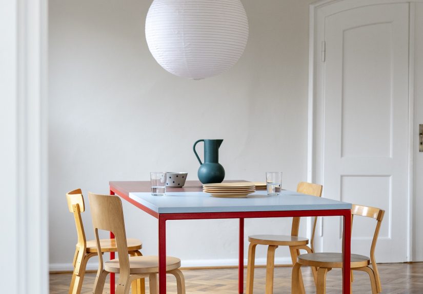
The table drawing so much attention is the Friis x Swantje Hinrichsen, a collaboration between Münster-based Donnerblitz Design and graphic designer Swantje Hinrichsen. The piece is made in Münster and features a powder-coated steel frame, a two-toned top, and multiple color combinations that shift the table from plain utility into visual centerpiece territory. It is also offered in two sizes, with custom sizing available, which makes it feel more like a design system than a one-off novelty.
What makes the table stand out is not only its color but its discipline. The top uses two tones rather than six. The frame contrasts without shouting. The oak-edged surface softens the sharper geometry. This is important, because the best color-blocked dining table designs are never random. They rely on balance, proportion, and material restraint. In other words, they are fun, but they know how to behave in public.
That balance is a hallmark of strong German furniture design. Good German design has long favored clarity, utility, and honest materials. A table should be sturdy. The finish should make sense. The structure should be visible. What color blocking adds is emotion. It keeps the piece from feeling severe, while still respecting the logic of the form.
Why Color Blocking Works So Well on Furniture
Color blocking is often discussed in terms of walls, fashion, or cabinetry, but furniture may be where it feels most satisfying. A dining table is already the visual anchor of the room. Once you accept that fact, giving it intentional color feels less like a risk and more like good manners. Why should the biggest object in the room pretend it has no opinion?
Design editors have been pointing out for years that color-blocked furniture has more presence than small multicolored accessories. That makes sense. A pillow can flirt with color. A table has to commit. And in a dining area, commitment is useful. It helps define the room, set the tone, and create a focal point before you add a single plate, branch, or candle.
The technique also allows a designer to create contrast without clutter. Instead of piling on patterned upholstery, bright art, loud wallpaper, and a dramatic rug all at once, a two-tone table introduces a clean, graphic statement in a single move. This is one reason modern interiors respond so well to it. The color is built into the object, not pasted on as an afterthought.
The Bauhaus Connection
If a German dining table with blocked color feels quietly familiar, there is a reason. Germany’s design legacy includes the Bauhaus, the school that fused art, craft, and industry into a new visual language. Bauhaus teaching emphasized materials, formal relationships, and color theory, and figures like Josef Albers helped shape how modern designers think about color interaction.
That heritage still echoes through contemporary furniture. Josef Albers’s stacking tables, with their painted glass tops in bold tones, are an early reminder that color can be structural, not just decorative. A modern two-tone dining table may not be a literal Bauhaus reproduction, but it carries some of that spirit: geometry, usefulness, visual rhythm, and a belief that beauty should not be separated from function.
So when you look at a color-blocked dining table from Germany, you are not just seeing a trend. You are seeing a long design conversation about how color changes form, how materials affect mood, and how everyday objects can feel artistic without becoming impractical.
What Makes This Look Feel Modern Instead of Messy
The secret is restraint. Strong color blocking uses limited colors, clear edges, and intentional contrast. It does not rely on visual noise. In fact, the cleaner the form, the more effective the color tends to be. A modern rectangular table with a lean metal frame gives the eye enough structure to appreciate the shift in tone.
Material pairing matters just as much. On the Friis table, the steel frame gives crispness and the wood-edged top adds warmth. That combination keeps the table from reading as overly industrial or overly playful. It lands in the sweet spot between workshop practicality and gallery-worthy polish.
Another reason it works is emotional. Color changes how a room feels. Designers frequently use warm rusts, dusty reds, muted blues, greens, and terracotta tones to create depth, comfort, or energy. In a dining space, that matters more than almost anywhere else. This is where people gather, linger, host, celebrate, argue over whose turn it is to do the dishes, and then eat cake anyway. Color should support all of that life, not drain it from the room.
How to Style a Color-Blocked Dining Table at Home
A dramatic table does not require dramatic everything else. In fact, one of the easiest mistakes is to over-style it. When the table already has a visual point of view, the rest of the room should act like a good supporting cast.
1. Start with Accessories, Not Chaos
One smart styling strategy is to echo the table’s colors in small, movable elements. Think placemats, napkins, candlesticks, rechargeable table lamps, or a low floral arrangement. Colorful accessories help the table feel integrated rather than isolated. Better Homes & Gardens has suggested building a color-blocked tablescape with grouped accessories and repeated hues, which is a helpful idea here too.
The trick is repetition with discipline. If your table uses blue and rust, do not suddenly introduce neon yellow because a vase looked lonely. Repeat the table tones in two or three places around the room, then stop. Good styling knows when to leave the room before it starts oversharing.
2. Let the Chairs Calm Things Down
Dining chairs do not need to compete. Natural wood, black, cream, or muted painted finishes usually work beautifully with a two-tone dining table. If the tabletop has strong graphic contrast, simple chairs prevent the room from becoming too visually busy. On the other hand, a classic chair shape can be a perfect partner because it adds familiarity beside a more experimental table.
This is one reason Scandinavian and Finnish chair silhouettes pair so well with German modern tables. Bent wood, soft curves, and honest materials bring warmth to a crisp color-blocked piece. The contrast feels human rather than stiff.
3. Use Lighting to Finish the Sentence
Lighting above the table should feel deliberate. A sculptural pendant, a simple linear light, or even a curved fixture can reinforce the table’s graphic quality. The goal is not to match the table exactly, but to continue the visual rhythm. If the table is low, long, and crisp, an oversized puffy paper lantern may not be its soulmate. It might still work, but it will be a very opposites-attract relationship.
Layered lighting also matters for atmosphere. A dining room should be functional for meals and pleasant for lingering. Overhead lighting, side lamps, and candlelight make the bold colors of the table feel richer and more dimensional.
4. Anchor the Table Properly
Layout matters more than many people realize. Designers often recommend matching the shape of the table to the room’s proportions. A rectangular table typically suits longer rooms, while round tables help square rooms feel softer and improve circulation. If you place the table on a rug, it should extend far enough beyond the edges so chairs remain on it when pulled out. A common rule is at least 24 inches on all sides.
In open-plan homes, placement becomes even more important. A rectangular dining table placed perpendicular to a kitchen island often creates a balanced flow. You want enough clearance for conversation, movement, and actual chair use. Nobody wants a dining setup where standing up from dinner feels like solving a geometry problem.
Who Should Buy a Color-Blocked Dining Table?
This look is ideal for homeowners who like modern furniture but find minimalist rooms too sterile. It also works well for people who want color without repainting walls every six months. A modern dining room table in blocked tones creates visual energy while staying function-first.
It is especially effective in these settings:
Minimal Rooms That Need a Pulse
If your dining room is full of white walls, pale floors, and clean lines, a color-blocked table can bring life without wrecking the calm. It acts like a shot of espresso for the room, except with fewer jitters.
Open-Plan Spaces
In homes where the dining area blends into the kitchen or living room, a colorful table helps define the zone. It works almost like architectural color blocking, giving the area identity without putting up walls.
Homes With Art-Loving Personalities
If you collect prints, ceramics, or books with strong graphic covers, this type of table makes sense. It feels at home in interiors where color is already appreciated as part of daily life.
People Who Actually Use Their Dining Table
This may be the biggest point of all. A well-made, color-blocked table is not only decorative. It supports everything a real household throws at it: weekday meals, laptops, homework, birthday candles, craft paper, awkward holiday seating charts, and the occasional midnight snack eaten directly over the placemat like a tiny raccoon in sweatpants.
Things to Consider Before Buying One
As beautiful as these tables are, they are not purely impulse purchases. Before bringing one home, think through scale, finish, and longevity.
Scale
Measure carefully. Bold furniture looks best when it fits the room properly. Too small and it loses impact. Too large and it turns every meal into a close-contact sport.
Palette Compatibility
Your table does not have to match the whole house, but it should relate to nearby rooms. Designers often create cohesion by repeating a family of tones such as greens, blues, or rusts throughout the home. That makes a statement piece feel intentional instead of random.
Surface Practicality
Look at how the top is finished and how the edges are handled. A table that mixes wood and coated metal can be both durable and inviting, but maintenance still matters. Households with kids, frequent entertaining, or lots of project work should think about how the surface will age over time.
The Experience of Living With a Color-Blocked Dining Table from Germany
There is also something worth saying about the day-to-day experience of a table like this, because furniture is not judged only by how it looks in a photograph. It is judged by mornings, evenings, ordinary Tuesdays, and the way a room feels when you walk into it half-awake holding coffee and questionable ambition.
A color-blocked dining table changes the room even when nothing is on it. That is part of its charm. An empty plain table can sometimes look like it is waiting for instructions. An empty two-tone table already feels complete. It still welcomes a bowl of fruit, a stack of mail, or a vase of branches, but it does not depend on styling to feel alive.
In the morning, the color often reads differently than it does at night. Sunlight can make one section of the tabletop glow warmer while the other stays cool and grounded. That shifting effect gives the piece more depth than a single-color surface. You notice it when the room is quiet. You notice it again when someone pulls out a chair and the frame catches the light. Good furniture rewards attention without begging for it.
It also tends to make everyday routines feel a little more intentional. A quick breakfast feels less thrown together. A laptop session feels less dreary. Even the usual pile of school papers or grocery lists somehow looks slightly more dignified sitting on a table that appears to have been designed by someone who has opinions about line, proportion, and probably coffee temperature.
When guests come over, the table does a lot of social work for you. It becomes a conversation starter before dinner even begins. People ask where it came from. They touch the edge. They notice the contrast between the frame and the top. The room feels considered, but not stiff. That is a hard balance to achieve, and this type of table helps with it naturally.
Another part of the experience is emotional. A lot of modern furniture is beautiful in theory but cold in practice. A color-blocked table can avoid that trap because color creates warmth, memory, and identity. If the palette includes earthy reds, soft blues, terracotta, olive, or muted cream, the piece feels lived with rather than showroom perfect. It becomes part of the home’s personality.
For families, that matters. The dining table is rarely just a dining table anymore. It becomes a homework station, a wrapping station, a life-admin station, and occasionally a stage for assembling something from a cardboard box while pretending the instructions are optional. A table with visual character makes all of that feel less like mess and more like life happening in a well-designed place.
And perhaps that is the strongest argument for a Bauhaus-inspired furniture approach in a modern home. It brings art into ordinary routines without making those routines precious. You can still use a coaster. You can still spill a little pasta sauce and panic for three seconds. You can still host Thanksgiving with mismatched glassware and one relative who insists on explaining crypto. The table can take it. Better yet, it makes the whole scene look more interesting.
Final Thoughts
A color-blocked dining table from Germany succeeds because it does two jobs at once. It is practical furniture, and it is visual design. It respects the logic of materials while embracing the joy of color. It nods to Bauhaus principles without feeling dusty or academic. And it offers something many dining rooms desperately need: personality with structure.
If you love modern interiors but want a warmer, more expressive home, this is one of the smartest pieces to consider. The right color-blocked dining table can define a room, guide a palette, and make everyday living feel more intentional. That is a lot to ask from a table. Fortunately, German design has never been shy about setting high standards.
Note: Source links are intentionally omitted for clean web publication.