Table of Contents >> Show >> Hide
- 1. Fake Plants That Fool Absolutely No One
- 2. Tiny Rugs That Float Around Like Postage Stamps
- 3. Plastic Frames and Generic Mass-Produced Art
- 4. Matchy-Matchy Furniture Sets
- 5. Word Art and Slogan Signs That Shout at Your Guests
- 6. Decorative Filler Clutter: Beads, Bowls of Orbs, and Random Trinket Piles
- 7. Harsh, One-Note Lighting and Cheap-Looking Fixtures
- Conclusion: A Stylish Home Is Edited, Not Overstuffed
- Real-Life Experiences: How These Decor Mistakes Sneak Into Normal Homes
Decorating a home is a little like seasoning soup: a pinch of personality is wonderful, but dumping in the whole spice rack can turn dinner into a cry for help. Most homes do not look tacky because the owner has “bad taste.” They look off because a few common decor choices quietly pull the whole room downhill. One fake fern here, one tiny rug there, one “Live Laugh Love” sign that somehow survived three moves, and suddenly your living room has the energy of a waiting room with opinions.
The good news is that tacky decor is rarely about money. You do not need a celebrity designer, a trust fund, or a lamp that costs more than your car payment. What designers repeatedly point out is that homes look better when they feel intentional, layered, and a little personal. The problem pieces are usually the ones that look overly trendy, mass-produced, oddly proportioned, or just a bit too eager to impress.
If you have ever wondered why a room feels cheap, cluttered, or vaguely chaotic even after you cleaned it, the culprit may be hiding in plain sight. These are seven decor items that designers often say can make a home look tacky, plus what to try instead if you want your space to feel warmer, calmer, and more pulled together.
1. Fake Plants That Fool Absolutely No One
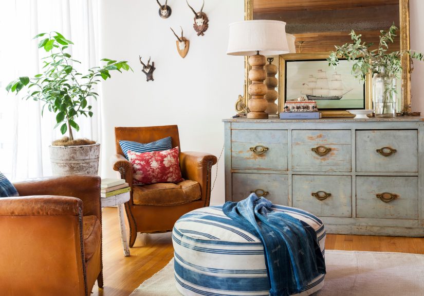
Let us begin with the dusty elephant in the room: fake plants. Yes, faux greenery is convenient. It does not need sunlight, water, or pep talks. But many artificial plants look exactly like what they areplastic leaves on a mission to disappoint. When the color is too shiny, the shape is too stiff, or the planter is too flimsy, the whole setup can make a room feel staged rather than lived in.
The real issue is not that every faux stem is evil. It is that bad faux greenery lacks the irregularity that makes real plants beautiful. Natural plants bend, spread, and grow in slightly messy ways. Cheap fake ones sit there like they are awaiting inspection. Add a layer of dust and suddenly your “lush indoor oasis” looks like it came with batteries.
What to do instead
Choose one of three better options: a real low-maintenance plant, a simple branch arrangement, or no plant at all. A pothos, snake plant, or ZZ plant can do far more for a room than an entire squadron of fake eucalyptus. And if you truly cannot keep greenery alive, use natural textures elsewherewood, linen, stone, woven basketsto add softness without pretending a plastic ficus is thriving.
2. Tiny Rugs That Float Around Like Postage Stamps
A too-small rug is one of the fastest ways to make a room look awkward. It is the home-decor equivalent of wearing pants that are just a little too short: people may not know exactly what is wrong, but they know something is wrong. When a rug only fits under the coffee table and leaves all the major furniture stranded around it, the room can feel disconnected and unfinished.
Rugs are supposed to anchor a space. They visually gather the sofa, chairs, and table into one conversation area. If the rug is too small, it does the opposite. It makes every piece look like it showed up separately and refuses to mingle. That is why even beautiful rugs can make a home look tacky when they are used in the wrong size.
What to do instead
In most living rooms, at least the front legs of the seating should sit on the rug. In a bedroom, the rug should extend beyond the bed enough to feel generous, not apologetic. When in doubt, size up. A larger rug usually makes the room feel more polished, more expensive, and more deliberate. A small rug can be charming in a tiny nook, but in a main living area it often reads as a budgeting decision your eyes can detect from across the room.
3. Plastic Frames and Generic Mass-Produced Art
Your photos and artwork deserve better than a flimsy plastic frame pretending to be wood. Cheap frames, especially shiny ones, can drag down even beautiful art. They scratch easily, warp over time, and often look more “last-minute checkout aisle” than “collected over the years.” The same goes for generic mass-produced prints that feel like they were selected by an algorithm trying to imitate personality.
Designers often stress that wall decor should feel intentional. When every piece looks interchangeable, the room starts to feel like a furniture showroom, not a home. Oversized motivational quotes, random abstract prints in plastic frames, and filler art chosen only because it matched the throw pillows can all create that oddly soulless effect.
What to do instead
Mix in art that actually means something to you. Frame a favorite photograph. Hang a vintage print. Pick up original work from a local artist, flea market, or antique store. Even inexpensive art can look elevated when the frame has weight, texture, and some visual honesty. Wood, metal, and quality resin tend to look far better than glossy plastic. Think less “bulk pack wall set,” more “I found this and loved it.”
4. Matchy-Matchy Furniture Sets
There is a difference between coordinated and cloned. A room where the sofa, loveseat, chair, coffee table, side tables, and media console all look like they arrived in one giant delivery box can feel flat and overly commercial. Matching sets are often sold as the easy answer to decorating, but easy is not always elegant.
Why does this look tacky? Because perfect matching removes visual tension. And no, not the stressful kind of tensionthe good kind, the kind that gives a room depth and charm. Homes look better when they feel assembled over time rather than ordered in a single panic-scroll session at midnight.
What to do instead
Mix shapes, finishes, and textures while keeping a common thread. That thread could be color, wood tone, silhouette, or overall mood. A linen sofa can sit beautifully next to a leather chair. A modern coffee table can work with vintage side tables. A room becomes more interesting when the pieces are in conversation instead of wearing identical uniforms. The goal is curated, not copy-pasted.
5. Word Art and Slogan Signs That Shout at Your Guests
There was a time when giant signs telling us to “Gather,” “Relax,” or “Laundry” were everywhere. That time should remain in the past, ideally boxed up in the garage behind holiday decorations and a broken crockpot. Word art can quickly make a home look tacky because it often feels mass-produced, visually noisy, and too literal.
Your kitchen does not need a sign announcing that it is, in fact, the kitchen. Your dining room does not need a wooden reminder to eat. And your walls do not need to perform emotional labor with a script font quote about love. The problem is not language itself. It is when the words replace actual style, character, or art.
What to do instead
If a phrase truly matters to you, display it in a more personal wayframed handwritten lyrics, a vintage poster, or typography with graphic punch instead of farmhouse cliché. Better yet, let your room communicate warmth through color, texture, and meaningful objects. A house feels far more welcoming when it shows personality rather than spelling it out like a roadside billboard.
6. Decorative Filler Clutter: Beads, Bowls of Orbs, and Random Trinket Piles
Some accessories exist for a reason. Others exist because a shelf looked lonely and social media got involved. Wooden beads draped over books, bowls full of decorative balls, trendy little objects that serve no purpose, and random piles of “styling pieces” can make a home feel overdone very quickly. One or two sculptural objects may look refined. Fifteen tiny filler items look like a home decor store exploded in slow motion.
This kind of clutter is tricky because each piece seems harmless on its own. But when every surface has a tray, every tray has beads, every bead has a tassel, and every tassel is next to a faux coral object for absolutely no reason, the room starts to feel busy and generic. Designers usually prefer fewer, better things.
What to do instead
Edit with a ruthless but loving hand. Keep the objects that have story, shape, or usefulness. A stack of books you actually read, a ceramic bowl from a trip, a candle you burn, a vintage box that hides remotesthese feel real. Decorative objects should earn their place. If an accessory looks like it was hired purely to fill empty air, it may be the first thing to cut.
7. Harsh, One-Note Lighting and Cheap-Looking Fixtures
Even a beautiful room can look tacky under bad lighting. If your entire space depends on one harsh overhead fixture and bulbs that cast an icy glow, the result can feel sterile, flat, and a little interrogation-room adjacent. Lighting affects color, mood, texture, and how expensive everything appears. That is a lot of power for one ceiling fixture that was probably installed when flip phones were still exciting.
Outdated shiny fixtures, dull builder-grade lights, and cool-toned bulbs can all cheapen a space. They flatten the room and erase the cozy shadows that make a home feel layered. Designers often talk about lighting as one of the most overlooked upgrades because people focus on furniture first and atmosphere second. But atmosphere is half the magic.
What to do instead
Layer your lighting. Use a combination of overhead fixtures, table lamps, floor lamps, and sconces where possible. Choose bulbs that give off a warm, inviting glow rather than a blue-white blast. And if your fixture is ornate in the wrong way, too shiny, too small, or simply sad, swapping it out can instantly make the whole room feel more intentional. Good lighting does not scream for attention. It quietly makes everything else look better.
Conclusion: A Stylish Home Is Edited, Not Overstuffed
If there is one theme running through all seven of these decor mistakes, it is this: tacky usually happens when a room tries too hard. Too many trends. Too many fillers. Too many fake finishes. Too much matching. Too much telling and not enough showing. A stylish home, on the other hand, feels relaxed. It knows what it is doing. It does not need a neon sign and a bowl of wooden beads to prove it.
The fix is not perfection. It is intention. Choose fewer things, better things, and more personal things. Let your rug actually fit. Let your art have meaning. Let your lighting flatter the room instead of punishing it. And if you still love one of these so-called tacky items, that is fine too. The best homes always have a little personality. Just aim for collected and confident, not cluttered and chaotic.
Real-Life Experiences: How These Decor Mistakes Sneak Into Normal Homes
One reason this topic resonates so much is because almost everyone has made at least one of these decorating choices with the best intentions. Maybe you ordered a rug online, unrolled it, realized it looked like a bath mat in the middle of your living room, and then kept it anyway because returning oversized items feels like a full-time job. For a few weeks, you convinced yourself it looked “minimal.” Then a friend came over, glanced down, and carefully asked whether the bigger rug was still on the way. Humbling, but helpful.
Fake plants are another classic example. People buy them because they want softness and color without the pressure of keeping something alive. Reasonable! But then the faux olive tree arrives, and instead of making the room look serene and Mediterranean, it looks like it came from a dentist’s office in 2007. It gets shoved into a corner, slowly collects dust, and somehow starts making the entire room feel neglected. Meanwhile, a single real pothos on a shelf would have done the job with half the drama.
Wall decor is where many homes quietly go off the rails. A homeowner starts with one family photo, adds a quote sign, then a generic print, then another frame in a slightly different finish, and suddenly the wall becomes a scrapbook with identity issues. None of the items are terrible on their own. Together, though, they create visual chatter. People often notice this only after removing a few pieces and realizing the room instantly feels calmer, taller, and more grown-up.
Matching furniture sets also tend to happen for understandable reasons. You move into a new place, you need everything at once, and a coordinated package sounds efficient. At first it feels great because the room is finally furnished. But over time it can start to feel stiff, like a catalog photo you are somehow living inside. Many people say their home improves the moment they break up the setadding a vintage side table, a different lamp, or one chair with a contrasting texture. Suddenly the room has a pulse.
Then there is the issue of filler decor. This often starts innocently too: a tray for the coffee table, some beads for the tray, a candle for the tray, a little object next to the candle so the candle is not lonely. Before long, every surface has a decorative committee meeting taking place on it. The room does not feel styled; it feels supervised. Editing those items can be surprisingly freeing. You realize that empty space is not a design failure. It is breathing room.
Lighting mistakes may be the most universal experience of all. Plenty of people do not notice their home feels cold until evening, when the overhead lights come on and everyone suddenly looks like they are being questioned by airport security. Add one warm lamp, however, and the mood changes immediately. The room softens. The furniture looks richer. People stay longer. It is one of those small upgrades that makes you wonder why you waited so long.
That is why articles like this are useful: not because they hand out rigid decorating laws, but because they help people recognize what feels off and why. Most tacky decor choices are not personal failures. They are just very common detours on the road to a home that feels comfortable, thoughtful, and unmistakably yours.