Table of Contents >> Show >> Hide
- 1. Trend-Driven Finishes That Age Faster Than a Banana on the Counter
- 2. Oversized Kitchen Islands That Hijack the Whole Room
- 3. Non-Essential Gadgets That Sound Luxurious but End Up Collecting Dust
- 4. Open Shelving That Looks Airy in Photos and Exhausting in Real Life
- 5. Busy Backsplashes That Steal the Show for All the Wrong Reasons
- 6. Same-Color Finishes Everywhere, Especially the Flat All-White Look
- How to Design a Kitchen You Will Still Love Later
- Real-Life Experiences Behind These Kitchen Regrets
- Final Thoughts
Designing a dream kitchen is a little like online dating: everything looks amazing in the photos, everyone says the right things, and then real life shows up with greasy fingerprints, cereal boxes, and a blender that needs a permanent parking spot. Suddenly, that “perfect” kitchen feature starts feeling less like a soulmate and more like a very expensive lesson.
That is exactly why designers keep sounding the alarm about kitchen regret. The biggest mistakes are rarely the giant, dramatic disasters from renovation TV. More often, they are the polished, trendy, well-intentioned choices that seem smart in the moment but become annoying, high-maintenance, or oddly impractical once the kitchen has to survive breakfast, homework, takeout containers, holiday baking, and the occasional midnight snack raid.
If you are planning a remodel, building from scratch, or simply trying to avoid future eye twitching every time you walk into your kitchen, these are the six features designers say people regret most. The good news? Every one of them has a better alternative.
1. Trend-Driven Finishes That Age Faster Than a Banana on the Counter
Designers consistently warn that kitchens suffer when homeowners choose finishes based on what is hot right now instead of what will still feel good five or ten years later. High-gloss cabinetry, ultra-bold tile, heavily textured surfaces, and dramatic statement materials can look exciting during installation day. The problem is that kitchens are not event spaces. They are workspaces. They get used hard, and trends can go stale fast.
Why people regret it
Trend-heavy finishes often create one of two headaches: they either feel dated quickly, or they demand more maintenance than expected. A glossy cabinet may look sleek in perfect lighting, but it can also highlight smudges, scratches, and every mystery splash created by spaghetti night. Highly textured surfaces may bring visual interest, but they can trap dust and grime in all the little ridges like they were born for the job.
The emotional regret is real, too. Homeowners often spend a serious amount of money on a kitchen only to realize the room feels tied to a narrow moment in design history. Nobody wants their renovation to whisper, “Remember 2024?” every time they make coffee.
What designers suggest instead
Use timeless materials for expensive, hard-to-replace surfaces. Think wood tones, natural stone, quiet tile, classic cabinetry profiles, and warm neutrals. Save trendier choices for lower-commitment elements such as bar stools, pendant lights, paint, or hardware. In other words, let your kitchen have personality, but do not let it become a costume party.
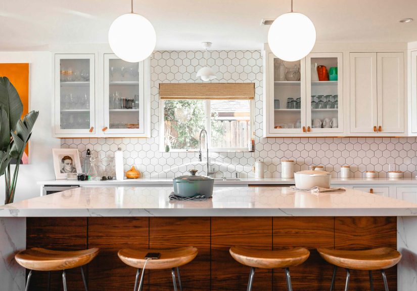
2. Oversized Kitchen Islands That Hijack the Whole Room
The kitchen island has become the celebrity of modern kitchen design. It preps, serves, stores, seats guests, hides trash, holds laptops, and somehow still gets asked to look fabulous. But bigger is not always better. Designers say one of the most common regrets is installing an island that is simply too large for the space.
Why people regret it
An oversized island can wreck circulation. Instead of gliding through the kitchen, you end up doing awkward side-steps around corners, bumping hips on cabinetry, and opening the dishwasher only to discover you have blocked your own path. That is not luxury. That is kitchen choreography gone wrong.
A too-large island can also disrupt the work triangle between the sink, refrigerator, and cooking area. Add seating in the wrong place and the room becomes a traffic jam with snacks. The island starts as the hero and ends up as a beautiful, stone-topped obstacle course.
What designers suggest instead
Size the island to the kitchen, not your fantasy Pinterest board. Prioritize proper clearances, smooth door swings, seating space, electrical access, and comfortable movement around all sides. In some kitchens, a smaller island works better. In others, a rolling island, peninsula, or even two well-proportioned zones make more sense. The best island is not the biggest one. It is the one that lets your kitchen breathe.
3. Non-Essential Gadgets That Sound Luxurious but End Up Collecting Dust
There is a special kind of optimism that appears during a remodel. It says things like, “We definitely need a warming drawer,” or “A built-in coffee station will change our lives,” or “Surely a pot filler will turn us into elegant pasta people.” Designers have seen this movie before, and the ending is usually a shrug.
Why people regret it
Many niche kitchen gadgets cost real money, take up valuable space, and go underused. Warming drawers, soda taps, secondary sinks, overcomplicated beverage stations, and other “wouldn’t it be cool if…” features often sound better than they perform. Once the renovation glow wears off, homeowners realize they gave premium square footage to something they use twice a month.
This regret gets sharper in kitchens where storage is already tight. Every unnecessary built-in means less room for the things people actually use every day: pots, mixing bowls, toaster ovens, lunch containers, and the giant air fryer nobody wants to admit they love.
What designers suggest instead
Spend on the real workhorses. A great range, strong refrigeration, durable cabinets, functional drawers, smart pantry storage, enough outlets, and good lighting will improve daily life far more than a flashy specialty feature. The best luxury in a kitchen is not novelty. It is convenience that keeps delivering on a random Tuesday.
4. Open Shelving That Looks Airy in Photos and Exhausting in Real Life
Open shelving has had a long, glamorous run. In styled images, it looks breezy, curated, and charmingly effortless. In actual homes, it often turns into a public display of mismatched mugs, snack boxes, dust, and the one souvenir bowl nobody knows where to put.
Why people regret it
Designers repeatedly say open shelving is one of the fastest routes to kitchen fatigue. Shelves near cooking areas attract grease. Shelves everywhere attract dust. And unlike closed cabinets, they offer no mercy for visual clutter. Your kitchen is suddenly expected to stay “styled” at all times, which is not exactly realistic for people who live with kids, roommates, partners, pets, or normal human schedules.
There is also the storage issue. Closed cabinetry simply holds more and hides more. That matters in a room where functionality wins every time.
What designers suggest instead
Use open shelving sparingly. A couple of shelves for everyday dishes, cookbooks, or a few beautiful pieces can work well. But let closed cabinets do the heavy lifting. The most livable kitchens mix display and concealment. Think of open shelving like hot sauce: a little can be excellent, but too much will absolutely get your attention.
5. Busy Backsplashes That Steal the Show for All the Wrong Reasons
The backsplash is one of the easiest places to get seduced by pattern, color, and drama. That is why it is also one of the easiest places to overdo it. Designers say highly patterned, overly colorful, or visually chaotic backsplashes often become a major regret.
Why people regret it
A busy backsplash can dominate the room and compete with everything else: cabinets, counters, hardware, lighting, and even the architecture. What looked punchy and fun as a sample may feel loud and cluttered across an entire wall. Some styles also date quickly, which is not ideal for a surface that is expensive and annoying to replace.
There is a second issue nobody talks about enough: visual fatigue. Kitchens already contain a lot of objects by nature. Adding one more high-energy surface can push the room from dynamic to chaotic in a hurry.
What designers suggest instead
Designers increasingly favor restrained tile, stacked or classic subway layouts, herringbone used thoughtfully, or slab backsplashes that create subtle movement without screaming for attention. If you love color, bring it in through accessories, art, runners, or paint. Your backsplash should support the kitchen, not audition for its own spinoff series.
6. Same-Color Finishes Everywhere, Especially the Flat All-White Look
There was a long stretch when all-white kitchens ruled everything. They felt clean, bright, safe, and universally appealing. But designers now say one of the most common regrets is taking sameness too far: white cabinets with white counters, white backsplash, white walls, and no contrast to break it up.
Why people regret it
When every finish matches, kitchens can feel flat, sterile, and strangely unforgiving. There is no depth, no rhythm, and no visual pause. On top of that, lighter monochromatic schemes can show smudges, spills, chips, and everyday wear very quickly. The result is a space that looks less “fresh and timeless” and more “please nobody touch anything.”
That works beautifully in a magazine spread. It is less charming when your actual home includes coffee, sauce, children, or people with hands.
What designers suggest instead
Contrast is the antidote. Mix painted cabinetry with wood tones. Pair quiet counters with a backsplash that adds gentle texture. Bring in aged brass, polished nickel, or matte black accents thoughtfully. Layered lighting helps, too, because even the most neutral kitchen feels richer when it has under-cabinet light, task lighting, and softer ambient glow. A timeless kitchen is rarely one-note. It is balanced.
How to Design a Kitchen You Will Still Love Later
If these regrets have a shared lesson, it is this: a good kitchen should be built around life, not just looks. Designers keep coming back to the same fundamentals for a reason. Prioritize storage. Respect clearances. Plan the workflow between sink, fridge, and cooking zone. Include enough outlets where people actually use appliances. Add layered lighting instead of relying on one lonely overhead fixture. And do not forget ventilation, because the kitchen should smell like dinner while you are eating it, not for the next three business days.
That might sound less glamorous than picking a dramatic tile or an eye-catching gadget, but it is the difference between a kitchen that ages gracefully and one that starts annoying you by Thanksgiving.
Real-Life Experiences Behind These Kitchen Regrets
Talk to enough designers and homeowners, and the pattern becomes almost comically familiar. The oversized island looked stunning on the plan, but once the bar stools were tucked in and the dishwasher door dropped open, the aisle became so tight that two people could not pass without one doing an apologetic shuffle. Morning coffee turned into a traffic exercise. One person reached for the fridge while another packed lunches, and suddenly the kitchen felt less like a dream and more like a politely hostile subway platform.
Open shelving inspires a different kind of regret. At first, it feels charming to display neatly stacked plates, a few handmade mugs, and maybe a trailing plant if you are feeling optimistic. Then life enters. The shelves collect dust. Grease floats farther than anyone expects. A family-sized bag of pretzels lands where a ceramic vase once lived. People discover that “curated” is often just another word for “constantly rearranged so the chaos looks intentional.” Many homeowners admit they did not actually want open shelving; they wanted the fantasy of being the kind of person who alphabetizes tea and never buys bulk paper towels.
Busy backsplashes often create regret more slowly. The first week, they feel exciting. By month three, they are all you can see. Instead of noticing the beautiful cabinetry or the natural light, your eye goes directly to the energetic tile pattern doing jumping jacks behind the stove. That kind of visual intensity can be fun in a powder room or on a small accent wall. In a hardworking kitchen, though, it can start to feel like your walls drank too much espresso.
All-white kitchens create the opposite problem. They begin with calm and end with paranoia. People start noticing every scuff, every drip, every fingerprint, every tiny chip on the cabinet edge. The room can feel beautiful, but also weirdly formal, as if the kitchen is expecting company even when you are just trying to toast a bagel in sweatpants. That is why designers keep recommending warmth and contrast. A little wood, a little stone variation, a little metal mix, and suddenly the room feels welcoming instead of medically supervised.
Then there are the gadgets. Designers hear the same confessions over and over: the fancy built-in feature that looked luxurious during the remodel is now barely used, while the homeowner still wishes they had added deeper drawers, better pantry storage, more outlets, or stronger task lighting over the prep area. It is rarely the missing novelty that hurts. It is the missing basics.
That is the most useful takeaway of all. Kitchen regret usually is not caused by a lack of style. It comes from forgetting that this room has a job. The happiest kitchens are not the ones trying hardest to impress. They are the ones that make daily life easier, cleaner, calmer, and just a little more enjoyable when dinner is late and everyone is hungry.
Final Thoughts
The most regretted kitchen features all have one thing in common: they prioritize the fantasy of a kitchen over the function of one. Designers are not saying your kitchen has to be boring. They are saying it should be livable. Choose materials with staying power, give yourself enough storage and clearance, layer your lighting, think through your workflow, and be honest about how you really cook and clean.
Because the best kitchen is not the one that wins the internet for seven minutes. It is the one that still feels smart, useful, and inviting years after the renovation dust settles.