Table of Contents >> Show >> Hide
- Quick Preview: The 4 Mistakes
- Mistake #1: Getting Scale and Proportion Wrong (Yes, This Is the “Tiny Rug” Issue)
- Mistake #2: Treating Lighting Like an Afterthought (a.k.a. “One Overhead Light and Vibes”)
- Mistake #3: Hanging Art Too High (or Too Small) The Floating Frame Problem
- Mistake #4: Decorating Without a Plan (Matchy Sets, Trend Overload, and Clutter Creep)
- Conclusion: The “Designer Fix” (and Real-World Experiences That Prove It Works)
Decorating is supposed to be funlike dressing your home in its best outfit. But sometimes we accidentally dress it like it’s going to four different parties at once: tiny rug, giant sofa, one lonely ceiling light, and wall art floating near the heavens like it’s trying to reach Wi-Fi.
The good news? Interior designers see the same “oops” moments over and over, which means the fixes are proven, practical, and usually less expensive than starting over.
Below are four of the most common decorating mistakes designers wish they could gently erase with a giant magic eraser (or a well-placed floor lamp). Each comes with clear signs to watch for, why it makes a room feel “off,” and easy, real-life solutions you can apply this weekendno beret required.
Quick Preview: The 4 Mistakes
- Mistake #1: Getting scale and proportion wrong (especially rugs and furniture sizing)
- Mistake #2: Treating lighting like an afterthought (aka “the Big Light problem”)
- Mistake #3: Hanging art too high (or choosing art that’s too small)
- Mistake #4: Decorating without a plan (matchy sets, trend overload, and clutter creep)
Mistake #1: Getting Scale and Proportion Wrong (Yes, This Is the “Tiny Rug” Issue)
If interior designers had a frequent-flyer program for decorating mistakes, “rug too small” would be platinum status. Scale and proportion problems show up everywhere, but rugs and furniture are the biggest offenders because they’re literally the foundation of how a room feels.
How to Spot It
- Your seating looks like it’s perched around a “postage-stamp” rug.
- The coffee table feels miles awayor jammed so close everyone has to crab-walk to sit down.
- A sofa dominates the room like it pays rent, and everything else is just visiting.
- There’s a lot of empty floor around the furniture, but the room still feels cramped.
Why Designers Care So Much
Scale is basically visual comfort. When key pieces are too small, the room feels unfinished and oddly chopped up. When pieces are too big, the space feels warned, crowded, and hard to move through. Designers often say proportion is what makes a room look “intentional”even if you bought half your decor during a midnight online scroll.
Designer Fixes That Work in Real Rooms
-
Choose a rug that anchors the seating area.
A safe rule: in living rooms, aim for a rug large enough that at least the front legs of sofas and chairs sit on it. In dining rooms, the rug should extend beyond the table so chairs stay on the rug when pulled out. -
Measure before you buy (yes, every time).
Designers measure the “zone,” not just the item. That means measuring the seating footprint (sofa + chairs + side tables) to see what rug size actually fits the layout you want. -
Pull furniture off the wallsjust a little.
Shoving every piece to the perimeter can make the center feel like a dance floor you didn’t request. Even 3–8 inches of breathing room can help the arrangement look more layered and welcoming. -
Use the “two-thirds” check for major pairings.
A coffee table typically looks best around two-thirds the length of the sofa. For art above a sofa, the same idea helps: wall decor should feel substantial enough to “belong” to the furniture below it.
Example: The Rug Upgrade That Changes Everything
Imagine a 9′ x 12′ living room with a standard sofa and two chairs. A 5′ x 7′ rug often looks like a bathmat that got lost. Moving up to an 8′ x 10′ (or even 9′ x 12′ in larger rooms) suddenly makes the seating feel connectedlike it’s one conversation area, not three pieces of furniture that met on Craigslist.
Mistake #2: Treating Lighting Like an Afterthought (a.k.a. “One Overhead Light and Vibes”)
Designers talk about lighting the way chefs talk about salt: it shows up everywhere, and when it’s wrong, you can’t ignore it. Many homes rely on a single ceiling fixture or recessed lights alone, which can create a flat, harsh feelgreat for searching for a lost earring, less great for making a room feel cozy.
How to Spot It
- The room feels “fine” during the day but weirdly gloomy at night.
- You only have overhead lighting (or you avoid turning it on because it’s aggressive).
- Your lighting is mismatchedcool bulbs in one lamp, warm bulbs in another.
- Reading, cooking, or working feels harder than it should because task lighting is missing.
Why Designers Care So Much
Lighting shapes mood, highlights textures, and makes colors look right. Even gorgeous furniture can look dull under poor lighting. Designers also point out that fixture size matters: an undersized chandelier looks accidental, while an oversized pendant can overwhelm a small space. And bulb color temperature can swing a room from “inviting” to “dentist waiting room” fast.
Designer Fixes That Work in Real Rooms
-
Layer your lighting: Aim for a mix of ambient (overall light), task (reading/cooking), and accent (highlighting art or shelves).
In a living room, that might mean a floor lamp near the sofa, a table lamp on a side table, and a small accent light near a bookcase. -
Choose warm, consistent bulbs.
Many designers recommend warm white bulbs (often around 2700K–3000K) for living spaces so the room feels softer and more flattering at night. If you dim lights often, look for “dim-to-warm” bulbs that get warmer as they dim. -
Put lights on dimmers (where possible).
This is one of the most “bang for your buck” upgrades. Dimmers let you shift from “functional” to “cozy” instantly. -
Right-size your fixtures.
If you’ve ever looked at a tiny pendant over a big dining table and thought, “Aw, it’s trying,” you already understand the issue. Use room dimensions and table size as guides, and don’t be afraid to go bigger than you think.
Example: The “Big Light” Makeover
If your living room has one ceiling fixture and nothing else, add two lamps firstone floor lamp and one table lamp. Suddenly, the room has depth. The corners don’t disappear into shadow, and your sofa stops looking like it’s under interrogation lighting.
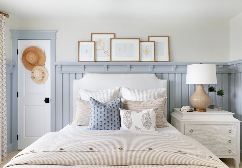
Mistake #3: Hanging Art Too High (or Too Small) The Floating Frame Problem
Hanging art is where many well-meaning decorators accidentally create a museum… for giraffes. Designers commonly recommend placing art at eye level. If your wall decor is hovering near the ceiling, it can throw off the balance of the entire roomeven if the art itself is beautiful.
How to Spot It
- You have to tilt your head up to view your wall art.
- Art above furniture looks disconnected, like it’s not part of the room.
- Pieces are too small for the wall, creating a “tiny island in a sea of drywall” effect.
- Your gallery wall feels scattered rather than cohesive.
Why Designers Care So Much
Wall decor is a major visual anchor. When it’s too high, the room feels top-heavy and awkward. When it’s too small, it reads as tentativelike the wall is wearing a bracelet when it needed a statement necklace. Designers love art because it adds personality, but placement makes the difference between “curated” and “random.”
Designer Fixes That Work in Real Rooms
-
Use the eye-level guideline.
A common approach is to hang art so the center of the piece lands around eye level (often cited around the high-50s inches from the floor, with a general range depending on ceiling height and furniture). -
Connect art to furniture.
Above a sofa or console, hang art closer than you thinkoften around 6–10 inches above the furnitureso it feels grouped rather than floating. -
Go bigger, or group smaller pieces.
If one piece looks too small, consider a larger frame, a bigger mat, or a pair/trio of related pieces. Grouping can create the scale you need without buying one massive artwork. -
Mock it up before committing.
Designers often use painter’s tape or paper templates to map out placement. It’s faster than patching holes after the “wait, why does this look weird?” moment.
Example: The Sofa Wall That Finally Looks Finished
You have an 84-inch sofa and a single 16×20 frame above it. The frame might be lovely, but it can look lost. Swap to one larger piece, or create a two- or three-piece arrangement that spans a substantial width above the sofa. Suddenly, the wall feels intentionaland your sofa stops looking like it’s waiting for the rest of the room to arrive.
Mistake #4: Decorating Without a Plan (Matchy Sets, Trend Overload, and Clutter Creep)
This is the mistake that sneaks in wearing a trench coat. You start with a pillow. Then you buy a second pillow because the first pillow looks lonely. Then you find a third pillow that “ties everything together,” except now your sofa has more accessories than you do.
Designers often see two extremes: rooms that look like a showroom (everything matches, nothing feels personal) and rooms that feel chaotic (too many styles, too many small items, no visual hierarchy). Both usually come from decorating without a clear direction.
How to Spot It
- Your room looks “busy” but not finished.
- Everything matches too perfectly, yet the space feels flat or generic.
- You keep buying small decor because the room doesn’t feel right.
- Every surface is covered (decor items, mail, candles, random chargersyour home’s “miscellaneous drawer,” but everywhere).
Why Designers Care So Much
Great rooms have a clear visual story: a mood, a palette, and a few focal points. When you decorate without a plan, you usually end up “accessory shopping” your way into clutter. Designers also warn that lots of small items can make a home feel less elevated, while fewer, larger, well-shape pieces often read as calmer and more intentional.
Designer Fixes That Work in Real Rooms
-
Start with function, then style.
Ask: How do we use this room? TV and conversation? Reading and relaxing? Entertaining? Your layout should support that first. -
Pick a simple palette and repeat it.
Choose 2–3 main colors plus a metal/wood tone, then repeat them across the room (textiles, art, accessories). Repetition creates cohesion without everything matching. -
Mix, don’t “buy the set.”
Matchy furniture collections can feel one-note. Designers often mix shapes, finishes, and even eras so a space feels layered and personal. -
Edit your surfaces.
Aim for “breathing room” on shelves and tabletops. Group objects in odd numbers (like 3 or 5), vary height, and leave negative space so the eye can rest. -
Use fewer, better statements.
If you keep buying little items to “finish” the room, that’s a sign you might need one bigger move: a larger rug, bigger art, substantial curtains, or a better light fixture.
Example: The “Stop Buying Small Stuff” Reset
If your console table has eight little objects and still feels messy, try this: remove everything, then add back just three elementslike a lamp, a tray (to corral remotes/keys), and one sculptural piece or vase. The room looks cleaner instantly, and your decor starts to feel deliberate instead of accidental.
Conclusion: The “Designer Fix” (and Real-World Experiences That Prove It Works)
Most decorating mistakes aren’t about “bad taste.” They’re about missing structure. Interior designers rely on a few foundational principlesscale, lighting, placement, and planningbecause those are the levers that make a room feel comfortable, cohesive, and lived-in (in the good way, not the “why is there a single sock on the ottoman?” way).
If you only remember four things, make it these: measure first, size up when in doubt, layer your lighting, and treat wall decor like it belongs to the furniture beneath it.
And now, per your request, here are real-world style “experiences” designers regularly describecomposite scenarios that show how these four fixes play out in actual homes. Think of them as the before-and-after stories your room is hoping for.
Experience #1: The “Tiny Rug, Big Regret” Living Room
A common scenario: someone buys a rug based on how it looks online, not how it functions in a layout. They unroll a 5′ x 7′ rug in a living room where the sofa alone is nearly 7′ long. The rug ends up floating in the center like an island, while the furniture stays stranded on the “shore” of the walls.
Designers describe the same fix again and again: choose a larger rug that allows at least the front legs of the main seating to sit on it. Once the rug anchors the arrangement, the room suddenly feels unified. The furniture looks like it belongs together, conversation feels easier, and the space reads as “designed” instead of “assembled.”
Bonus: people often report the room feels bigger afterwardbecause the layout finally has a clear zone rather than a scattered perimeter.
Experience #2: The Great Lamp Awakening (a.k.a. Escaping the Big Light)
Another repeat story: a home looks decent in daylight but becomes flat and harsh at night because the only light source is overhead. Designers often say clients don’t realize how much lighting affects mood until they add just two lamps.
One floor lamp by the sofa plus one table lamp near a chair creates instant depth. Add warm bulbs and a dimmer, and suddenly the room becomes the one everyone gravitates toward. People describe it as “cozier,” “calmer,” and “more expensive-looking,” even though the furniture didn’t change.
It’s also one of the most livable upgrades: task lighting makes reading and relaxing easier, and layered lighting helps highlight textureswood grain, woven fabrics, a great paint colorso the room feels rich rather than washed out.
Experience #3: The Floating Art That Finally Comes Down to Earth
Designers often walk into a room and immediately notice wall art hovering too high. Homeowners typically do it because they’re trying to “fill the wall” or they’re nervous about hanging art near furniture. The result is a room that feels disconnected: the sofa sits low, the art sits high, and the space in between looks awkwardly empty.
The fix is surprisingly simple: lower the art so it relates to the furnitureoften closer than people expect. When the center of the piece lands around eye level and the art sits within a comfortable distance above a sofa or console, the wall becomes a cohesive vignette.
In many designer anecdotes, this single change makes a room look finished overnight. It’s also why mock-ups are so popular: painter’s tape lets you “see” the right placement before you commit, which reduces the trial-and-error (and spackle).
Experience #4: When a Room Stops Looking Like a Catalog (and Starts Looking Like You)
A final experience designers describe often: clients buy matching sets or follow trends too literally, and the room ends up feeling genericor they buy a lot of small decor trying to force personality, and the room ends up cluttered.
The most effective shift is creating a plan: a simple palette, a functional layout, and a few statement choices (a rug with presence, art with scale, lighting with character). Then designers editremoving random extras so the eye has room to breathe. People frequently report the room feels “more me” after this step, even though it technically has less stuff.
The lesson: personality doesn’t come from adding more; it comes from choosing better and placing it with intention. Your home doesn’t need to look perfectit needs to look purposeful.
If you’re tempted to do one thing today, do this: pick the biggest “anchor” problem in your room (rug size, lighting, art height, or clutter), fix that first, and reassess. Designers love small steps because one strong improvement often makes everything else easier to see clearly.