Table of Contents >> Show >> Hide
- What “Painted Stripe Coffee & Blue” Actually Means
- Why Coffee Brown + Blue Works So Well
- Where Painted Stripe Coffee & Blue Shines Best
- 1) Throw Pillows That Instantly Make a Sofa Look Styled
- 2) Upholstery That Doesn’t Take Over the Room
- 3) Drapery and Roman Shades That Frame Windows Like Art
- 4) Table Linens That Make Everyday Meals Look Intentional
- 5) Bedding Layers That Feel Crisp but Cozy
- 6) A Subtle “Pattern Neutral” in Mixed-Print Rooms
- 7) A Kid- and Pet-Friendly Pattern That Still Looks Grown-Up
- 8) Accent Walls and “Stripe Drenching” Without Wallpaper Commitment
- Pattern-Mixing Cheat Codes for Coffee & Blue Stripes
- Fabric-Friendly Details That Save You From Expensive Oops
- DIY: How to Paint a Coffee & Blue Striped Wall (Without Crying)
- Care and Maintenance: Keeping Coffee & Blue Looking Fresh
- Mistakes to Avoid (So Your Stripes Stay Chic)
- Conclusion: The Quiet Power of a Painted Stripe
- Bonus: of Real-World “Stripe Living” (Coffee & Blue Edition)
Some patterns try a little too hard. Stripes? Stripes don’t have to. They stroll into a room, sip your espresso,
and instantly make everything look more intentionallike you meant for that “temporary” chair to live there for three years.
Now add a warm, grounded coffee brown and a calm, coastal-leaning blue, and you’ve got a combo that feels both classic and fresh:
Painted Stripe Coffee & Blue.
This look is all about balance: relaxed but tailored, playful but not “carnival tent,” and bold without shouting.
Whether you’re styling a fabric moment (pillows, drapery, upholstery) or borrowing the vibe for a painted accent wall,
the magic is the sameclean lines with a hand-done soul.
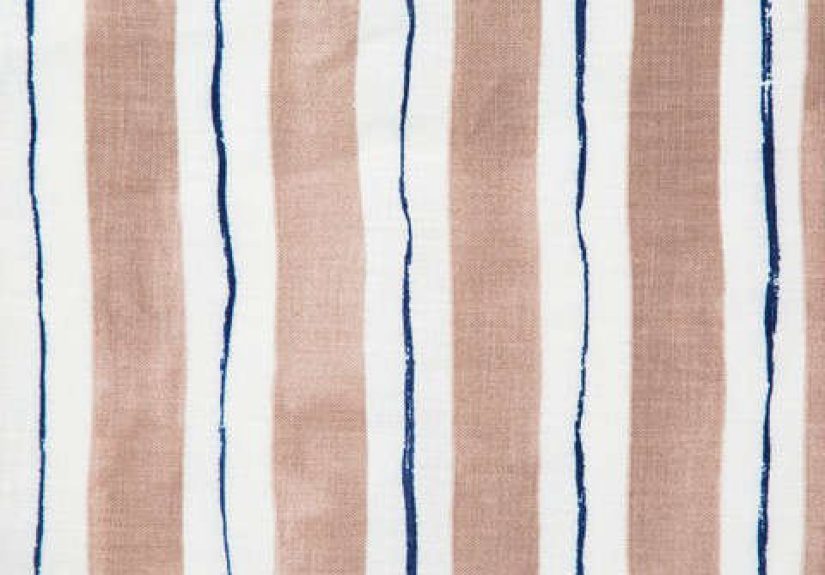
What “Painted Stripe Coffee & Blue” Actually Means
“Painted stripe” isn’t just a poetic adjectiveit’s a style. Instead of perfectly uniform bars that feel factory-flat,
a painted stripe keeps subtle variation in edges and saturation, like a brush had a say in the final result.
The Coffee & Blue colorway typically reads as a soft, earthy brown paired with a moody, denim-to-nautical blueversatile enough
for coastal, modern farmhouse, traditional, and even minimalist spaces that need a little warmth.
If you’re working with the well-known “Painted Stripe” fabric version of this idea, it’s often printed on linen and designed to be
mixed with other patterns (yes, even floralsdon’t panic). The point is not perfection; it’s that breezy “I summer in a tasteful catalog”
feeling, minus the price tag of pretending you own a second home.
Why Coffee Brown + Blue Works So Well
Blue has a reputation for being calming and crisp. Brown brings warmth, depth, and an organic, grounded feel.
Together they behave like the best kind of friendship: one keeps things cool, the other makes it feel like home.
This pairing also plays nicely with the most common “supporting cast” colors in real housescreams, ivories, soft whites,
black accents, brass, natural wood, and woven textures.
It’s a “Year-Round” Palette
In spring and summer, Coffee & Blue can lean coastalespecially with lighter neutrals, rattan, and airy linens.
In fall and winter, it turns cozy: add camel leather, deeper wood tones, and a throw that looks like it came from a fancy lodge.
Same stripes, different seasonal mood. No wardrobe change required.
It Looks Good in Both Sunlight and Lamplight
Warm browns are famously forgiving in warm indoor lighting, while blue keeps things from going too beige-and-boring.
The result is a room that looks “awake” during the day and “inviting” at nightlike it’s always hosting a small gathering
of people who actually use coasters.
Where Painted Stripe Coffee & Blue Shines Best
1) Throw Pillows That Instantly Make a Sofa Look Styled
If your couch feels like it’s missing personality, stripes are the easiest upgrade. A painted stripe pillow reads structured,
but the hand-done look keeps it casual. Pair it with one solid pillow (cream, oat, or leather) and one textured pillow (bouclé,
nubby linen, or a subtle weave). That trio is basically the “smart casual” dress code of living rooms.
2) Upholstery That Doesn’t Take Over the Room
A stripe on a chair, bench cushion, or headboard is a statementwithout becoming the only thing anyone can talk about.
Coffee & Blue is especially good for pieces that need to feel durable and timeless: breakfast nook benches,
reading chairs, ottomans, and upholstered headboards.
Pro move: keep the stripe orientation consistent with the furniture shape. Vertical stripes on a tall chair can feel tailored and
elongating. Horizontal stripes on a wide bench can feel grounded and relaxed. Either way, you get “designer energy” without
changing your entire personality.
3) Drapery and Roman Shades That Frame Windows Like Art
Painted stripes in Coffee & Blue look especially sharp as window treatments because the vertical fall naturally complements stripes.
If you want the room to feel taller, go vertical. If you want a softer, cottage-coastal vibe, consider a Roman shade where the folds
break up the stripe slightly (translation: it looks fancy even when you’re just trying to block the neighbor’s floodlight).
4) Table Linens That Make Everyday Meals Look Intentional
Striped runners, napkins, or even a casual tablecloth in this palette can make weeknight dinners feel more “host mode.”
Coffee hides life. Blue hides… also life. It’s the rare combo that looks elegant and forgives spaghetti night.
5) Bedding Layers That Feel Crisp but Cozy
Use the stripe as an accent: a lumbar pillow, a bed skirt, or a throw at the foot of the bed.
Keep the rest simplewhite, cream, or pale blue sheetsand let the stripe do the styling work.
The result: hotel energy, but with better snacks.
6) A Subtle “Pattern Neutral” in Mixed-Print Rooms
A thinner or softer stripe can act like a neutral from a distance. That’s why designers love pairing stripes with louder prints:
the lines add rhythm and structure, and your florals stop feeling like they’re partying without supervision.
7) A Kid- and Pet-Friendly Pattern That Still Looks Grown-Up
Stripes are surprisingly resilient visually: minor wrinkles, everyday wear, and even a slightly crooked pillow still look intentional.
Coffee is forgiving. Blue is calm. Together they’re basically the “clean aesthetic” of patterns.
8) Accent Walls and “Stripe Drenching” Without Wallpaper Commitment
If you love the look but don’t want to upholster anything (or you’re in your “I will not own a staple gun” era),
you can paint stripes. Painted stripes can mimic the same Coffee & Blue vibeespecially if you choose one shade as a base
and the other as the stripe color.
Pattern-Mixing Cheat Codes for Coffee & Blue Stripes
Mixing patterns sounds scary until you realize it’s mostly just three rules and one bold decision.
Here’s how to make stripes play nicely with everything else you already own.
Keep the Palette Tight
- Base neutrals: cream, ivory, oat, warm white, soft gray
- Supporting woods: walnut, oak, medium pine, warm-stained finishes
- Metals: brass/bronze for warmth; black for contrast
- Accent colors (optional): muted rust, mustard, olive, or terracotta (sparingly)
Vary the Scale (So Nothing Competes)
If your stripe is medium or bold, keep other patterns smaller and more textured than graphic.
If your stripe is subtle, you can introduce one larger patternlike a floral, abstract, or oversized check.
The goal is contrast in scale, not chaos in vibes.
Use Texture as a “Pattern Break”
When in doubt, add texture instead of another print: chunky knit throws, bouclé, woven baskets, cane, jute rugs,
matte ceramics, or raw wood. Texture gives the eye a place to restlike a pause button for your décor.
Respect the Stripe on Upholstery
Stripes on furniture look best when seams are aligned and corners are crisp. If you’re upholstering,
prioritize careful pattern matching. A slightly off stripe on a pillow looks charming. A slightly off stripe
on a chair can look like the chair got dressed in the dark.
Fabric-Friendly Details That Save You From Expensive Oops
Order a Swatch First (Yes, Even If You’re “Pretty Sure”)
Coffee browns can lean warm (caramel) or cool (taupe). Blues can lean gray, navy, or teal.
A swatch tells you the truth in your lightingand lighting is the final boss of interior design.
Plan Yardage with Pattern Matching in Mind
Stripes require more intentional cutting than solids, especially for upholstery and full-length drapes.
You may need extra yardage to align stripes across seams or to center a stripe on a cushion or headboard.
If you’re working with a professional workroom or upholsterer, tell them you want the stripe placement considered.
(They’ll thank you. Your finished piece will also thank you.)
Railroaded Stripes: Why Orientation Matters
Some stripe fabrics are “railroaded,” meaning the pattern runs horizontally across the width of the fabric.
That can be great for upholstery (fewer seams on long runs) but it changes how you cut for drapery or vertical applications.
The fix is simple: know the direction before you buy yardage, and plan accordingly.
DIY: How to Paint a Coffee & Blue Striped Wall (Without Crying)
Painted stripes are a high-impact, relatively low-cost way to borrow the Painted Stripe Coffee & Blue aesthetic.
The trick is preparationbecause tape will absolutely betray you if you rush it.
Step 1: Choose Your Stripe Strategy
- Two-color classic: warm coffee base + blue stripes (or the reverse)
- Soft-on-soft: light warm neutral base + coffee stripes, then blue accents in textiles
- Modern twist: matte base + satin stripes in the same color family (subtle, sophisticated)
Step 2: Paint the Base Coat First
Paint the entire wall in your lightest color (often a warm neutral or the “coffee” shade if it’s not too dark).
Use two coats for even coverage. Let it dry thoroughly before tapingpatience now prevents touch-ups later.
Step 3: Measure Like a Person Who Wants Straight Lines
Measure the wall width and decide stripe width so the math works. Mark stripe edges lightly in pencil.
Use a level (or laser level if you’re feeling fancy) to keep lines straight. Your eyes will lie to you; the level will not.
Step 4: Tape, Press, Seal
Apply painter’s tape along your pencil marks and press edges firmly. For extra-crisp lines, “seal” the tape edge by brushing
a thin layer of the base color along the tape edge first. Once that dries, paint your stripe colorthis helps prevent bleed.
Step 5: Paint the Stripes in Thin Coats
Two light coats beat one thick coat. Thick paint loves to seep under tape because it’s basically looking for drama.
Let coats dry per the paint instructions.
Step 6: Remove Tape at the Right Moment
Pull tape slowly at a 45-degree angle. Many pros remove it while paint is still slightly wet to prevent peeling and cracking.
If anything bleeds, touch up with a small angled brush once fully dry.
Step 7: Style It Like a Grown-Up
Keep the rest of the wall décor simple: one or two framed pieces, warm wood, and a few textured accents.
Let the stripes be the star, not a backdrop for visual shouting.
Care and Maintenance: Keeping Coffee & Blue Looking Fresh
If you’re using a linen-based painted stripe fabric, treat it like linen: gentle cleaning, low heat, and quick stain response.
Always follow the care instructions for the specific product you bought, but in general, cold water and a gentle cycle (when permitted)
help preserve color and fiber integrity. Air drying or low drying reduces shrink risk.
Quick Spill Protocol (a.k.a. “Don’t Let It Become a Memory”)
- Blot, don’t rub: rubbing pushes stains deeper and frays fibers.
- Use mild soap: a small amount of gentle detergent and cool water goes a long way.
- Test first: try any cleaner on an inconspicuous area.
- Avoid high heat: hot water and high dryer heat can shrink linen and set stains.
Mistakes to Avoid (So Your Stripes Stay Chic)
Choosing a Blue That Fights Your Existing Undertones
If your floors lean warm (honey oak, warm walnut), pick a blue that isn’t icy. If your space leans cool (gray tile, concrete),
choose a coffee tone with enough warmth to keep it from going flat.
Using Too Many Stripe Scales at Once
One bold stripe + one subtle stripe can be great. Three bold stripes in one sightline can look like your room joined a barbershop quartet.
Keep one dominant stripe and let the rest be solids and textures.
Ignoring Alignment on Upholstery
If you’re investing in a striped upholstered piece, insist on careful seam alignment. It’s the difference between “custom” and “close enough.”
Skipping the Sample Stage
Screens lie. Lighting lies. Your confident late-night decision-making lies.
A swatch is the only one that consistently tells the truth.
Conclusion: The Quiet Power of a Painted Stripe
Painted Stripe Coffee & Blue is one of those rare design moves that feels both expressive and livable.
The stripe brings structure. The painted variation keeps it human. Coffee warms the room. Blue cools it down.
Use it in a pillow, commit with drapery, or go bold with a painted walleither way, you’re choosing a pattern that ages well,
works across styles, and makes a space feel finished without feeling fussy.
Bonus: of Real-World “Stripe Living” (Coffee & Blue Edition)
Here’s what people tend to notice once Painted Stripe Coffee & Blue stops being an idea and starts being part of daily life:
it changes the mood of a room in a way that feels subtle at first, then weirdly essential. In the morning, the blue reads crisp and clean
the same way a freshly ironed shirt looks responsible even if the rest of your life is held together with calendar alerts and caffeine.
By afternoon, the coffee tone warms up and starts to feel almost caramel, especially in natural light. It’s the pattern equivalent of
“I woke up like this,” except it actually did.
In living rooms, the stripe often becomes the anchor that keeps everything else from floating away. A couch can handle a lot of accessories,
but without a strong visual rhythm, pillows turn into random soft objects you own. Coffee & Blue stripes give you instant organization.
Even if you mix in a floral or a geometric print, the stripe acts like the grown-up in the room: “Okay, everyone breathe. We’re coordinating.”
And because the palette is balancedwarm + coolit doesn’t feel seasonal or trendy in a way that gets old fast.
In bedrooms, the experience is quieter. A striped lumbar pillow or bed skirt in this palette tends to make the space feel calmer, but not bland.
People often describe it as “put together” without being “precious,” which is exactly what most of us want in a room where we’re supposed to
sleep, not audition for a design award. If you add brass hardware or warm wood nightstands, the coffee tone ties everything together.
If you add crisp white bedding, the blue feels fresh. Either way, it plays nicely.
For families (or anyone with a pet who believes the sofa is their personal kingdom), Coffee & Blue earns extra points for looking good
between cleanings. The coffee tone helps camouflage everyday smudges and minor wear, while the blue distracts the eye in a “nothing to see here”
kind of way. Stripes are also forgiving about wrinklesespecially when the stripe has that painted variation. A perfectly crisp stripe might make
wrinkles look messy. A painted stripe makes wrinkles look… intentional. Like linen being linen. Which is the most linen thing linen can do.
If you paint the stripe look on a wall, the lived experience is less about maintenance and more about attitude. Stripes give energy to small spaces:
hallways feel more designed, nooks feel more intentional, and awkward corners suddenly look like you meant for them to be “a moment.”
The funny part is how quickly you stop noticing the stripes as “a project” and start noticing them as “the reason the room works.”
Guests may comment on them; you’ll mostly just enjoy the way they make the space feel finished.
And yesat some point, you will catch yourself thinking, “This wall looks great with coffee.” That’s when you’ll know the stripes have fully won.