Table of Contents >> Show >> Hide
- What Is Ombre Floral Wall Art, Exactly?
- Why Ombre Floral Wall Art Works So Well
- How to Choose the Right Ombre Floral Wall Art
- Best Materials and Styles for Ombre Floral Wall Art
- Where to Use Ombre Floral Wall Art
- DIY Ideas for a More Personal Look
- Common Mistakes to Avoid
- Living With Ombre Floral Wall Art: Real Experiences and Decorating Moments
- Final Thoughts
Some walls are just walls. Other walls walk into the room wearing a silk robe and a fabulous attitude. That, in a nutshell, is the magic of ombre floral wall art. It blends the softness of flowers with the slow, dreamy fade of ombre color, creating decor that feels artistic, romantic, and modern without trying too hard. In other words, it is the design equivalent of looking effortlessly put together while secretly having a very strong opinion about throw pillows.
Whether you love oversized blooms, watercolor petals, textured paper flowers, pressed botanical pieces, or abstract floral canvases that fade from blush to plum, ombre floral wall art has a rare gift: it can calm a room down while still making a statement. It adds movement, color, and personality, but it does not have to shout. It can whisper beautifully. And sometimes that is exactly what a room needs.
This guide breaks down what ombre floral wall art is, why it works so well, how to choose the right piece for your space, where to hang it, what mistakes to avoid, and how to make the style feel personal instead of generic. If you have a blank wall that has been judging you for months, this is your sign to do something about it.
What Is Ombre Floral Wall Art, Exactly?
Ombre floral wall art is wall decor that combines a floral subject with a gradual color transition. The ombre effect can move from light to dark, dark to light, or one tone into a neighboring shade. The floral element can be realistic, painterly, sculptural, printed, embroidered, pressed, or fully abstract. Some pieces look like a garden at sunrise. Others feel more like a moody bouquet after a dramatic breakup. Both can work.
The appeal is in the balance. Florals bring softness, shape, and a natural subject people instantly recognize. Ombre brings rhythm. Instead of one flat color or one rigid pattern, you get a visual fade that gently pulls the eye across the wall. The result feels layered and intentional, which is designer language for “this room has its life together.”
Ombre floral wall art can appear in many forms:
- Large canvas paintings with blooming color gradients
- Framed prints featuring petals that fade across the composition
- Pressed flower shadow boxes arranged in tonal order
- Paper or fabric floral relief art with dimensional texture
- Mixed-media pieces that combine paint, petals, metallic accents, or resin
- Wallpaper-style framed panels that behave like oversized art
Why Ombre Floral Wall Art Works So Well
It softens a room without making it feel sleepy
Floral decor can sometimes veer too sweet, too vintage, or too cottage-core-at-full-volume. Ombre helps modernize it. The gradient effect introduces movement and keeps the piece from feeling static. It turns floral art from “pretty picture” into a full-on atmosphere.
It adds color with more finesse
A block of bright color can feel abrupt. An ombre transition feels smoother and more deliberate. That is especially useful if you want more color in a room but do not want your wall art to look like it was chosen during a caffeine emergency. Soft transitions are easier to coordinate with rugs, upholstery, curtains, and accent pieces.
It works in both bold and quiet interiors
If your room is minimalist, ombre floral wall art can become the one expressive element that keeps the space from feeling too serious. If your room is layered and eclectic, the same type of art can act as a bridge between colors and textures. It is flexible like that. Very emotionally intelligent decor.
It can be flat, textured, or somewhere in between
One of the most exciting things about this style is that it can be purely visual or richly dimensional. A watercolor print gives you softness and ease. A shadow box with preserved petals adds depth. A sculptural paper flower installation turns a wall into an experience. Same family, very different personalities.
How to Choose the Right Ombre Floral Wall Art
Start with the mood of the room
Before you shop, ask a simple question: what should this room feel like? Peaceful? Romantic? Airy? Energizing? Sophisticated? The answer will guide the palette. Soft blue, green, lavender, and blush ombre florals usually create a calm mood. Peach, coral, berry, and gold feel warmer and more lively. Deep plum, rust, burgundy, charcoal, and smoky mauve bring drama without becoming harsh.
Think about scale before style
A common decorating mistake is choosing art that is too small for the wall or the furniture beneath it. Ombre floral wall art often works best when it has enough size to be taken seriously. Above a sofa, bed, console, or dining sideboard, the piece should feel visually connected to the furniture instead of floating around like a lost postcard.
If you love the look of smaller pieces, group them in a coordinated set. Diptychs and triptychs work especially well because the ombre effect can travel across multiple panels, creating a sense of flow from one frame to the next.
Use color families, not random chaos
The most successful ombre looks usually stay within related shades. That does not mean the piece has to be boring. It means the transition should feel natural. A dusty rose fading into mauve and plum is elegant. Mint into sage into olive feels organic. Cream into sand into terracotta feels grounded and warm. Random jumps from lemon yellow to cobalt to crimson can work in abstract art, but they are harder to style in an everyday room.
Consider texture as part of the design
If your space already has smooth surfaces like glass, painted walls, polished metal, and streamlined furniture, textured floral wall art can add much-needed dimension. Look for canvas brushwork, raised petals, linen backing, layered paper blooms, beadwork, or pressed botanicals. Texture gives floral art more presence and helps it feel collected rather than mass-produced.
Best Materials and Styles for Ombre Floral Wall Art
Canvas art
Canvas is the easiest all-around choice. It suits modern, transitional, and casual interiors, and it handles gradients beautifully. A large floral canvas in faded pinks or blue-grays can fill a wall without making the room feel busy.
Framed watercolor prints
If you want something lighter and more delicate, watercolor-style ombre florals are a smart pick. They look especially good in bedrooms, guest rooms, reading nooks, and spaces where you want softness without too much visual weight.
Pressed flower or botanical shadow boxes
These pieces add authenticity and a handcrafted feel. They are ideal for people who love natural materials and quieter detail. If real flowers are part of the project, they should be dried or pressed promptly so their color and texture stay more beautiful over time.
Paper floral installations
For maximum drama, paper flowers arranged in tonal order can create a wall installation that feels somewhere between art and event design. This works beautifully in nurseries, dressing rooms, craft studios, and party spaces, though it can also look incredible in a bold entryway if you commit to the look.
Mixed-media and textile pieces
If you want warmth and originality, consider floral art made with embroidery, fabric petals, macrame details, or layered materials. These pieces soften hard architecture and pair well with natural woods, boucle, rattan, and upholstered furniture.
Where to Use Ombre Floral Wall Art
Living room
This is the classic location for a statement piece. A large ombre floral canvas above the sofa can anchor the entire room. If your living room has neutral furniture, the art can carry the color story. If your room is already colorful, choose a piece that repeats one or two tones already in the space so everything feels connected.
Bedroom
Ombre floral wall art is basically built for bedrooms. It brings softness, shape, and a restful mood, especially in cooler or dusty shades. Try one oversized piece above the bed or a symmetrical pair over the nightstands for a more tailored look.
Entryway
An entry sets the emotional tone for the home. Floral art with a gradient effect feels welcoming without being predictable. It can add life to a narrow console wall, especially when paired with a mirror, a lamp, or a vase that repeats a shade from the artwork.
Dining room
Dining rooms benefit from art that feels expressive and slightly elevated. Ombre florals can do that beautifully. Richer palettes like wine, peach, terracotta, ink blue, or forest green make the space feel intimate and layered.
Home office
If your desk area feels too stiff, floral art can soften it. If it feels too chaotic, ombre can calm it down. That is a pretty useful trick for a wall hanging. Choose a piece with energy but not too much visual noise, so your background looks polished and your brain remains on speaking terms with you.
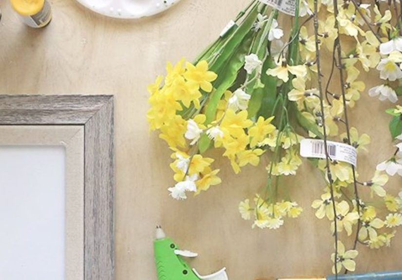
DIY Ideas for a More Personal Look
Buying a ready-made piece is great, but DIY ombre floral wall art has charm because it can reflect your exact colors, memories, and style. Here are a few approachable ideas:
- Painted canvas: Blend three to five related shades across a canvas, then add loose floral outlines or layered petals over the fade.
- Pressed-petal frame: Arrange dried petals from light to dark inside a floating frame or shadow box.
- Paper bloom panel: Create paper flowers in graduated tones, then mount them in a sweeping cluster over canvas or wood.
- Paint-swatch floral collage: Cut petal shapes from swatches in related colors and arrange them into oversized blossoms.
- Resin botanical art: Preserve small blooms or petals in clear resin for a glossy, modern finish.
The beauty of DIY is not perfection. It is personality. If one petal sits a little crooked, congratulations: your art now has character.
Common Mistakes to Avoid
Choosing a piece that is too tiny
Big wall, tiny art, sad outcome. If the wall is large, either go bigger or create a grouped arrangement. Small art can be lovely, but it needs help from neighboring pieces, shelves, mirrors, or sconces to hold visual space.
Ignoring the room’s existing palette
Ombre floral wall art should feel like it belongs in the room, not like it took a wrong turn on the way to another house. Pull one or two shades from your rug, pillows, curtains, or accent furniture so the piece feels integrated.
Hanging it too high
Art should relate to people and furniture, not hover near the ceiling like it is avoiding eye contact. Keep the piece visually grounded, especially above a sofa, bed, dresser, or mantel.
Forgetting contrast
Soft florals on a soft wall can be beautiful, but they still need enough contrast to be seen. If your wall is pale, make sure the art includes some richer tones, shadow, texture, or framing that helps it stand out.
Overcrowding the wall
Ombre floral art already has movement. It does not need twelve competing accessories around it. Give the piece enough breathing room so the gradient can be appreciated.
Living With Ombre Floral Wall Art: Real Experiences and Decorating Moments
One reason people connect so strongly with ombre floral wall art is that it tends to feel personal. It is not just decoration; it often becomes part of the memory of a room. In a first apartment, for example, a soft floral canvas can make a rented space feel less temporary. White walls, builder-grade lighting, mystery beige carpet, and suddenly there is one beautiful piece above the couch that says, “Actually, someone with taste lives here.” That matters more than people admit.
In bedrooms, the experience is often emotional before it is visual. A piece with a slow fade from pale blush to mauve or from seafoam to deep green changes the room’s mood the second you walk in. It can make the space feel quieter, softer, and more finished. Plenty of people do not want a bedroom full of loud patterns or hard lines. They want the room to exhale a little. Ombre florals are very good at that. They bring movement without visual stress.
There is also something special about floral wall art that marks a life event. People use preserved petals from weddings, anniversaries, graduations, memorial bouquets, and birthday arrangements to create shadow boxes or framed botanical pieces. When those petals are arranged in tonal order, the result is not only beautiful but meaningful. It turns a bouquet that would have faded in a vase into a piece you can live with for years. That is decor with a backstory, which is always more interesting than decor that simply matched the sale section.
Families often love this style because it can grow with a room. In a nursery, ombre floral wall art feels whimsical and sweet. A few years later, the same room can evolve with deeper bedding, new lamps, and a more mature rug, and the art still works. In that sense, it is a smart choice. It has softness, but it does not feel babyish. It is romantic, but it does not have to feel overly formal. It adjusts.
Another common experience is using ombre floral art to solve the “something is missing” problem. You know the one. The room has furniture. The lamp is there. The rug is behaving. The throw blanket is doing its best. And yet the space still feels unfinished. Often the missing ingredient is a vertical focal point. Once a floral gradient piece goes on the wall, the room suddenly makes sense. It can pull together random accent colors, soften hard corners, and make the architecture feel intentional.
Even people who do not usually describe themselves as “floral people” often respond to this look when the colors are muted or the blooms are oversized and modern. That is the sneaky brilliance of the style. It does not always read as traditionally floral. Sometimes it reads as abstract, atmospheric, and artistic first, floral second. That opens the door for more spaces: modern condos, minimalist bedrooms, transitional living rooms, even home offices that need warmth but not fuss.
Seasonally, ombre floral wall art is helpful too. It can shift with the room around it. Add linen pillows and lighter accessories in spring, richer velvet or boucle in fall, metallic accents around the holidays, and the art keeps up. It is one of those rare decor choices that can feel fresh in July and cozy in November. Not many wall pieces manage that without needing a personality transplant.
Most of all, living with this kind of art tends to be a reminder that beauty does not need to be loud to be effective. A gradual fade of color. A petal edge catching light. A little texture in a shadow box. A wall that once felt empty now has rhythm, warmth, and presence. That is the real experience people are after. Not just filling space, but changing how the space feels.
Final Thoughts
Ombre floral wall art works because it brings together two things rooms almost always need more of: softness and direction. The floral element adds life. The ombre effect adds movement. Together, they create wall decor that can feel serene, expressive, modern, romantic, or dramatic depending on the palette, scale, and texture you choose.
If you want a space to feel more finished, more layered, and more emotionally inviting, this style is worth considering. Go oversized for impact, keep the palette connected to the room, use texture when the space feels flat, and remember that the best art does not just match the sofa. It changes the mood. And that is a much better trick than matching the sofa anyway.