Table of Contents >> Show >> Hide
- Why checklist analytics matter more than most teams expect
- What Userpilot’s checklist dashboard actually gives you
- The metrics that separate a smart checklist from a decorative one
- How checklist data fits into Userpilot’s wider analytics ecosystem
- How to build a better checklist analytics workflow in Userpilot
- A practical example of checklist dashboard analysis
- Common mistakes teams make with checklist dashboards
- Experience notes from the dashboard: what teams usually learn after living with checklist analytics
- Final thoughts
A checklist can be a beautiful little productivity wizard. It waves at new users, points them toward the right buttons, and quietly says, “You got this.” But without analytics, that same checklist is basically a laminated wish. It may look helpful, yet you still do not know whether people are starting it, ignoring it, abandoning it halfway through, or clicking tasks like they are swatting flies.
That is where checklist dashboard and analytics inside Userpilot become wildly useful. Instead of guessing whether your onboarding checklist is doing its job, you can inspect how it performs, how different user segments behave, which tasks get traction, and where the experience starts leaking users. Better still, you can connect that checklist performance to broader product analytics so you are not just tracking busywork. You are tracking activation, feature adoption, retention, and actual product progress.
In plain English, the checklist is the tour guide. The dashboard is the security camera, clipboard, and scoreboard rolled into one. And if you use it well, you stop designing onboarding around vibes and start designing it around evidence.
Why checklist analytics matter more than most teams expect
Product teams often treat onboarding checklists as simple UX helpers. That is true, but only halfway. In reality, a checklist is a behavioral system. It nudges users toward the actions that are supposed to create momentum: finishing setup, inviting teammates, connecting an integration, publishing something, or reaching the first “aha” moment. If those actions are carefully chosen, the checklist becomes a compact growth engine. If they are poorly chosen, it becomes a polite little distraction box.
The difference usually shows up in the data. A good checklist shortens time to value, keeps onboarding from feeling like a chore, and helps users complete high-impact tasks in the right order. A weak checklist attracts clicks but not progress. An even weaker one gets shown a lot, completed rarely, and dismissed with the digital equivalent of a shrug.
This is why Userpilot checklist analytics should not be treated as a vanity add-on. It is how you answer questions that actually matter: Are users seeing the checklist? Are they finishing it? Which task is causing the biggest drop-off? Are certain segments moving faster than others? And, most importantly, does checklist completion line up with stronger feature adoption or retention later on?
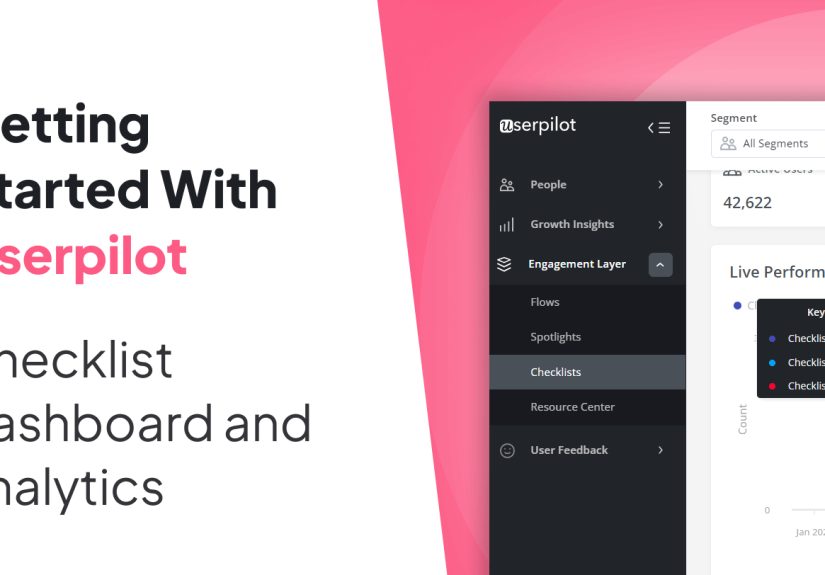
What Userpilot’s checklist dashboard actually gives you
Userpilot does a solid job of making checklist management less chaotic. In the overview area, you get a table of all created checklists along with settings and performance information. That means you can review status, target users, target page, and the core engagement signals like shown, completed, dismissed, and last clicked. In other words, you are not staring at a pile of onboarding assets and wondering which one is alive, which one is stale, and which one should be escorted quietly into retirement.
Userpilot also gives you practical filters so the dashboard is not just a giant junk drawer. You can search by title, filter by date range, status, segment, creator, page, and trigger. That sounds simple, but it matters. A checklist shown to new trial users on a billing page should not be judged the same way as a checklist for power users inside a feature-rich workspace. Context changes everything.
On top of that, the platform lets you manage columns, export data to CSV, switch views, and even prioritize checklist order when multiple checklists might compete to appear at the same time. That last piece is more important than it sounds. If users get bombarded by overlapping guidance, your onboarding experience starts to feel less like a guided path and more like a mall kiosk shouting for attention.
Drilling into a single checklist
Once you click into an individual checklist, the analysis gets more useful. Userpilot lets you filter by segment and time period, which is exactly what a serious team needs. Broad averages are cute, but segmented truth is better. Your checklist may look healthy overall while completely underperforming for enterprise accounts, admin users, or mobile-heavy customers.
Inside that checklist view, the headline metrics are refreshingly straightforward: Started, Completed, and Dismissed. You can also inspect performance trends over time, click into data points to see which users interacted during a specific period, and review a task breakdown to see how each item performs. That task-level view is where real optimization usually begins.
Think of it this way: if 68% of users start the checklist, 31% complete it, and one specific task has a miserable click or completion rate, the problem is probably not the whole checklist. The problem is that one task. Maybe it asks too much, appears too early, sends users to the wrong page, or depends on an event that is harder to trigger than your team assumed.
The metrics that separate a smart checklist from a decorative one
Let us talk about the numbers that deserve attention. Not every metric is equally helpful, and not every pretty chart deserves applause.
1. Started or shown
This tells you whether people are actually seeing or opening the checklist. If the number is low, you may have a targeting issue, a visibility problem, or a trigger that is about as discoverable as a sock behind a dryer. Before you rewrite tasks, first make sure the checklist is reaching the users it was built for.
2. Completed
Completion is the obvious star metric, but it should never be read in isolation. A 70% completion rate sounds fabulous until you realize only a tiny slice of the intended audience ever started the checklist. Completion is powerful only when paired with reach.
3. Dismissed
Dismissals are underrated because they are uncomfortable. A dismissal is a user saying, “No thanks, I do not need this, do not trust this, or absolutely do not have time for this right now.” That feedback is gold. A high dismissal rate may signal poor timing, weak relevance, or too many checklist items. Sometimes the checklist is not wrong; it is simply arriving at the wrong moment like a vacuum salesperson during dinner.
4. Task-level clicked and completed
This is where onboarding teams earn their coffee. If users click a task but do not complete it, something between intent and action is breaking. Maybe the linked flow is confusing. Maybe the destination page is cluttered. Maybe the task copy is promising one thing and the interface is delivering another. If users never click a task at all, the item may look low-value, too advanced, or badly worded.
5. Timeframe and segment comparisons
A checklist is never “good” in the abstract. It is good for a specific audience during a specific stage of the journey. Compare new users against returning users. Compare smaller accounts against larger teams. Compare this month’s performance with last month’s after a copy change or task reordering. The trend line is often more revealing than the raw total.
6. Downstream product impact
This is the grown-up metric category. Userpilot’s broader dashboards and reports help you connect checklist activity to bigger outcomes: active users, stickiness, feature adoption, retention, page visits, event engagement, and common paths before or after a key event. If your checklist completion rises but core feature adoption does not, congratulations, you optimized the onboarding theater and forgot the plot.
How checklist data fits into Userpilot’s wider analytics ecosystem
One of the best things about Userpilot is that checklist analytics do not have to live in isolation. The platform’s Product Usage Dashboard helps you track broader usage patterns like daily, weekly, and monthly activity, top pages, top events, session duration, and engaged users or companies. The Core Feature Engagement Dashboard goes even deeper by measuring adoption rate, usage trends, stickiness, and retention around a specific feature event.
This matters because a checklist is only successful if it moves users toward meaningful product behavior. If one checklist drives more users to complete setup but does not increase core feature usage, something is off. Maybe the tasks are technically complete but strategically weak. Maybe users are checking boxes without reaching value. That is the onboarding version of eating a salad and rewarding yourself with three milkshakes.
Userpilot’s custom dashboards strengthen this workflow. Teams on higher plans can combine reports into personalized dashboards for things like trial-to-paid conversion, feature engagement, or upgrades. That is where checklist analysis becomes executive-friendly. You stop reporting “users completed a checklist” and start reporting “users who completed the checklist adopted the core feature faster and converted at a higher rate.”
If checklist items launch flows, flow performance analytics add another layer of clarity. Those metrics include total shown, completed, dismissed, and average time to complete. So when a checklist task seems weak, you can inspect whether the issue is the task itself or the multi-step experience it triggers. Sometimes the checklist is doing its job perfectly and the follow-up flow is the one stepping on a rake.
How to build a better checklist analytics workflow in Userpilot
Start with the activation milestone, not the widget
Before you create tasks, define the action sequence that actually leads to value. Do not ask, “What can we put in a checklist?” Ask, “What do successful users do early that predicts retention?” That answer should shape your checklist.
Choose tasks tied to real events
Good checklist analytics rely on good instrumentation. Every key item should map to a meaningful action: creating a workspace, inviting a teammate, connecting a data source, publishing a first project, or using a core feature. If completion criteria are vague, your dashboard becomes a liar with excellent manners.
Target the right users on the right pages
Userpilot allows checklist targeting by domain, page, audience, and trigger rules. Use that power wisely. New users need a different checklist than expanding accounts. Admins need different tasks than end users. Relevance is not a bonus. Relevance is the whole game.
Test before going fully live
Preview mode, test mode, staged publishing, and internal-only targeting help you catch awkward wording, broken targeting, or weird UI collisions. Nothing says “premium SaaS experience” quite like a checklist that appears on the wrong page and tells users to do something impossible.
Review performance weekly, not once per quarter
Checklists are living assets. Review started, completed, and dismissed trends regularly. Look at task-level behavior. Compare segments. Then make small improvements: tighten copy, reorder tasks, simplify steps, remove fluff, or swap in actions that align better with product value.
A practical example of checklist dashboard analysis
Imagine a project management SaaS tool using Userpilot for onboarding. Its checklist has four tasks: create a workspace, invite a teammate, connect Slack, and build the first project board.
The dashboard shows healthy reach. Plenty of users start the checklist. Completion, however, is mediocre. Task breakdown reveals that “connect Slack” gets far fewer completions than the other items. The team clicks into the user list and compares segments. Small teams are skipping that task more often, while larger teams complete it later in the journey.
The solution is not to panic and redesign everything in a dramatic midnight Slack thread. The solution is to adjust the checklist logic. For smaller teams, move “build the first project board” higher and demote or remove the Slack task during initial onboarding. For larger teams, keep the integration step because collaboration features are more relevant earlier.
Then the team checks the broader Product Usage and Core Feature Engagement dashboards. After the change, first-board creation goes up, adoption of the core planning feature improves, and new-user retention inches upward. That is what checklist analytics are supposed to do: point to the change that improves product behavior, not just interface cosmetics.
Common mistakes teams make with checklist dashboards
- Measuring completion without measuring value. A completed checklist is not the finish line unless it leads to useful product behavior.
- Stuffing in too many items. If your checklist looks like a wedding planning binder, users will flee.
- Ignoring dismissals. Dismissed checklists are feedback, not failure confetti.
- Skipping segmentation. What works for one audience may annoy another.
- Tracking the wrong events. Bad instrumentation creates confident nonsense.
- Never revisiting task order. The first task sets momentum. Choose wisely.
Experience notes from the dashboard: what teams usually learn after living with checklist analytics
Here is the part people rarely say out loud: the first version of a checklist almost never deserves a trophy. It deserves observation. Teams build their first checklist with admirable optimism. They gather in a meeting, identify the “must-do” actions, polish the copy, align the colors, and hit publish with the confidence of people unveiling a moon landing. Then the dashboard starts talking. And the dashboard is not always polite.
One of the first lessons teams learn is that users do not experience product onboarding in the neat little order shown in a strategy deck. Real users are messy. They get interrupted. They skip steps. They open a task, get distracted by another tab, come back tomorrow, and decide the third item suddenly feels impossible. Analytics make that mess visible, which is a good thing. Once you stop expecting perfect behavior, you start designing for actual behavior.
Another common lesson is that the “hard” task is not always the problem. I have seen teams assume that an integration setup step would be the villain, only to discover that the real drop-off happened one step earlier because the copy was too abstract. Users were not refusing the task; they simply did not understand why it mattered. A tiny rewrite can do more work than a dramatic redesign. Sometimes the biggest optimization is replacing a vague sentence like “Configure your environment” with “Connect your data source so your first dashboard has something useful to show.” Suddenly the task stops sounding like homework and starts sounding like progress.
Teams also discover that timing is everything. A checklist shown too early feels pushy. A checklist shown too late feels pointless. The sweet spot is usually the moment a user has enough context to understand the next step but not so much friction that they have already wandered off. When the dashboard shows strong reach but weak completion, the copy may be the issue. When it shows low reach, weak clicks, and a mountain of dismissals, timing and targeting are often the real culprits.
The most mature teams eventually stop asking, “How do we improve checklist completion?” and start asking, “Which checklist behavior predicts long-term success?” That is the shift from surface-level onboarding to strategic onboarding. Once you connect checklist data with feature adoption, retention, and core usage trends, the work gets smarter. You may find that completing all tasks is not necessary. Maybe users who finish just the first two tasks already have a strong chance of sticking around. If that is true, your next move is not to beg for four completed items. It is to strengthen the first two.
There is also a strange emotional benefit to checklist analytics: they reduce internal arguments. Without data, onboarding debates can stretch forever. One teammate wants more guidance. Another wants less friction. Someone else wants a giant “book a demo” button on everything with a pulse. The dashboard becomes the referee. Not a perfect referee, but a useful one. It shows what people clicked, completed, dismissed, and ignored. That means decisions get less theatrical and more practical.
In the end, the biggest experience-based takeaway is simple. A great checklist is not the one with the prettiest widget or the cleverest microcopy. It is the one that helps the right users take the right actions at the right time, and proves it in the data. Everything else is just onboarding karaoke: energetic, well-intentioned, and not nearly as effective as the performers think.
Final thoughts
Checklists: Dashboard and Analytics – Userpilot is not just a feature category. It is a workflow for improving onboarding with evidence. Userpilot gives teams the tools to monitor checklist reach, completion, dismissals, task-level engagement, and segment-specific performance. When you pair those insights with product usage, feature engagement, paths, and flow analytics, you get a much clearer answer to the question every product team is asking: what actually helps users reach value faster?
The best checklist is rarely the longest, loudest, or flashiest. It is the one that removes confusion, creates momentum, and earns its keep in the dashboard. That is the kind of checklist worth shipping.