
Table of Contents >> Show >> Hide
- Why “Bad Design” Goes Viral (and Why Your Group Chat Loves It)
- The Greatest Hits of Bad Design: Patterns That Keep Reappearing
- What These Fails Teach About Good Design (a.k.a. How Not to End Up on a List)
- Internet Shaming vs. Constructive Critique: Keeping It Human
- A Quick “Don’t Get Roasted” Checklist
- Extra: Real-Life “Design Fail” Experiences You’ve Probably Had (and What They Teach)
- Conclusion
There’s a special kind of chaos that happens when a design is so confusing that your brain briefly bluescreens.
You’re standing in front of a door that looks like it wants to be pushed, but it’s clearly judging you for not pulling.
You’re staring at a sign that tries to “help,” but instead sends you on a scavenger hunt through a building you didn’t want to explore in the first place.
You pick up a product that claims to be “easy open,” and five minutes later you’re considering a career in can-opener engineering.
That’s the energy behind the Bored Panda roundup “50 Designs That Are So Bad, People Are Shaming Them On The Internet”:
a greatest-hits playlist of facepalm-worthy design fails gathered from online communities where people document the everyday moments when design stops being invisible
and starts being the main character (in the worst possible way).
It’s funnyuntil you remember these failures live in the real world, where confusion can waste time, money, and sometimes put people in danger.
This article breaks down why these designs get mocked, what patterns show up again and again,
and how to avoid becoming the next viral “who approved this?” screenshot.
We’ll keep it practical, a little spicy, and very focused on the real lessons hiding under the memes.
Why “Bad Design” Goes Viral (and Why Your Group Chat Loves It)
The internet doesn’t shame bad design because it hates designers. It shames bad design because it hates
surprise homework. Bad design forces users to think harder than necessary, guess what’s meant,
and clean up the mess when things go wrong. It turns simple tasks into mini escape roomsexcept the prize is
“finally using the thing you already paid for.”
The most shareable design fails usually hit one of these nerves:
- Expectation betrayal: It looks like it should work one way, but it works another.
- Ambiguity: Multiple interpretations feel equally likely, so users roll dice with their dignity.
- High confidence, low competence: The design is trying very hard… and failing very loudly.
- Universal relatability: Everyone has been personally attacked by a confusing label or sign.
And to be fair: a lot of internet “design shaming” is really people reacting to the gap between how something
should behave and how it actually behaves. That gap is the whole story.
The Greatest Hits of Bad Design: Patterns That Keep Reappearing
The designs that show up in viral compilations aren’t random. They cluster into familiar categoriesbecause the
same design mistakes happen across products, buildings, packaging, apps, and signage.
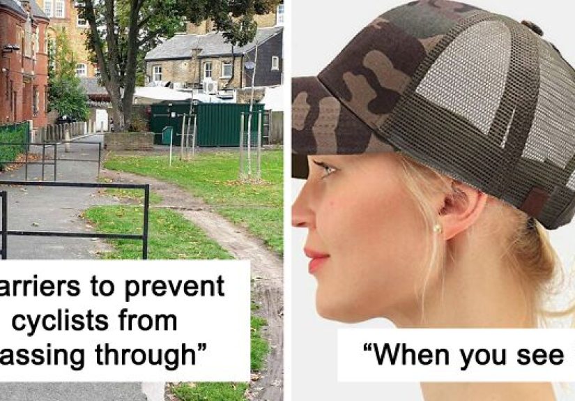
1) Signage and Wayfinding That Sends You on a Side Quest
“Wayfinding” is the fancy term for helping people get from Point A to Point B without losing their will to live.
When it’s good, you barely notice it. When it’s bad, you’re suddenly the star of a low-budget thriller called
Where Is The Elevator?
Common signage fails include:
- Signs placed after the decision point: You needed that information before the turn, not after it.
- Text you can’t read at real-world distances: Tiny fonts, low contrast, or reflective surfaces that hate eyeballs.
- Too much information at once: A “helpful” sign that looks like a legal contract.
- Inconsistent naming: The same place is called “Restroom,” “Toilet,” “WC,” and “Facilities” depending on the mood of the hallway.
The internet loves to roast signs because they’re supposed to be the simplest form of design: deliver a message fast.
When that fails, it’s like watching a lifeguard forget how water works.
2) Product Design Fails That Ignore How Humans Actually Human
A classic design fail is a product that technically functions, but only if you use it in a way that no normal person would.
Think of awkward grips, slippery surfaces, controls placed where hands naturally block them, or “creative” mechanisms that
require a physics degree and a prayer.
Bad product design often comes down to ignoring basic human factors:
how people hold things, see things, reach things, and interpret labels under time pressure.
If a product requires a warning label to compensate for a hazard that could have been designed out,
that’s usually a signal the design is trying to patch over a deeper problem.
The internet reacts strongly here because the stakes can be higher than “mild annoyance.”
A poorly designed step, slippery edge, or misleading control can cause real injuries. In other words:
sometimes it’s not just uglyit’s dangerous.
3) Packaging and Labels That Create Accidental Comedy
Packaging is where typography, layout, and language go to either earn a gold medal or get clowned forever.
The most common viral packaging fails include:
- Ambiguous phrasing: Words that accidentally imply something wildly different from what was intended.
- Bad line breaks: A normal phrase becomes a new sentence with a very unfortunate meaning.
- Hierarchy confusion: The most important info (what it is, how to use it, warnings) is smaller than the slogan.
- Overdesigned minimalism: Everything looks “clean,” but you can’t find the actual details you need.
People don’t share these because they’re mean. They share them because the fail is instantly understandable
and because a label that reads wrong can live rent-free in the brain forever.
4) Digital UX That Turns Basic Tasks into a Time Sink
In the digital world, “bad design” often looks like friction:
confusing navigation, unclear calls to action, inconsistent layout, and pages that don’t answer the user’s real question.
The classic UX problems are boringly consistentbecause they’re rooted in human behavior, not trends.
A few repeat offenders:
- Weak search: People rely on search. If search fails, trust collapses fast.
- Non-scannable text: Walls of copy that ignore how people read on screens.
- Breaking conventions for “creativity”: If every other site does it one way, changing it needs a strong reason.
- Tiny tap targets: If buttons are small or too close together, misclicks become a lifestyle.
The funniest part? Digital design fails often feel “fine” to the people who built thembecause the builders already know where everything is.
Users don’t have that map. They only have what the interface communicates.
5) Accessibility Mistakes That Exclude People (Often by Accident)
Accessibility is where “bad design” stops being a joke and becomes a barrier.
Low contrast text, missing labels, unlabeled buttons, and confusing heading structure don’t just annoy usersthey lock out users.
Accessibility is not a niche feature. It’s basic quality.
Here’s the uncomfortable truth: many modern websites still ship with lots of automatically detectable accessibility errors.
The most common issues repeat year after year (especially low contrast text and missing alternative text),
which suggests the problem isn’t “we didn’t know.” It’s “we didn’t prioritize.”
And the internet notices. It notices when “sleek” means “unreadable,” when motion effects cause discomfort,
or when a form can’t be completed without a mouse. Bad design gets shamedbut inaccessible design gets remembered.
What These Fails Teach About Good Design (a.k.a. How Not to End Up on a List)
If you strip away the screenshots and the roasting, the core lesson is simple:
good design reduces the amount of interpretation required.
It makes the next step obvious. It respects attention. It anticipates mistakes.
Make actions obvious (don’t make users guess)
Users look for cueshandles, buttons, labels, arrows, contrast, placement. When cues are missing or misleading,
users guess. And guesswork is where errors are born.
The best designs communicate “what this is” and “what you can do with it” without needing instructions.
Consistency isn’t boringit’s merciful
Consistency builds confidence. When the same action behaves differently from one screen to another, or the same sign style
means different things across a building, users lose trust. Consistent layout, labeling, and interaction patterns reduce mental load
and make systems feel learnable.
Fewer choices can feel like better service
When users face too many options at once, decision-making slows down, frustration rises, and abandonment becomes more likely.
Curate choices. Group options logically. Default to the most common path. Give people a clear “primary” next step.
Test early, test cheap, test with real humans
The fastest way to catch a future viral design fail is to put your design in front of someone who hasn’t seen it before
and ask them to complete a task while you watch silently. You’ll learn more in 10 minutes of observing confusion
than in 10 hours of internal debate.
Accessibility is a design requirement, not a polish step
High contrast, clear labels, sensible headings, keyboard support, readable typography, and error messages that actually help
these are foundational. If a design requires perfect eyesight, perfect dexterity, perfect attention, and perfect patience,
it’s not “premium.” It’s fragile.
Internet Shaming vs. Constructive Critique: Keeping It Human
Let’s acknowledge the awkward part: “design shaming” is entertaining, but there’s a line between laughing at a goofy fail
and bullying people. Many bad designs are the result of constraintstight budgets, rushed timelines, unclear requirements,
or stakeholders who insisted on “making the logo bigger” until the product cried.
If you want to be the kind of person who improves design culture (and not just the comment section), try this:
- Critique the outcome, not the person: “This label is ambiguous” beats “Whoever made this is dumb.”
- Name the user impact: “This could cause someone to trip” is more useful than “LOL.”
- Offer a fix: Even a simple alternativebetter contrast, clearer hierarchy, a different placementmoves the conversation forward.
You can still laugh. Just don’t forget that good design is a team sport, and failure is usually shared.
A Quick “Don’t Get Roasted” Checklist
- Can a first-time user understand it in 5 seconds? If not, simplify or add clearer cues.
- Is the important information the most visible? If your slogan is bigger than your instructions, rethink priorities.
- Is it readable from the right distance? Signs and labels should work in real conditions, not just in a design file.
- Does it still work with low vision, no mouse, or one hand? If not, accessibility and usability need attention.
- Did you test it with someone outside your team? If nobody fresh has tried it, you’re guessing.
- Are you relying on warnings to compensate for hazards? Fix the root design when possible.
If you do these consistently, your design is far less likely to become internet content. And if it does…
at least the comments might say, “Honestly, this is mostly fine.”
Extra: Real-Life “Design Fail” Experiences You’ve Probably Had (and What They Teach)
To make this topic feel less like a slideshow of other people’s mistakes, let’s talk about the experiences that practically
everybody has lived throughthose small moments where a design turns your day into a tiny, unnecessary obstacle course.
Not “movie villain” chaos. More like “why am I negotiating with a stapler?” chaos.
The Push/Pull Door Standoff. You walk up confidently, push, nothing happens. You pull, it opens.
Or worse: you pull, it doesn’t budge, and now you’re performing interpretive dance in a lobby. The lesson here is that
people don’t read signs firstthey read signals first. If the door has a bar that screams “push,” users will push.
If you need a sign that says “PULL” in all caps, that’s your design admitting it can’t communicate on its own.
The Sign That Shows Up Too Late. You’re driving through a confusing parking structure or walking through a big building,
and the sign telling you where to go is placed after the only meaningful decision point. So you do what humans do:
you improvise. You turn around. You backtrack. You feel annoyed at yourself even though it wasn’t your fault.
The lesson: information must appear when the decision is made, not after.
The “Minimalist” Website That’s Actually a Hide-and-Seek Game. The menu is an icon with no label.
The search is buried. Links don’t look like links. You click a thing that looks clickable and nothing happens.
Then you find the actual button and it’s a faint gray outline whispering “submit” like it’s shy. The lesson:
clarity beats cleverness, and conventions exist because they reduce learning time.
The Tiny Button Problem (a.k.a. Thumb Gymnastics). You’re on your phone, trying to tap a small “X,”
or two buttons are so close together you keep hitting the wrong one. You start tapping more carefully,
which means you’re now spending extra time doing something that should’ve been effortless.
The lesson: target size and spacing aren’t “pixel details.” They’re usability.
The Label That Accidentally Says Something Unhinged. You’ve seen it: a line break or font choice turns
a normal phrase into a hilarious new meaning. It gets shared because it’s funny, but it also reveals something serious:
designs are read in seconds, not studied. If text layout changes meaning at a glance, it’s riskyespecially for safety,
dosage, instructions, or anything people rely on under stress.
The “Just Add a Warning” Fix. Ever notice how some environments add warning signs like they’re collecting them?
“Caution: step.” “Caution: wet.” “Caution: existence.” Warnings have their place, but they can’t fully compensate for hazards
that should have been addressed through contrast, visibility, guardrails, or safer layouts. The lesson: warnings are not a substitute
for design that prevents harm.
What all these experiences have in common: the user didn’t wake up hoping to solve a puzzle.
People want to complete tasks quickly and confidently. When design fails, users blame themselves first (“Maybe I’m missing something”),
then they get annoyed, then they give upor they share it online because at least the internet will validate the frustration.
That’s why lists like Bored Panda’s work: they turn private confusion into public comedy, and they remind us that good design is not
about being fancy. It’s about being kind to the person trying to use the thing.
Conclusion
“Bad design” isn’t just an aesthetic problem. It’s a communication problem.
It’s what happens when a product, sign, interface, or space fails to make its purpose clearand asks users to do the translation.
The internet may laugh, but the real takeaway is hopeful: most design fails are fixable with better hierarchy, clearer cues,
consistent patterns, accessibility basics, and real user testing.
If you remember one thing, make it this: design should reduce effort, not create it. And if your design ever makes someone say,
“Wait… what am I supposed to do here?” take that as a giftbecause confusion is feedback, and feedback is cheaper than going viral for the wrong reasons.

 Close
Close