Table of Contents >> Show >> Hide
Choosing exterior color schemes is a little like choosing a haircut: it’s visible from space (or at least from the street),
it will be photographed during every holiday, and if you go too trendy, you’ll be explaining yourself to future-you for years.
The good news? You don’t need a design degreejust a plan that respects your home’s architectural style,
your fixed features (roof, stone, brick), and the fact that sunlight is basically a full-time drama queen.
How to Choose an Exterior Color Scheme Without Spiraling
Start with the stuff you’re not repainting: roof shingles, stone, brick, hardscaping, and any permanent metal finishes.
Those elements “vote” whether your palette should be warmer (creamy whites, beiges, clay tones) or cooler (crisp whites, blue-grays, charcoals).
Next, pick a main body color, a trim color, and one accent (like shutters, brackets, or a front door color).
If your house has extra architectural details (gingerbread trim, exposed rafters, decorative vents), add one more accentbut no more than your home can “wear.”
A quick trick: look at how much light your exterior gets. Bright sun can wash out light colors and make them look chalkier; shade can deepen colors and pull out undertones.
When in doubt, test large swatches and check them morning, noon, and sunset. (Yes, your neighbors will see you staring at paint samples.
No, they won’t call the police. They’ll just quietly judge your undertones.)
Finish matters too: lower-sheen paints are common for the main body, while trim and doors often look best with a slightly higher sheen for durability and crisp detail.
Translation: your trim can be fancy, but your siding doesn’t need to sparkle like a wet dolphin.
The 42 Color Schemes, Organized by Architectural Style
Colonial
1) Classic Navy & White
Body: deep navy • Trim: bright white • Accents: black shutters • Door: glossy red or natural wood.
A timeless curb-appeal move that reads “historic” without feeling museum-y.
2) Warm Greige & Cream
Body: warm greige • Trim: soft cream • Accents: muted charcoal • Door: olive or deep walnut.
Great if you want traditional, but not “stark contrast” traditional.
3) Heritage Green & Ivory
Body: medium heritage green • Trim: ivory • Accents: matte black hardware • Door: butter yellow or stained wood.
A calm, established look that pairs well with brick paths and mature landscaping.
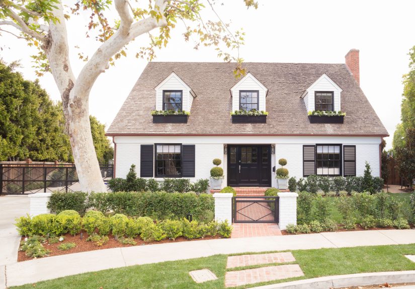
Cape Cod / New England Cottage
4) Weathered Gray & Crisp White
Body: weathered shingle-gray • Trim: crisp white • Accents: black lanterns • Door: marine blue.
Coastal energy without the “gift shop seashell” vibe.
5) Soft Blue-Gray & Warm White
Body: blue-gray • Trim: warm white • Accents: natural cedar • Door: sunny coral.
Reads fresh and breezy, especially with simple railings and clean lines.
6) Creamy White & Sandy Beige
Body: creamy white • Trim: sandy beige • Accents: bronze metal • Door: sage.
Perfect if your goal is “cozy and light,” not “glare at noon.”
Craftsman
7) Earthy Olive & Putty
Body: olive • Trim: putty • Accents: deep brown beams • Door: copper or brick.
Craftsman homes love nature tonesconsider it their personality type.
8) Smoky Charcoal & Warm White
Body: smoky charcoal • Trim: warm white • Accents: stained wood brackets • Door: golden amber.
A modern twist that still respects the home’s built-in texture.
9) Dusty Teal & Cream
Body: dusty teal • Trim: cream • Accents: dark bronze • Door: classic black.
Works especially well with river rock, tapered columns, and chunky trim.
Tudor
10) Cream Stucco & Espresso Timbers
Body: warm cream • Trim: deep espresso (timbers) • Accents: black iron • Door: stained oak.
The classic Tudor formulabecause it already nailed the assignment.
11) Soft Taupe & Dark Bronze
Body: soft taupe • Trim: dark bronze • Accents: stone-gray • Door: oxblood.
A slightly quieter Tudor look that still feels rich and storybook.
12) Misty Gray & Near-Black
Body: misty gray • Trim: near-black • Accents: aged copper • Door: deep green.
Crisp contrast that feels tailored, not costume-y.
Victorian / Queen Anne
13) Three-Tone Jewel Box
Body: muted plum • Trim: warm cream • Accents: dusty teal + antique gold details • Door: glossy black.
The goal: highlight details without becoming a carnival ride.
14) Sage, Buttercream & Rose
Body: soft sage • Trim: buttercream • Accents: muted rose • Door: walnut.
Romantic and welcomingespecially great with ornate trim and spindles.
15) Coastal Victorian
Body: pale seafoam • Trim: bright white • Accents: navy • Door: coral or cherry.
For Victorians near wateror anyone who wants the vibe without the ocean.
Ranch
16) Mid-Tone Greige & White
Body: mid-tone greige • Trim: white • Accents: charcoal • Door: terracotta.
A clean reset that makes low rooflines look polished.
17) Desert Tan & Clay
Body: desert tan • Trim: soft beige • Accents: clay red • Door: dark bronze.
Especially flattering with stone veneer or warm brick.
18) Soft Olive & Linen
Body: soft olive • Trim: linen • Accents: black shutters • Door: caramel wood.
A natural palette that plays nicely with wide lawns and mature trees.
Mid-Century Modern
19) White + Charcoal + Wood
Body: warm white • Trim: charcoal • Accents: natural wood siding • Door: mustard.
Simple geometry loves bold, controlled contrast.
20) Palm Springs Pastels (Grown-Up Edition)
Body: pale blush or sand • Trim: crisp white • Accents: teal • Door: citrus orange.
Keep lines clean so the color feels intentional, not accidental.
21) Graphite & Concrete Gray
Body: graphite • Trim: concrete gray • Accents: black metal • Door: bright white or lemon.
Perfect for flat planes, wide windows, and minimal trim.
Modern Farmhouse
22) Warm White & Matte Black
Body: warm white • Trim: black • Accents: natural wood • Door: black or stained oak.
A crowd favoritebecause it looks good in photos and real life.
23) Soft Greige & White
Body: soft greige • Trim: white • Accents: black metal roof accents • Door: dusty blue.
A calmer take that still feels current and clean.
24) Moody Green Farmhouse
Body: deep forest green • Trim: warm white • Accents: black • Door: natural wood.
Bold, earthy, and surprisingly timeless with simple landscaping.
Mediterranean / Spanish Revival
25) White Stucco & Terracotta
Body: soft white • Trim: same-tone white • Accents: terracotta roof + black iron • Door: walnut.
Let the roof and ironwork do the heavy lifting.
26) Sunbaked Sand & Cream
Body: sunbaked sand • Trim: creamy white • Accents: deep teal tiles • Door: dark bronze.
Warmth that complements arches and textured stucco.
27) Pale Peach & Soft White
Body: pale peach • Trim: soft white • Accents: olive shutters • Door: deep brown.
A gentle color that feels authentic, not like a dessert.
Southwestern / Adobe
28) Classic Adobe Clay
Body: adobe clay • Trim: warm cream • Accents: turquoise • Door: dark walnut.
It’s iconic for a reasonespecially with exposed wood beams.
29) Dusty Rose & Bronze
Body: dusty rose • Trim: sand • Accents: bronze • Door: teal.
Soft, regional, and great with desert landscaping.
30) Canyon Taupe & Deep Brown
Body: canyon taupe • Trim: warm beige • Accents: deep brown • Door: copper.
Subtle, grounded, and nearly impossible to hate.
Coastal / Beach House
31) Bright White & Sky Blue
Body: bright white • Trim: bright white • Accents: sky blue shutters • Door: navy.
High-contrast and freshgreat with metal roofs or light shingles.
32) Sea Glass Green & White
Body: sea glass green • Trim: white • Accents: natural wood • Door: coral.
A friendly palette that looks amazing with porches and simple trim.
33) Driftwood Beige & Cream
Body: driftwood beige • Trim: cream • Accents: black hardware • Door: deep blue.
Coastal, but understatedlike a nice linen shirt.
Contemporary / Minimalist
34) Near-Black Monochrome
Body: near-black • Trim: same-tone near-black • Accents: warm wood • Door: same-tone black.
Minimal, sculptural, and best when landscaping is crisp.
35) White & Warm Wood
Body: clean white • Trim: white • Accents: cedar • Door: charcoal.
Modern, bright, and great for homes with big windows and flat planes.
36) Concrete Gray & Soft Black
Body: concrete gray • Trim: soft black • Accents: brushed metal • Door: bold red.
One pop of color = personality, without turning the facade into a meme.
Prairie / American Foursquare
37) Prairie Brown & Cream
Body: prairie brown • Trim: cream • Accents: deep green • Door: stained wood.
Feels rooted and strongperfect for wide eaves and horizontal lines.
38) Olive-Greige & Warm White
Body: olive-greige • Trim: warm white • Accents: charcoal • Door: mustard.
Subtle, modern, and flattering on chunky porch columns.
39) Smoky Blue & Ivory
Body: smoky blue • Trim: ivory • Accents: bronze • Door: oxblood.
Classic but less expectedgreat for foursquares with bold trim.
Mountain / Cabin / Rustic
40) Deep Brown Stain + Black Trim
Body: deep brown stain • Trim: black • Accents: stone-gray • Door: natural wood.
A rugged palette that looks intentional year-round.
41) Charcoal & Natural Cedar
Body: charcoal • Trim: charcoal • Accents: cedar • Door: warm white.
Contemporary cabin energyworks beautifully with metal roofs.
42) Moss Green & Cream
Body: moss green • Trim: cream • Accents: dark bronze • Door: stained wood.
If your house is surrounded by trees, this is basically camouflagebut chic.
Fast Pairing Tips for Roofs, Brick, and Stone
If your roof reads warm (brown, bronze, red-tinged blends), look at creamy whites, warm greiges, taupes, and clay tones.
If your roof reads cool (charcoal, slate, blue-gray), crisp whites, cooler grays, blue-grays, and deep navies tend to behave.
For brick or stone, pull one subtle undertone from it and echo that in either the body color or the accentyour house will look “pulled together”
even if your garage is currently storing three broken patio chairs and a mysterious bag of mulch.
Common Mistakes That Make a House Look “Off”
- Skipping big tests: small paint chips lie. Large samples tell the truth.
- Ignoring sunlight: the same color can look creamy at 9 a.m. and slightly green at 4 p.m.
- Over-accenting: if everything is an accent, nothing is an accent.
- Fighting fixed materials: your roof and stone will win. Always. Choose peace.
Field Notes: of Real-Life Exterior Color Experience
The first time I helped someone choose an exterior palette, we started with confidence and ended with 14 sample pots, three “almost whites,”
and a front yard that looked like a very polite graffiti artist had been at work. And honestly? That’s normal. Exterior paint is tricky because
it’s not just “a color”it’s a color plus sun angle, plus shadow from the maple tree, plus the way your neighbor’s bright red car
reflects onto your siding at exactly 5:12 p.m. (Yes, that’s a thing. Light is petty.)
The most useful habit I’ve seen is the “two-step test.” Step one: pick three options that are in the same family (say, three warm whites),
then paint big swatches on different sides of the house. Step two: live with them for a few days and take pictures at the same times each day.
Photos reveal what your eyes normalize. You might think your favorite is the brightest, cleanest whiteuntil your camera shows it going slightly icy
next to your warm roof blend. Suddenly, the “boring” creamy white becomes the hero. It’s like a makeover montage, but for siding.
Another real-world lesson: trim color is the quiet MVP. People obsess over the body color (understandably), but trim is what gives the house definition.
If the trim is too stark, it can look harsh and outline every edge like a cartoon drawing. If it’s too close to the body color, the whole house can flatten out.
A small shiftwarmer, cooler, lighter, or deeperusually fixes it. And if you want drama, put it where it’s easy to change later:
the front door. A bold door color is basically a reversible jacket. If you get tired of it, you repaint one small surfaceno scaffolding required.
Finally: don’t underestimate the power of “neighborhood harmony.” This isn’t about copying your neighbors; it’s about not starting a visual argument.
If every house on your street is soft and muted, a neon-bright experiment might feel like your home is yelling during a library tour.
But if the neighborhood has personalityhistoric homes, varied styles, strong landscapingyou have more freedom to go deeper, moodier, or more colorful.
The sweet spot is a palette that feels like it belongs where it is, while still feeling like you. That’s the real curb appeal: not perfectionjust confidence.
Conclusion
The best exterior color schemes respect your home’s architecture, coordinate with fixed materials, and use contrast strategicallyespecially on trim and doors.
Whether you’re going timeless with navy-and-white or going bold with a moody green farmhouse, a thoughtful palette can elevate curb appeal for years.
Test big, watch the light, and remember: your house doesn’t need to be trendy. It needs to be right.