Table of Contents >> Show >> Hide
- Before You Pop the Paint Can
- 21 Wall Painting Ideas That Work Anywhere
- 1) The Classic Accent Wall (But Make It Smart)
- 2) The “Partial Accent” (A.K.A. Commitment Issues, But Stylish)
- 3) Two-Tone Walls for Instant Architecture
- 4) Color Blocking with a Clean Line
- 5) Vertical Split Walls (Modern, Minimal, and Weirdly Flattering)
- 6) Painted Stripes That Don’t Scream “Kids’ Playroom”
- 7) The Painted Arch (Instant Focal Point, Zero Heavy Lifting)
- 8) The Reverse Arch (Outline Only, Maximum Cool)
- 9) Geometric Tape Patterns (Triangles, Angles, and Good Decisions)
- 10) Stenciled “Painted Wallpaper” for Pattern Without the Price Tag
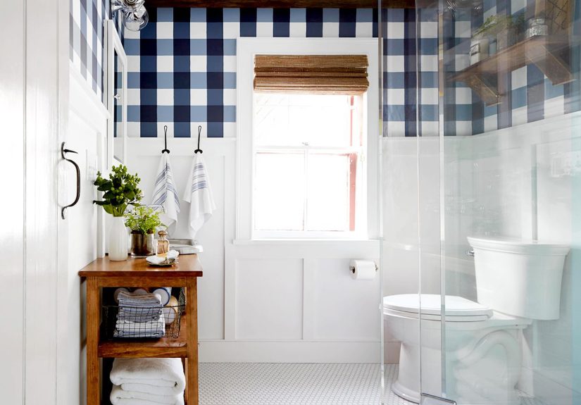
- 11) Checkerboard or Grid Walls (Playful, Not Preschool)
- 12) A Simple Wall Mural (Yes, You Can Do This)
- 13) Ombre Accent Walls That Feel Calm (Not Like a 2012 Pinterest Board)
- 14) Color Washing for a Soft, Cloudy Texture
- 15) Limewash for That Old-World, Sun-Soaked Texture
- 16) Faux Finishes: Sponging That Actually Looks Good
- 17) High-Gloss Statement Walls (Shiny, Fancy, and Slightly Dramatic)
- 18) Chalkboard Paint for a Wall That Does Something
- 19) Paint the Ceiling (The “Fifth Wall” Glow-Up)
- 20) Color Drenching for a Cocoon Effect
- 21) Monochrome “Frame Wall” (Architectural Detail Without the Construction)
- How to Choose the Right Idea for Your Space
- Conclusion
- of Real-World Experience (So You Don’t Learn the Hard Way)
If your walls could talk, they’d probably say something like: “Hey… we’ve had the same beige on since the era of flip phones.”
The good news: paint is one of the fastest ways to make a room feel bigger, warmer, cleaner, more expensive, or at least like you
didn’t move in yesterday. The better news: you don’t need to be a professional muralist or own seventeen ladders to pull off a wall
upgrade that looks intentional.
Below are 21 wall painting ideas that work in basically any spacetiny apartment, open-concept living room, rental-friendly nook,
“why is this hallway so long?” corridor, you name it. I’ll give you what to do, where it works best, and the little strategy behind why it
looks so good. Expect practical tips, a bit of design psychology, and zero lectures about “finding your truth” in a paint swatch.
Before You Pop the Paint Can
A great paint job is 50% color choice and 50% not rushing like you’re on a game show. Do these quick moves first:
- Test swatches in real lighting (morning, afternoon, night). Colors change more than your mood on a Monday.
- Pick the right finish: matte hides wall texture; eggshell/satin cleans easier; semi-gloss is bold and… honest about imperfections.
- Prep wins: clean walls, patch holes, sand bumps, and tape like you mean it.
- Choose a focal wall on purpose: behind a bed, sofa, or dining table usually reads “designer,” not “accidental.”
21 Wall Painting Ideas That Work Anywhere
1) The Classic Accent Wall (But Make It Smart)
One bold wall can anchor a whole room without overwhelming it. The “smart” part: choose the wall your eyes naturally land on (bed wall,
fireplace wall, TV wall) and go deeper than the restnavy, forest green, terracotta, charcoal. It’s the easiest way to add depth and
make decor pop.
2) The “Partial Accent” (A.K.A. Commitment Issues, But Stylish)
Paint only a sectionlike a wide rectangle behind a headboard, a block behind a console table, or a painted zone for a reading chair.
This gives you focal-point energy with less paint (and less fear). Bonus: it helps define areas in open layouts without building walls.
3) Two-Tone Walls for Instant Architecture
Paint the lower half one color and the upper half another (or keep the top white). This mimics wainscoting and adds structure, especially
in builder-basic rooms. Go classic with a deeper bottom color, or modern with a crisp split at chair-rail heightor even a little higher
to make ceilings feel taller.
4) Color Blocking with a Clean Line
Instead of “half-and-half,” try a bold geometric block: a large square behind a desk, a wide band around the room, or a block that wraps
a corner. Color blocking is great for small spaces because it creates visual orderlike giving your room a backbone.
5) Vertical Split Walls (Modern, Minimal, and Weirdly Flattering)
Split a wall vertically into two colors50/50, 60/40, or even a skinny stripe of a bold color near a doorway. Vertical splits can make a
room feel taller and more contemporary, especially in offices, entryways, and narrow bedrooms.
6) Painted Stripes That Don’t Scream “Kids’ Playroom”
Stripes can be crisp and grown-up if you keep the contrast controlled: tone-on-tone (two shades of the same color) or a soft neutral paired
with white. Horizontal stripes visually widen a room; vertical stripes add height. Use painter’s tape carefully and remove it while paint is
slightly tacky for cleaner lines.
7) The Painted Arch (Instant Focal Point, Zero Heavy Lifting)
Paint an arch behind a nightstand, reading chair, crib, or bar cart. It frames what’s in front of it like built-in architecture. Keep it
simple: one arch in a contrasting color or a tone slightly deeper than the wall for a subtle “oh, this place is curated” effect.
8) The Reverse Arch (Outline Only, Maximum Cool)
Instead of filling the arch, paint a thick outline (or two thin lines) to create a graphic shape. This works beautifully in modern spaces
where you want design detail without adding visual weightlike a minimalist bedroom or a calm home office.
9) Geometric Tape Patterns (Triangles, Angles, and Good Decisions)
Use painter’s tape to create a geometric patterntriangles, shards, or a modern “mountain range.” Keep the palette tight (2–3 colors max)
so it reads intentional rather than chaotic. This is a killer option for feature walls in bedrooms, creative studios, and teen rooms that
won’t feel dated in six months.
10) Stenciled “Painted Wallpaper” for Pattern Without the Price Tag
Stenciling can mimic wallpaper with far more control. Choose a repeating pattern (Moroccan, floral, geometric), use a stencil brush with
less paint than you think you need, and build the design slowly. Great for powder rooms, laundry rooms, and entryways where a little drama
goes a long way.
11) Checkerboard or Grid Walls (Playful, Not Preschool)
A large-scale checkerboard in soft neutrals can feel modern and artsyespecially behind shelves or in a breakfast nook. If squares feel too
bold, try a thin grid line pattern (like a subtle plaid). It adds texture and rhythm without screaming for attention.
12) A Simple Wall Mural (Yes, You Can Do This)
“Mural” doesn’t have to mean Sistine Chapel. Think: a sunset gradient, abstract curves, oversized botanicals, or a minimalist landscape line.
The trick is planning: sketch lightly, block in big shapes first, then refine. Murals are perfect for nurseries, dining rooms, and any wall
that needs a main-character moment.
13) Ombre Accent Walls That Feel Calm (Not Like a 2012 Pinterest Board)
Ombre works when the colors are close relativeslike three shades of blue-gray or warm sand tones. The gradient adds softness and depth,
especially behind a bed or in a reading nook. Blend with a dry brush or sponge technique and keep the transitions gentle.
14) Color Washing for a Soft, Cloudy Texture
Color washing uses glaze and paint to create depth that looks lived-in and warm. It’s ideal if your walls have minor imperfections because
the variation distracts the eye. Use a brush for more texture or a sponge/rag for a softer, more diffused look.
15) Limewash for That Old-World, Sun-Soaked Texture
Limewash has a chalky, velvety movement that feels historic and high-end. It’s gorgeous in living rooms, bedrooms, and even modern spaces
that need warmth. The magic is in the variationbrush strokes create natural shifts, so the wall looks textured even when it’s one color.
16) Faux Finishes: Sponging That Actually Looks Good
Faux finishes are backwhen done with restraint. Sponging in two or three complementary tones can add subtle dimension, especially in
Mediterranean or coastal-inspired spaces. The goal is “depth,” not “I found a sponge and got excited.”
17) High-Gloss Statement Walls (Shiny, Fancy, and Slightly Dramatic)
Want a wall that looks custom and expensive? Paint one wall in a high-gloss or lacquer-like finish. The shine bounces light around and can
make darker colors look rich instead of heavy. Best in dining rooms, offices, or powder roomsspaces that can handle a little attitude.
18) Chalkboard Paint for a Wall That Does Something
Chalkboard walls aren’t just for kids. Use one in the kitchen for grocery lists, in the office for brainstorming, or in a mudroom for schedules.
Pro move: add magnetic primer underneath so it becomes a message board + gallery wall combo. Just remember to “season” the wall (rub chalk over
it and wipe off) before the first real use to prevent ghosting.
19) Paint the Ceiling (The “Fifth Wall” Glow-Up)
Painting the ceiling adds surprise and polish. A soft blue ceiling can feel airy (hello, porch-ceiling vibes), while a deep color makes a room
feel cozy and intentional. Try this in bedrooms, dining rooms, and small spaces where a little theatrical flair pays off.
20) Color Drenching for a Cocoon Effect
Color drenching means painting walls, trim, and sometimes the ceiling in the same hue. It reduces visual breaks, makes spaces feel cohesive,
and can even make small rooms feel larger by simplifying the edges. It’s especially stunning in offices, libraries, bedrooms, and moody powder rooms.
21) Monochrome “Frame Wall” (Architectural Detail Without the Construction)
Here’s a designer trick: hang thrifted frames (or apply simple trim shapes), then paint the entire wallincluding framesone bold color.
The texture creates shadow and dimension, while the single color keeps it sophisticated. It’s a budget-friendly way to get that editorial,
layered look without remodeling your life.
How to Choose the Right Idea for Your Space
If you’re stuck, match the idea to the room’s job:
- Small rooms: color drenching, vertical splits, subtle stripes, soft color washing.
- Busy rooms (kitchen, mudroom): two-tone walls, chalkboard sections, wipeable satin finishes.
- Rooms that need “wow”: murals, limewash texture, glossy statement walls, painted ceilings.
- Open layouts: partial accents, color blocks, arches to define zones.
Conclusion
The best wall paint idea is the one that fits your space and your lifestyle. Bold accent walls add instant personality, two-tone and
color blocking create architecture where there wasn’t any, and textured techniques like limewash and color washing bring depth you usually
pay a designer to “source.” And if you only remember one thing: sample first, tape carefully, and don’t paint when you’re hungry. That’s how
you end up with a wall color named “Regret Latte.”
of Real-World Experience (So You Don’t Learn the Hard Way)
Let’s talk about what actually happens when you try these wall painting ideas in real homeswhere the floor isn’t perfectly level, the walls
are hiding mysterious bumps, and your roller tray somehow becomes a paint crime scene.
First: lighting will humble you. A warm greige that looks dreamy at noon can turn into “wet cardboard” at night under warm bulbs.
I’ve seen people choose a color based on a tiny swatch, paint the whole room, then spend the next week texting friends, “Is this… green?”
The fix is boring but effective: paint a large sample (or two) on different walls and check it at different times. The wall by the window will
lie to you in a different way than the wall in the corner.
Second: tape is your friend, but it’s also a chaotic neutral. For stripes, geometric patterns, and crisp color blocking, the
difference between “clean lines” and “modern art disaster” is usually pressing tape down firmly (especially over texture), sealing the edge
with the base wall color, and pulling the tape at the right moment. Pull too late and you’ll peel paint. Pull too early and you’ll smudge.
The sweet spot is when the paint is dry to the touch but not fully curedlike it’s confident, but not married to the wall yet.
Third: your finish choice matters more than you think. Matte is forgiving and cozy, but it can scuff in high-traffic areas.
Satin is the sweet spot for most living spaces because it cleans up without looking plastic. High-gloss can look jaw-dropping on a statement wall,
but it’s brutally honestevery patch, bump, and sanding mistake gets promoted to “featured detail.” If you want a glossy wall, prep like you’re
expecting a close-up on a reality TV show.
Fourth: specialty looks are easier when you embrace imperfection. Limewash and color washing are forgiving because variation is the
point. If you try to make it perfectly uniform, you’ll fight the material and lose. Instead, aim for consistent techniquesimilar pressure,
similar brush directionthen let the wall do its textured, moody thing.
Finally: start with a space you can “win”. A powder room, a laundry room, or a small bedroom wall is perfect for your first arch,
stencil, or two-tone experiment. Once you see a finished project (and realize you survived), your confidence jumpsand suddenly that long hallway
doesn’t seem like an enemy. It’s just a canvas with bad attitude.